Shazam’s App Design Simplifies The Music Identification Process
Shazam is a brand that connects users with the music and television around them. It helps users identify songs and shows through a mobile app that assesses music through a digital footprint system.
Essentially, Shazam takes a digital audio footprint of the music you’re listening to and matches it to its database of audio to identify and connect you with that specific song.
When the app first launched in 2008, this was its primary function. It was an app that let you identify a given number of songs at a time for free. Users could pay to access an unlimited number of identifications. But since then the app has grown into a music necessity, identifying songs, connecting users to artists and allowing them to download these tracks to their music streaming service of choice — whether that’s Apple Music or Spotify.
Today, the app has over 12 billion users. And that’s thanks to its innovations and growth. Users can now identify all the songs they want, add them to their music streaming service and can even track and tag videos as well using the app.
This is a highly intuitive app that focuses on giving users an experience catered to them specifically. It offers users a unique, personalized and interactive experience. And it serves a purpose. How many times have you heard a song on the radio, and haven’t been able to quite figure out where you’ve heard it, what the name is or who sings it?
Of course, you could turn to Google to figure it out but sometimes you only really have the beat to play off of. Shazam comes in and answers those questions with ease, and its simple and efficient app design makes that happen — while also letting users have some fun along the way.

Shazam’s Mobile Platform Uses Intuitive Technologies And A Clean Interface To Connect Users With Information
The Shazam app offers an intuitive and simple service that seemingly everyone has been in need of at least once in their lives. It connects users with music and video that they’ve seen or heard, but can’t quite remember.
Thanks to an innovative and efficient algorithm, the Shazam app can take a digital footprint of the medium you’re trying to learn more about, and provide it to you within seconds. Learn about an artist, a song title and the meaning behind the lyrics with ease and satisfaction.
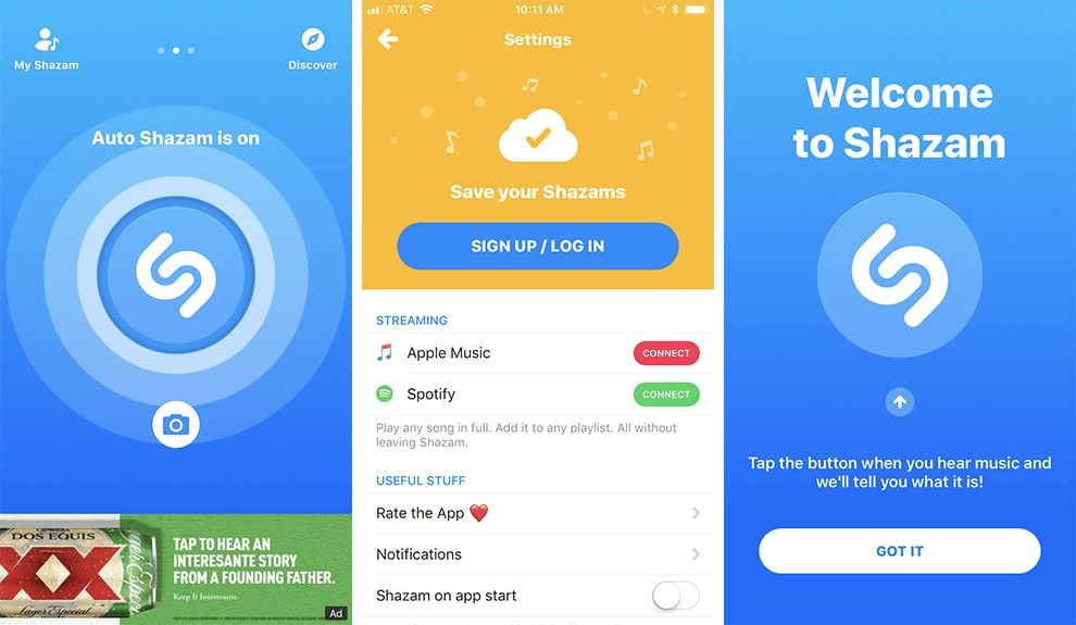
This is all done on a clean, straightforward and bright interface. The Shazam app is clean and simple — with minimal copy and imagery getting in the way of your main goal — finding out what that song is that you can’t get out of your head.
The main page includes the Shazam symbol in white, two interlocking U shapes tilted at an angle. All a user has to do is press down on this symbol while music is playing and voila, their new favorite track is uploaded onto the screen.
From here, transferring this song to their music streaming service is a breeze thanks to its innovative and easy integration of Apple Music and Spotify into the app’s platform.
Users can also discover new music based on their listening preferences and upload these to their other accounts all from the same, intuitive and personalized platform.
Simple illustrations, to-the-point CTAs and an overall bright and airy interface make navigating through this app fun and fluid. There are only a few options to choose from, a few actions to take. This takes out any guesswork or stress.
This app has a direct purpose and goal, and it doesn’t let any additional exciting, but possibly off-brand features get in the way. It’s all about connecting users with the music and video that makes them happy, and it does just that.

The Simple Shazam App Provides A Clean, Clear And Engaging User Experience
Shazam is a simple, bright and clean app design that makes it easy for users to find new music, and listen to it on their streaming music services.
The layout of this app is bright, clean and refreshing. There is plenty of empty space made up of bright and exciting colors and creative and subtle designs. Illustrations are seamless and stunning, adding a playful touch to the overall app and helping users along the three-paged app design.
This app is split into three sections — the personal, account section, the Shazam section and the discover section. All a user has to do is swipe to get where they want to go.
The simplicity of the app is powerful. There are only so many functions, making the overall journey simple and seamless. Identify a song, or find new songs that are catered to your personal style. And once you find that song, you can easily connect it to your Apple Music or Spotify account.
This app takes the guesswork out of music listening. It offers a breezy service that allows users comfort and efficiency.
Its clean and crisp layout, bright colors and straightforward illustrations make the concept and the usability quick and easy — letting users get in, get out and get on with their day.


