Key Points
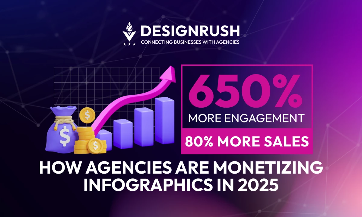
- Infographics Drive Dramatic Performance Gains: Posts featuring infographics generate up to 650% more engagement and can boost sales by 80% by improving comprehension and recall. Additionally, content with infographics earns 178% more backlinks and 3x more shares, enhancing both SEO and brand reach.
- Productization = Scalable Revenue for Agencies: Leading firms like Column Five and Siege Media have built dedicated service lines around infographics, offering them as standalone deliverables or bundled within strategy, reporting, and content retainers; turning visuals into repeatable, billable IP.
- Infographics Enhance Trust and Conversion: In complex sectors like finance, healthcare, and B2B tech, infographics act as clarity engines, building trust by making technical data digestible. When embedded in landing pages or emails, they reduce bounce rates and increase conversions by simplifying the buyer journey.
- AI Accelerates Output, Not Strategy: Agencies winning in 2026 use tools like Canva Magic Design and Adobe Firefly to streamline production, but preserve competitive edge by focusing on insight synthesis, brand alignment, and behavioral design. AI can automate layout, but not meaning or positioning.
In a rush? Have a quick listen.
We unpack how infographics went from eye candy to revenue stream, with engagement stats, productized services, and real agency playbooks that scale. Listen to the full episode on Spotify.
Data alone doesn’t win attention, design does. While everyone’s publishing reports, decks, and dashboards, the agencies getting noticed are the ones turning raw numbers into branded narratives.
Creative infographics aren’t filler content, they’re high-leverage assets that drive clarity, signal authority, and convert interest into action. For agencies, they’ve become a strategic tool: pitch enhancers, thought leadership anchors, and bundled revenue drivers.
Here’s how creative infographic design is reshaping visual storytelling, and how agencies can harness it to drive business growth.
How Agencies Use Creative Infographics to Drive Business Growth
1. Monetizing Infographics as a Service
Infographics aren’t just a value-add, they’re billable IP.
And the smart agencies? They are folding them into strategy decks, quarterly performance reports, and content retainers as premium deliverables. Instead of treating visuals as afterthoughts, they’re packaging them into modular offerings:
- Infographics for thought leadership (blog posts, LinkedIn carousels)
- Visuals for investor reports or stakeholder briefings
- Sales funnel content that combines narrative and data in one branded asset
Agencies like Column Five and Siege Media have built entire service lines around visual storytelling. The model works because clients see immediate ROI: complex data gets shared, retained, and remembered — and agencies get paid for turning chaos into clarity.
2. Infographics as Trust-Building and Conversion Tools
In high-stakes industries (think B2B tech, finance, and healthcare) buyers don’t read walls of text. They scan.
And when the stakes are high, clarity equals trust. Infographics serve as visual proof of expertise: they decode technical topics, spotlight wins, and package insights in a format that builds confidence without overwhelming.
When embedded into landing pages or nurture sequences, they reduce bounce and increase conversion.
Add a well-designed infographic to a gated report or email campaign, and engagement spikes — not because of flashy design, but because it helps the audience understand faster.
3. Design = Differentiation in Pitching & Thought Leadership
In a pitch meeting, a custom infographic says more than a slide full of bullet points ever could. It signals polish. It shows the agency understands how to distill insight.
Whether visualizing a client’s pain points or forecasting potential outcomes, infographics are the difference between being another proposal and being the one that sticks.
The same applies to executive visibility. Agency leaders who publish branded infographics (on LinkedIn, in industry roundups, or as part of public-facing research) establish not just expertise, but ownership of the conversation.
The game has shifted. These days, it’s not just about getting seen — it’s about getting seen fast.
Where AI Fits...and Where It Doesn’t
AI design tools like Canva’s Magic Design, Adobe Firefly, and ChatGPT plugins are changing the speed of content production. Infographics that once took days can now be roughed out in minutes.
For clients, that sounds like efficiency. For agencies, it sounds like a threat. But it’s not.
Here’s the reality: AI levels the playing field for execution, not strategy. It can replicate styles, suggest layouts, or auto-generate charts—but it can’t synthesize proprietary insights, align visuals with a brand’s voice, or structure a narrative that supports a specific buyer journey.
Agencies that treat AI as an accelerator, not a replacement, are winning. They use generative tools to reduce production time and redirect creative energy toward higher-value work:
- Turning raw analytics into narrative arcs
- Building infographics that reinforce positioning, not just display data
- Layering design with behavioral cues and brand psychology
The bottom line: AI can design infographics, but it can’t design outcomes. Agencies that pair automation with insight stay billable, relevant, and defensible.
Winning Visuals: 18 Creative Infographic Examples
-content-large-webp.webp)
1. Cargo Leaders (Export Value by Country)
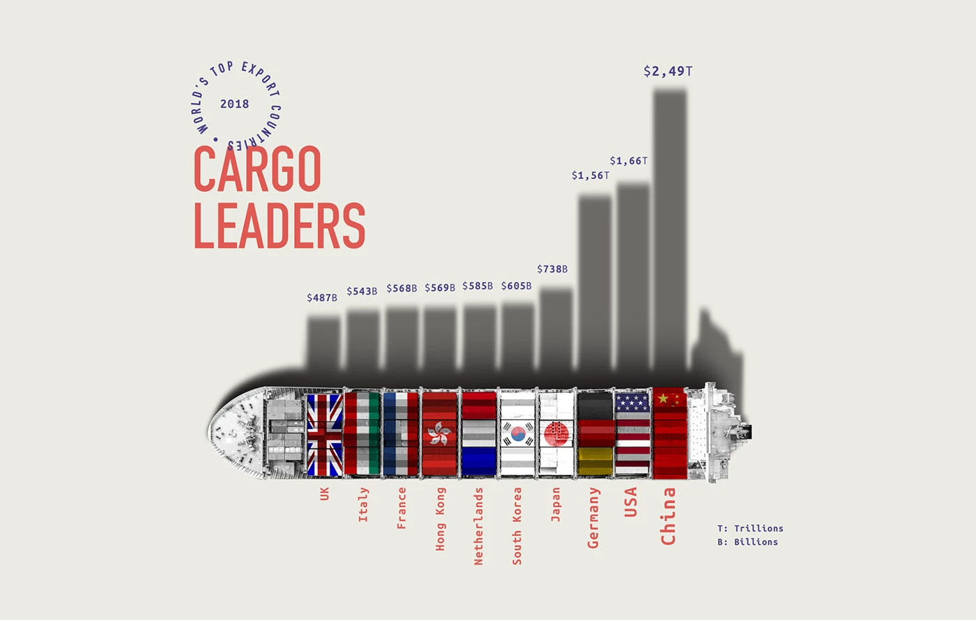
Overview:
This infographic visualizes the top global export countries using a ship-shaped bar chart filled with national flags, combining trade data with a memorable metaphor for global commerce.
- Creative Touch: Ship silhouette as chart frame — turns data into metaphor-driven storytelling.
- Strategic Function:
Helps trade economists, supply chain analysts, and logistics consultants quickly benchmark export dominance per nation, enhancing presentations and trade policy discussions with visual clarity. - Agency Play:
Package as part of a global market insights toolkit or sector-specific trade intelligence report. Repurpose design style for annual export dashboards or geo-political presentations.
2. Ready or Not, Here I Am
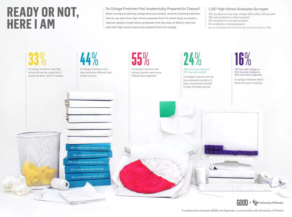
Overview:
A clean, object-driven infographic using color-coded stats and symbolic furniture items to illustrate how unprepared students feel entering college, based on national survey data.
- Creative Touch: Represents student sentiment through furniture icons that reflect emotional readiness, blending everyday objects with survey results.
- Strategic Function: Delivers education experience insights that fuel policy advocacy, curriculum development, or student services improvements, using clear percentages and intuitive icons.
- Agency Play: Use as a template for survey storytelling. Offer to education clients running national perception studies or awareness campaigns. Embed in admissions UX revamps or whitepaper assets.
3. "Our Favorite Drugs" (Drug Use by Region)
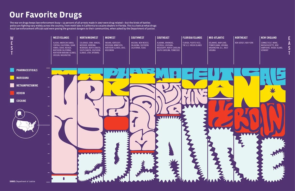
Overview:
Uses typographic shape-mapping to depict regional drug preference data across the U.S., transforming narcotics data into a bold visual landscape segmented by geography.
- Creative Touch: Shapes typography into a geographic map of the U.S., creating a bold fusion of regional data and typographic art.
- Strategic Function: Highlights law enforcement and public health data in a way that’s instantly scannable — fueling regional strategies for prevention, treatment, and funding.
- Agency Play: Offer as part of behavioral data visualizations or policy advocacy design kits. Great for clients addressing sensitive social issues who need bold but digestible visual framing.
4. Pink Floyd Timeline (Discography + Band History)
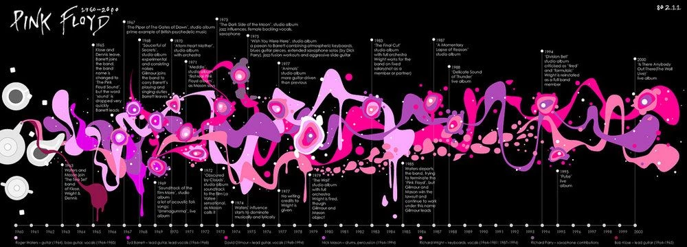
Overview:
Maps the creative evolution of Pink Floyd from 1960 to 2000 through a flowing timeline of album releases, band member shifts, and visual rhythm that mimics the band's psychedelic style.
- Creative Touch: Applies psychedelic styling and visual rhythm that mirror the band's aesthetic, bringing musical history to life through design.
- Strategic Function: Turns chronological data into a storytelling timeline, combining visuals and rhythm to deepen audience engagement across music, culture, or entertainment history.
- Agency Play: Use this model for branded timelines, rebrands, or anniversary campaigns. A strong format for culture-rich storytelling in decks, reports, or retrospectives.
5. Body Parts: What Are You Worth?
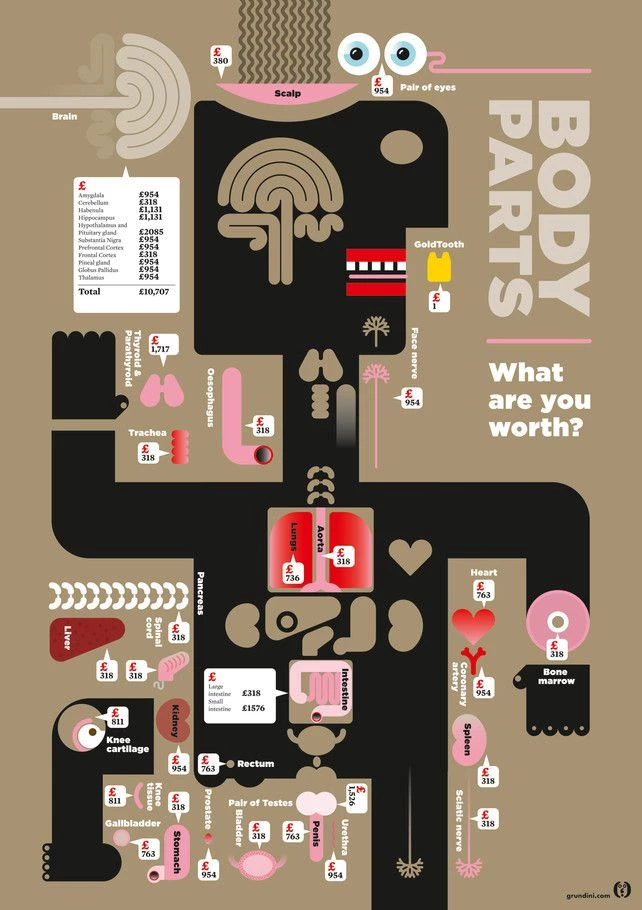
Overview: Visualizes the black-market value of human body parts using a stylized human figure, with price tags assigned to each organ or anatomical section.
- Creative Touch: Uses a stylized human figure with price tags to visualize organ values, creating a stark and impactful commentary on medical ethics.
- Strategic Function: Drives social awareness around organ trafficking, medical ethics, or human value through visually confronting, data-backed illustration.
- Agency Play: Use in impact-driven storytelling for global issue advocacy. Can serve as a conversation starter in CSR decks or human rights campaigns.
6. Top Hiring Sectors in the Next Four Years
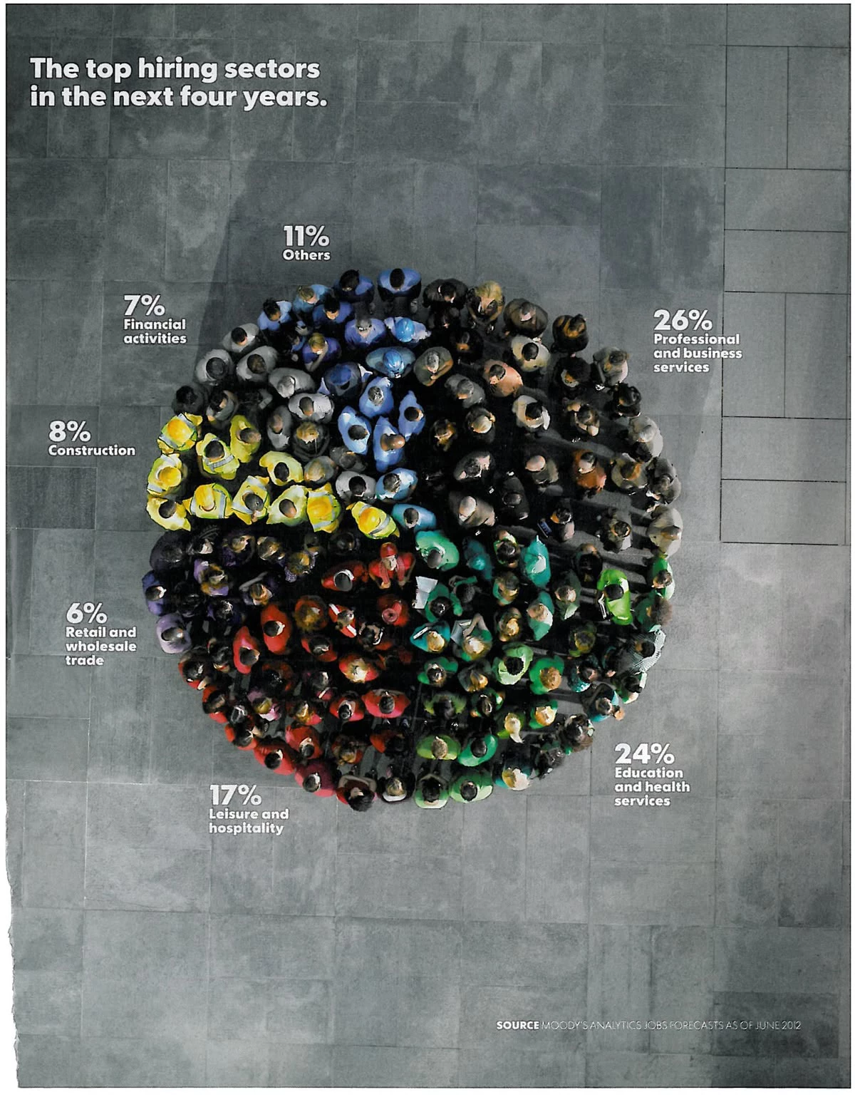
Overview: Depicts job growth forecasts using a pie chart made of humans, segmented by labor sector, with color-coded professions visually clustered in a circular formation.
- Creative Touch: Illustrates job forecast data using people-shaped segments in a pie chart, making abstract stats feel more human and tangible.
- Strategic Function: Translates abstract job market forecasts into tangible, relatable visuals, boosting clarity in economic forecasting or workforce planning reports.
- Agency Play: Turn into dynamic forecast infographics for workforce-related clients. Build into hiring trend reports or skills gap campaigns for business leaders and policymakers.
7. Emotions Exposed
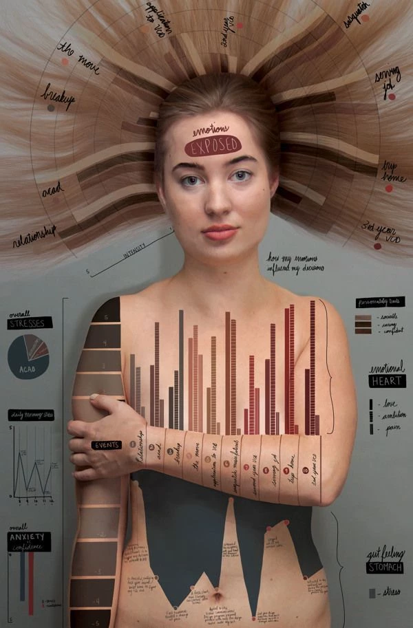
Overview: Maps the impact of emotional triggers and stress events on a female body, using a blend of photography, bar graphs, line charts, and personal annotation.
- Creative Touch: Overlays data on a human body to visually map emotional responses, turning internal experiences into an engaging visual format.
- Strategic Function: Humanizes mental health data by visualizing the internal experience, making stress, anxiety, and emotion feel tangible and readable.
- Agency Play: Leverage in health UX storytelling or emotional experience design. A compelling option for empathy-driven design frameworks or clinical education visuals.
8. Religion + Perception in the Workplace
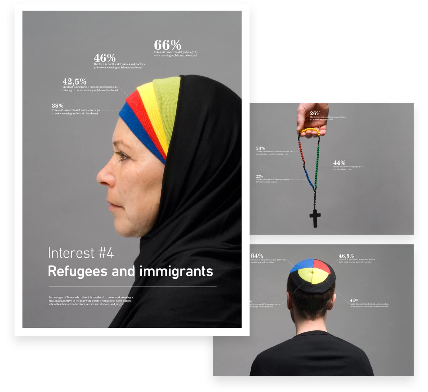
Overview: A triptych of portraits paired with religion-based workplace perception stats, each showing a different faith symbol (hijab, cross, yarmulke) and its corresponding public sentiment.
- Creative Touch: Combines minimalist portraits with public sentiment data, making the visualization of bias both personal and powerful.
- Strategic Function: Captures implicit bias data through minimalist photography and clear percentages, making workplace equity data emotionally resonant and highly shareable.
- Agency Play: Use this format for perception studies, bias audits, or internal training decks. Ideal for creating tension and conversation in inclusion-driven branding.
9. Mental Maze: Prevalence of Mental Disorders
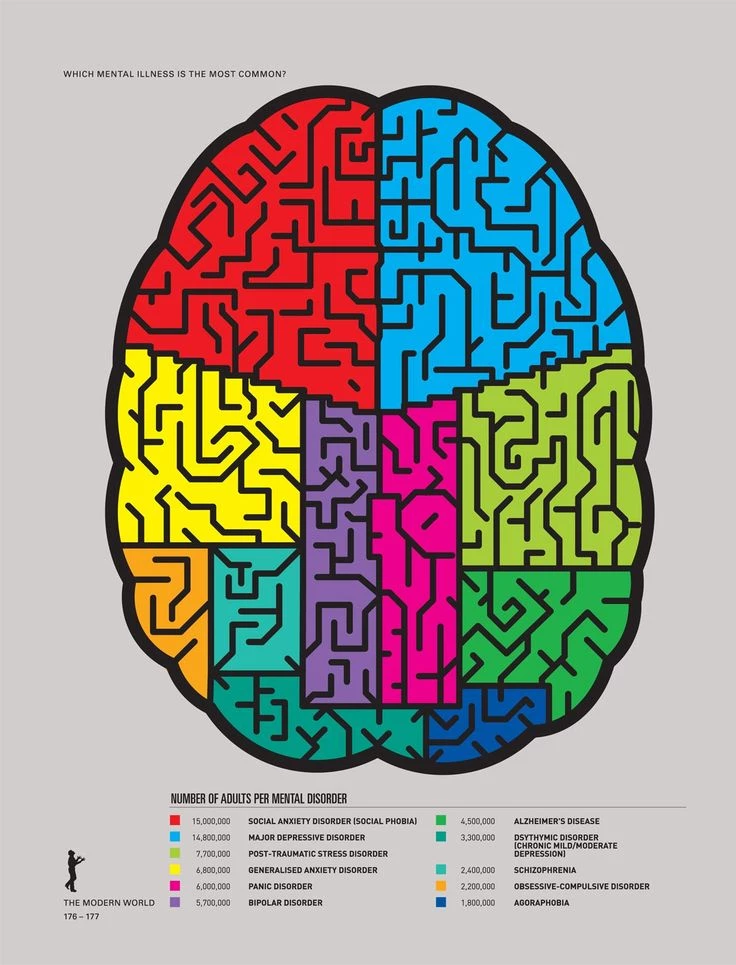
Overview: This infographic visualizes mental illness prevalence using a brain-shaped diagram segmented into maze-like blocks. Each color-coded region represents a different disorder, scaled by the number of affected adults, turning epidemiological data into a thought-provoking visual structure.
- Creative Touch: Transforms the brain into a colorful maze, symbolizing the complexity of mental health and using spatial proportion to communicate impact without overwhelming with numbers.
- Strategic Function: Helps audiences understand the relative prevalence of mental health conditions in an intuitive and visually engaging way — supporting educational, advocacy, and destigmatization efforts.
- Agency Play: Use in mental health awareness campaigns, nonprofit reports, or healthcare content strategy. Ideal for turning data into accessible conversation starters for clients in wellness, education, or public health sectors.
10. Nobel Peace Prize Radial Timeline
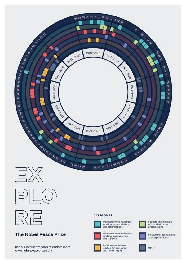
Overview: A circular timeline visualizing Nobel Peace Prize recipients by decade and category, organized in a multi-ring radial format for historical and categorical depth.
- Creative Touch: Uses a circular, multi-ring layout to show recipients by decade and category, offering a comprehensive yet elegant view of historic data.
- Strategic Function: Makes complex, longitudinal award data instantly digestible and explorable by pattern, ideal for education, archives, or thematic storytelling.
- Agency Play: Use as a data-driven storytelling model. Repurpose for brand timelines, award retrospectives, or industry accolades content.
11. Gender Breakdown in Universities
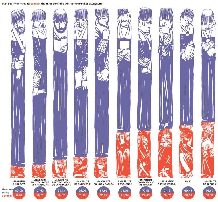
Overview: Illustrations show the gender split of faculty by university, each stack reflecting the % of men vs. women in chair positions.
- Creative Touch: Visualizes faculty gender distribution through cartoon-style character stacks, making inequality data more relatable and easy to read.
- Strategic Function: Makes institutional inequality data visually undeniable, humanizing the gender disparity story without overwhelming the viewer.
- Agency Play: Include in DEI reports or equity audit visuals. Repurpose for client-specific inclusion dashboards or sector diversity reviews.
12. Millennial Marketers (Adobe Study Visualization)
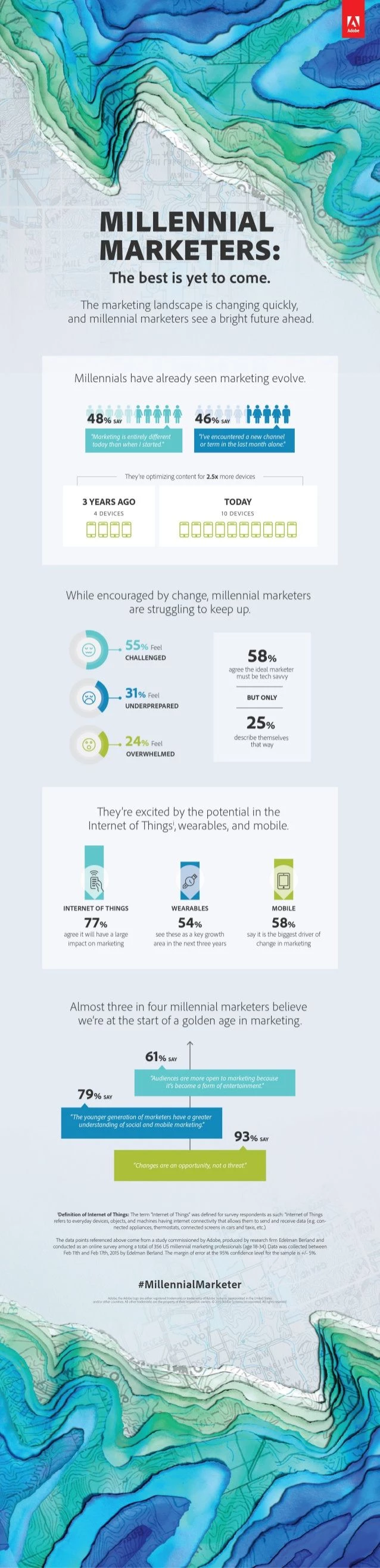
Overview: This vertically structured infographic distills Adobe’s research into generational marketing attitudes, featuring layered content modules, icon-based stat visuals, and strategic quote callouts to communicate millennial marketers’ challenges, optimism, and future outlook.
- Creative Touch: Uses topographic-style background art and soft, thematic gradients to create a sense of depth, movement, and generational identity — visually aligning research with the idea of exploration and change.
- Strategic Function: Communicates research findings in a digestible, emotionally engaging format for B2B use, helping brand marketers and agencies tailor messaging, services, or recruitment strategies to millennial professionals.
- Agency Play: Adapt as a model for generational research storytelling or employer brand insights. Ideal for turning whitepaper data into engaging, scrollable social or content marketing assets.
13. Florida Wildlife: Coastal + Everglades Conservation Snapshot
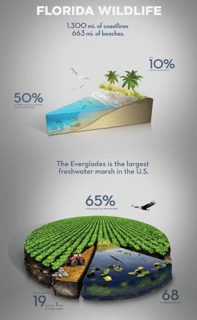
Overview: This infographic showcases key ecological facts about Florida’s natural landscape, including coastline extent, beach loss, Everglades biodiversity, and land degradation percentages.
- Creative Touch: Combines 3D terrain visuals with stat overlays to make environmental facts more digestible and visually rich.
- Strategic Function: Simplifies complex environmental data into a visually engaging, layered composition. It communicates ecological urgency while remaining approachable and visually rich—ideal for public education and advocacy.
- Agency Play: Use this as a model for eco-stat storytelling, blending illustration with realistic textures to enhance credibility. Ideal for cause-driven campaigns, climate reports, or immersive explainer content in destination branding and sustainability marketing.
14. Politicians’ Salaries & Income Inequality
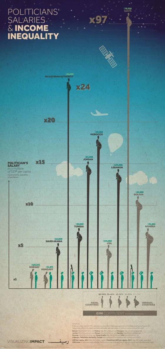
Overview: This infographic uses scale manipulation and vertical exaggeration to contrast politicians’ salaries with national GDP per capita across countries, highlighting dramatic disparities in a highly visual, narrative-driven way.
- Creative Touch: Applies extreme vertical proportions and visual metaphors like satellites, planes, and balloons to dramatize inequality across countries.
Silhouettes of politicians are slightly exaggerated (some appear noticeably portly or aloof) quietly reinforcing themes of excess, distance, and greed. These subtle character cues add emotional context without overt caricature, turning economic data into a layered critique of political privilege. - Strategic Function:
Illustrates the relationship between income inequality and government compensation, making economic justice and governance data visually resonant and easy to grasp at a glance. - Agency Play:
Use in advocacy storytelling, global governance reports, or editorial campaigns on inequality. This format works well for nonprofits, policy think tanks, or media brands looking to spotlight disparity through data.
15. Bear Population Density in Finland
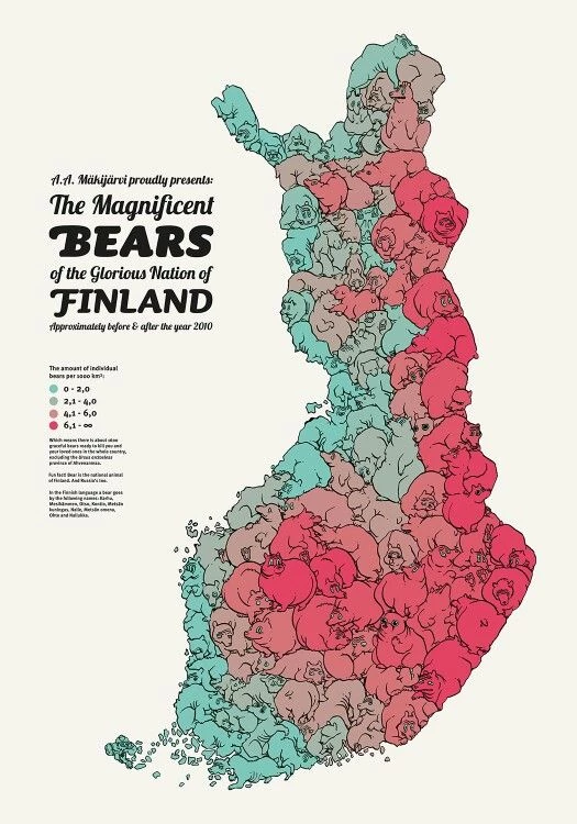
Overview: A hand-illustrated map packed with cartoon bears color-coded by population density across Finnish regions, reflecting pre- and post-2010 data.
Creative Touch: Maps wildlife data using hand-drawn bear illustrations, adding charm and character to ecological statistics.
Strategic Function: Transforms wildlife population data into a memorable, whimsical map, ideal for storytelling in conservation, tourism, or national identity.
Agency Play: Offer as part of eco-education kits, cultural storytelling campaigns, or place-based branding visuals.
16. What Scares the World (Global Risk Stacking)
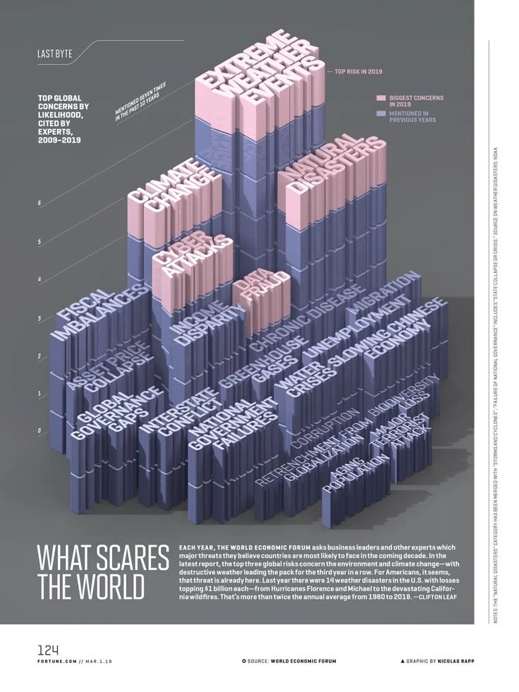
Overview: An infographic showing the most-cited global risks by likelihood over a decade, emphasizing repeated mentions like climate change and extreme weather.
- Creative Touch: Uses staggered 3D columns to visualize how frequently global risks are mentioned over a decade, with height representing recurrence and color shifts highlighting current-year urgency.
The typographic stacking of risk names atop each pillar adds dimensional weight, making threats like “extreme weather” feel visually dominant. The isometric design evokes data architecture, reinforcing the idea of risk accumulation and systemic pressure. - Strategic Function: Visualizes geopolitical and environmental risk trends in a way that emphasizes recurrence, priority, and impact, making it ideal for executive briefings.
- Agency Play: Integrate into crisis comms kits, macroeconomic reports, or strategic foresight dashboards.
17. The Diabolical Diagram of Movie Monsters
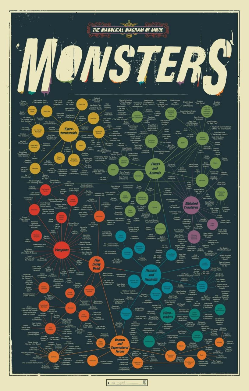
Overview: This densely packed radial diagram maps movie monsters by type, origin, and genre, creating a color-coded universe of cinematic creatures — ranging from extraterrestrials and vampires to mutated animals and supernatural beings.
- Creative Touch: Uses a radial map of uniform circles to organize movie monsters by type and origin. Color coding groups monsters into clear categories like vampires, humanoids, or plants, while connecting lines show narrative or thematic relationships.
This structure turns genre lore into a readable visual taxonomy. - Strategic Function: Functions as both a pop culture taxonomy and a visual explainer; connecting characters, archetypes, and story worlds in a single meta-framework. It helps audiences (and creatives) understand the narrative ecosystems that genre IPs build upon.
- Agency Play: Repurpose for IP strategy decks, character ecosystem mapping, or fan engagement campaigns. This format also lends itself to immersive digital versions (click-to-explore character trees or lore timelines) for transmedia campaigns or franchise storytelling pitches.
18. Uncomfortable Truths
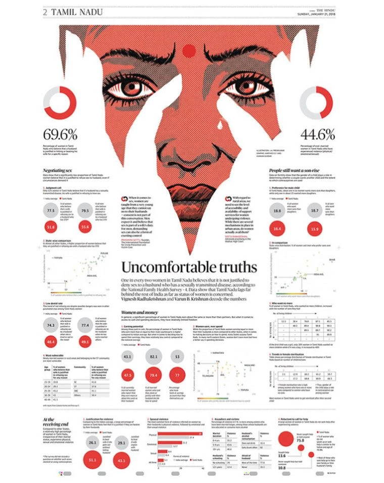
Overview: This infographic explores gender attitudes and violence against women in Tamil Nadu using hard-hitting data from national health surveys. It combines statistics on sexual rights, abuse, child preference, and autonomy with narrative headlines and multi-style charts.
- Creative Touch: Anchored by a haunting, half-tone portrait of a woman framed by symbolic hands and a tear, the design draws from vintage pop-art and feminist poster aesthetics.
Red is used deliberately to symbolize both cultural identity (bindi) and violence. The infographic uses a newspaper-style serif font for gravity, while the central figure becomes both subject and symbol, bridging art and data in a visceral way. - Strategic Function: Surfaces deeply ingrained gender bias and social taboos through visually impactful data storytelling. Empowers journalists, advocacy groups, and educators to frame difficult conversations with evidence.
- Agency Play: Use as a model for editorial advocacy design or issue-based campaign storytelling. Strong fit for NGOs, social change agencies, or media clients needing to translate raw data into emotionally resonant narratives.
What This Means for Agencies
Infographic design has officially outgrown its reputation as a “nice-to-have.” For agencies, it’s now a core growth lever: part asset, part differentiator.
- Visual storytelling is now table stakes. Clients aren’t just asking for reports, they’re expecting content that reads fast, looks polished, and reinforces their positioning. A static PDF won’t cut it. That’s why over 60% of businesses now integrate infographics into their content marketing strategies.
- Productization = predictable revenue. Agencies that standardize infographic creation (using templates, tiered deliverables, or retainer packaging) are scaling output without scaling headcount. And for good reason: infographics have been shown to increase sales by up to 80% by improving consumer comprehension.
- Design is positioning power. Infographics don’t just communicate, they persuade. In fact, presentations that include infographics are up to 43% more persuasive.
When agencies use visuals to express strategy, process, or results, they elevate their brand and their margins.
What Clients Can Expect
CMOs, brand leads, and heads of strategy are under constant pressure to simplify complexity and communicate impact...fast. Creative infographics offer a powerful solution:
- Faster comprehension across all audiences. Whether it’s a stakeholder briefing or a sales campaign, visuals reduce friction and boost recall.
- Campaign clarity with performance baked in. Infographics embedded in email, social, or reporting workflows drive real results, posts with infographics generate up to 650% more engagement than text-only alternatives.
- More links, more reach. Articles with infographics attract 178% more inbound links, which doesn’t just improve SEO — it amplifies credibility.
- Visual content = influence. Companies that use infographics are 28% more likely to identify strategic opportunities and risks, turning design into a decision-making asset.
Tools, Templates, and Platforms to Design Unique Infographics
Building standout infographics isn’t just about creativity It’s also about systemizing output, leveraging the right platforms, and tying visuals directly to strategic goals.

Software Tools by Use Case
- Adobe Illustrator – Best for complete creative control when building high-fidelity visuals that reflect a unique brand identity. Ideal for design teams with deep creative resources.
- Figma – Designed for collaboration. Great for teams that need to co-design layouts, test iterations, or prototype interactive visual content.
- Canva – The go-to for speed. Canva enables fast deployment of branded visuals, especially for teams managing multiple clients or campaigns.
- Visme / Piktochart – Ideal for motion-capable or interactive infographics. Useful in turning static content into digital experiences without heavy dev work.
Data Sources for Infographic Content
- Statista, Pew Research, Google Trends – These offer reliable third-party data to support content narratives with credibility.
- Client dashboards (GA4, HubSpot, Salesforce, etc.) – Visualizing owned data helps clients see value in your work—and in their metrics.
- Proprietary agency research – When you run your own polls, user studies, or audits, infographics give you a platform to package IP as premium thought leadership.
Template Repositories & Automation
- Build an internal design library of branded infographic templates to streamline production.
- Create vertical-specific variants (e.g., fintech, ecommerce, healthcare) to speed up sector work.
- Test AI-assisted design tools like Adobe Firefly or Canva Magic Design to scale layout generation for social cutdowns, reports, or content series.
Agency Playbooks for Pitching and Scaling Infographic Design Services
Turning infographic design into recurring revenue requires more than good aesthetics—it needs structured integration into your service model.
Bundling in Retainers or Project-Based Work
- Include infographics as a monthly deliverable in content calendars, reporting suites, or campaign retainer scopes.
- Use them to enhance SEO or analytics reporting, turning performance data into executive-ready visual takeaways.
- Position interactive infographics as a premium tier upgrade from static deliverables.
Process for Client Briefing and Creative Development
- Start with a data sourcing workshop andgather the right inputs early (dashboards, reports, or survey data).
- Align on objectives: awareness, engagement, or conversion will define visual strategy and format.
- Scope the deliverables clearly: will you need PDF handouts, web-embeddable visuals, motion cutdowns, or all three?
Differentiation Tips for Standing Out
- Develop a proprietary visual style, layout grid, or icon library unique to your agency.
- Offer localized or multilingual versions — a strong value-add for global campaigns or diverse audiences.
- Track infographic performance over time and build case studies that demonstrate engagement, shares, or conversions.
Creative Infographics: Wrap Up
Infographics are no longer just decorative visuals. Their resurgence marks a shift toward strategic function. They clarify complex ideas, reinforce brand authority, and drive measurable campaign performance. When built with intent, they become assets, not just add-ons.
For agencies, the opportunity is twofold:
✔ Creative differentiation in a crowded field
✔ Revenue expansion through repeatable, productized design services
As data becomes the default language of decision-making, agencies that can visualize insight,not just report it, will own the conversation.
Infographics are no longer optional. They’re the visual currency of trust, clarity, and conversion.
![]()
Creative Infographics: FAQs
1. What qualifies as a “creative infographic”?
Creative infographics go beyond basic charts, using unique layouts, interactive elements, custom illustrations, or storytelling to transform data into brand-worthy visuals.
2. Are infographics still relevant in 2026?
Yes. Infographics are more relevant than ever as audiences demand clarity, speed, and visual fluency in both B2B and consumer content.
3. Can infographic design become a revenue stream for agencies?
Absolutely. Agencies are successfully bundling it into content, branding, and reporting packages, many charging premium rates for high-performance visuals.
4. What’s the best infographic format for social media?
Vertical infographics or multi-panel carousels work well on LinkedIn and Instagram, while animated formats (GIF or HTML5) perform on X and web embeds.