Let's be honest: nobody wakes up excited to read a 40-page report. But show someone a sharp infographic? Suddenly they're nodding, scrolling, and forwarding it to three coworkers before lunch.
That's the quiet magic of a great infographic. It takes the kind of information that usually puts people to sleep (spreadsheets, surveys, century-spanning histories) and turns it into something the eye actually wants to follow. Done well, it's data wearing a tailored suit. Done badly, it's a PowerPoint slide that escaped into the wild.
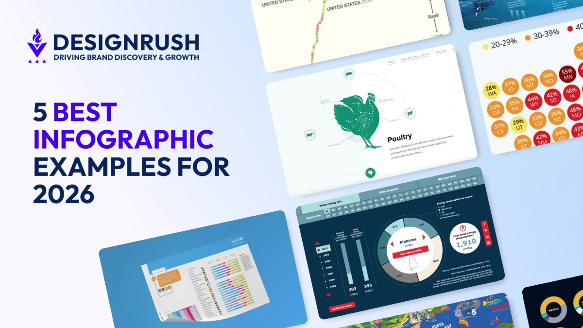
The five examples below get it right. Each one represents a different flavor of infographic, and each one earns its place by doing what text alone simply can't: making you see the story.
What Makes an Infographic Effective?
Before we get to the examples, a quick gut-check. The best infographics share a handful of traits, and missing any one of them makes the whole thing wobble.
- Clear purpose. Every infographic should have a specific objective: educate, persuade, or inform. Focus equals impact.
- Visually appealing design. Color harmony, typography, and clean layouts pull the viewer in.
- Accurate data. Credibility lives or dies here. No source, no trust.
- Logical structure. Headings and visual hierarchy guide the eye where it needs to go.
- Simple messaging. Cut anything that doesn't earn its space.
- Engaging visuals. Icons, charts, and illustrations carry meaning faster than paragraphs.
- Audience-centric design. Match the tone and style to who's looking.
- Smart data visualization. Charts and graphs should clarify, not decorate.
- Effective white space. Breathing room is a feature, not wasted real estate.
- Interactive features (when it fits). Clicks, hovers, and animations can turn passive viewers into active explorers.
Types of Infographics and Examples
Infographics come in various types, each tailored to suit different purposes and audiences. From educational and statistical infographics to comparison and interactive designs, each format excels at delivering information in unique and engaging ways.
- Timeline Infographics
- Data Visualization Infographics
- Comparison Infographics
- Statistical Infographics
- Interactive Infographics
1. Timeline Infographics
-content-large-webp.webp)
Timelines turn "a lot happened over a long time" into "look, you can follow it with your finger." They're the format of choice for histories, product roadmaps, and any story where order matters more than volume.
A standout example is the Tracking Energy website, a visual communication example that gives you an interactive look at over 50 years of U.S. energy consumption. Clickable buttons and sliders let you slice the data however you like, while smooth animations transition between states without ever feeling busy. The grid layout, clean icons, and confident typography do the heavy lifting, packing fifty years of energy policy into a few minutes of browsing.
2. Data Visualization Infographics
-content-large-webp.webp)
When the data itself is the headline, this is the format. Charts, graphs, and heat maps translate raw numbers into shapes your brain can actually process at a glance.
Two-N's Global Gender Gap Browser is a masterclass and a great example of what a thoughtful data visualization tool can do. The responsive layout pairs context on the left with a shape-shifting infographic on the right.
Circles reorganize into line graphs when you look at country rankings, a moving median line adjusts in real time when you switch to regional views, and a customizable section lets users pick their own data points and watch the visualization respond.
The Global Gender Gap Browser turns a dense, intimidating dataset into something that feels almost playful.
3. Comparison Infographics
-content-large-webp.webp)
Two options, three products, five regions: comparison infographics exist to make trade-offs visible. Venn diagrams, side-by-side tables, and split layouts all live here.
UNICEF's country comparison infographic, designed by Lawal Bakare, proves dense data doesn't have to look dense. The left side anchors the eye with a geographic snapshot of each country; the right side delivers the numbers through color-coded bars and stat blocks framed in clean geometric borders.
Supporting details get tucked into colored cards so nothing fights for attention. It's the kind of layout where every element has a job and every job is small.
4. Statistical Infographics
-content-large-webp.webp)
When the numbers are the story, statistical infographics give them stage lights. Think percentages, rankings, and survey results dressed up with enough visual context to actually mean something.
The Forbes and Statista U.S. eviction-risk map is a clean example. A stylized map of the United States is built from circles, each one carrying a state abbreviation and a percentage, color-coded from yellow to dark red to show severity at a glance.
A simple legend handles the rest. You don't need to be a data analyst to read it; you just need eyes.
5. Interactive Infographics
-content-large-webp.webp)
This is where infographics stop being images and start being experiences. Clicks, drags, scroll-triggered animations: they invite the viewer to participate instead of just observe.
The Eurovet website, built by award-winning design agency Red Collar, uses circular interactive infographics to present technical veterinary products in a way that feels almost like a game. Scrolling triggers animal illustrations into motion; icons respond to clicks and drag gestures.
It's a strong reminder that "interactive" doesn't have to mean "complicated." It just has to reward the user for showing up.
Best Practices in Creating Infographics
The examples above didn't happen by accident. They follow a fairly consistent playbook.
- Know your audience. Their expertise level shapes everything: tone, density, vocabulary.
- Pin down one clear objective. Trying to do three things at once usually means doing none of them well.
- Build a visual hierarchy. Size, color, and position should pull the eye toward what matters most.
- Pick a layout that fits the data. Chronology wants a timeline; trade-offs want a comparison; geography wants a map.
- Simplify ruthlessly. If a chart needs a paragraph to explain it, redesign the chart.
- Stay consistent. Same color logic, same icon style, same font family throughout.
- Brand quietly. A logo and brand colors are plenty. Don't shout.
- Mind accessibility. Contrast, legible fonts, and alt text are non-negotiable.
- Optimize for where it'll live. Social, web, and print all want different dimensions.
- Test before you publish. A small audience preview catches problems your eye has stopped seeing.
Infographic Examples: Key Takeaways
The best infographics don't just present data. They translate it. Whether it's Two-N letting you remix a dataset on the fly or Forbes and Statista turning eviction rates into a single readable map, the principle is the same: respect the audience's time, and they'll reward you with their attention.
Infographic Examples FAQs
1. Is an infographic the same as a poster?
No. Infographics communicate data and information through charts, icons, and structured visuals. Posters lean on bold imagery and minimal text to promote a message or event.
2. How do I make an infographic?
Start with a clear purpose and audience. Outline the content, then choose a layout that matches the type of information: timeline, comparison, statistical, and so on. Pair clean visuals with concise text and let hierarchy do the guiding.
3. Why do I need an infographic?
Because attention is scarce. Infographics make complex information faster to grasp, easier to remember, and more likely to be shared, which is good for engagement, credibility, and brand recall.
4. What are the best content marketing tools for crafting engaging infographics?
Some of the top content marketing tools for crafting infographics include Canva, Piktochart, and Visme. They're template-driven and beginner-friendly. For more custom work, Figma and Adobe Illustrator give you full control.
5. Where can infographics be used?
Pretty much anywhere visual communication matters: social media, presentations, blog posts, annual reports, classroom materials, internal training, and beyond.