Right before someone buys, clicks, or cares, your product either sinks or swims. In that split second, words feel like work, and attention is gone. This is where product infographics shine.
A product infographic simplifies complex details — features, benefits, specs — into a clear, compelling visual. Done right, it grabs attention, tells a story, and sells without the hard sell.
Trends like AI-driven automation, interactive elements, and minimalism are redefining product infographics. The best product infographic designs guide consumers by breaking down features, comparing options, or showcasing transformations.
The brands that get this right don’t just get noticed — they get remembered. Let's explore product infographic templates and examples that nail storytelling, design, and clarity.
1. S8 Stellar Earbuds: Ecommerce Product Breakdown Infographic Example
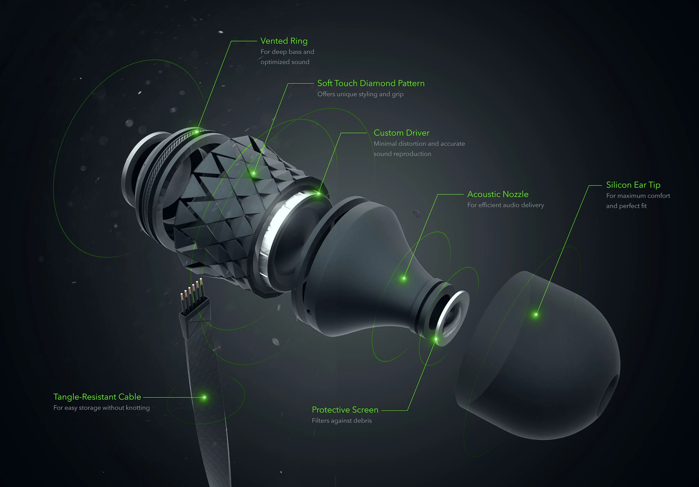
Key Features:
- Modular layouts for quick scanning
- Icons and visual hierarchy that guide the eye
- Spec-heavy, benefit-focused storytelling
Think of the eCommerce product breakdown infographic as the visual blueprint of a product’s soul — not just what it is, but what makes it tick. A good infographic strips the fluff and gets straight to the essential specs, features, and benefits. It’s an x-ray of what you’re buying, with every critical detail structured for easy digestion.
Sleek, dark, and sharp as a scalpel, Anton Weaver’s product breakdown infographic rips open a high-end earbud and lays every crucial piece bare. The vented ring, acoustic nozzle, and custom driver aren’t casual name-drops. Instead, they’re mapped to function, making the tech feel less like jargon and more like a selling point.
Ideal for Amazon, Shopify, and DTC brands that prioritize conversions over lengthy explanations. It’s particularly effective for high-involvement purchases like tech, appliances, and high-end fashion, where detailed visuals and concise messaging help sell the dream. Ultimately, it works for any brand that values its customers’ time — and intelligence.
2. ÜLLO Wine Purifier: Step-by-Step Product Usage Infographic Example
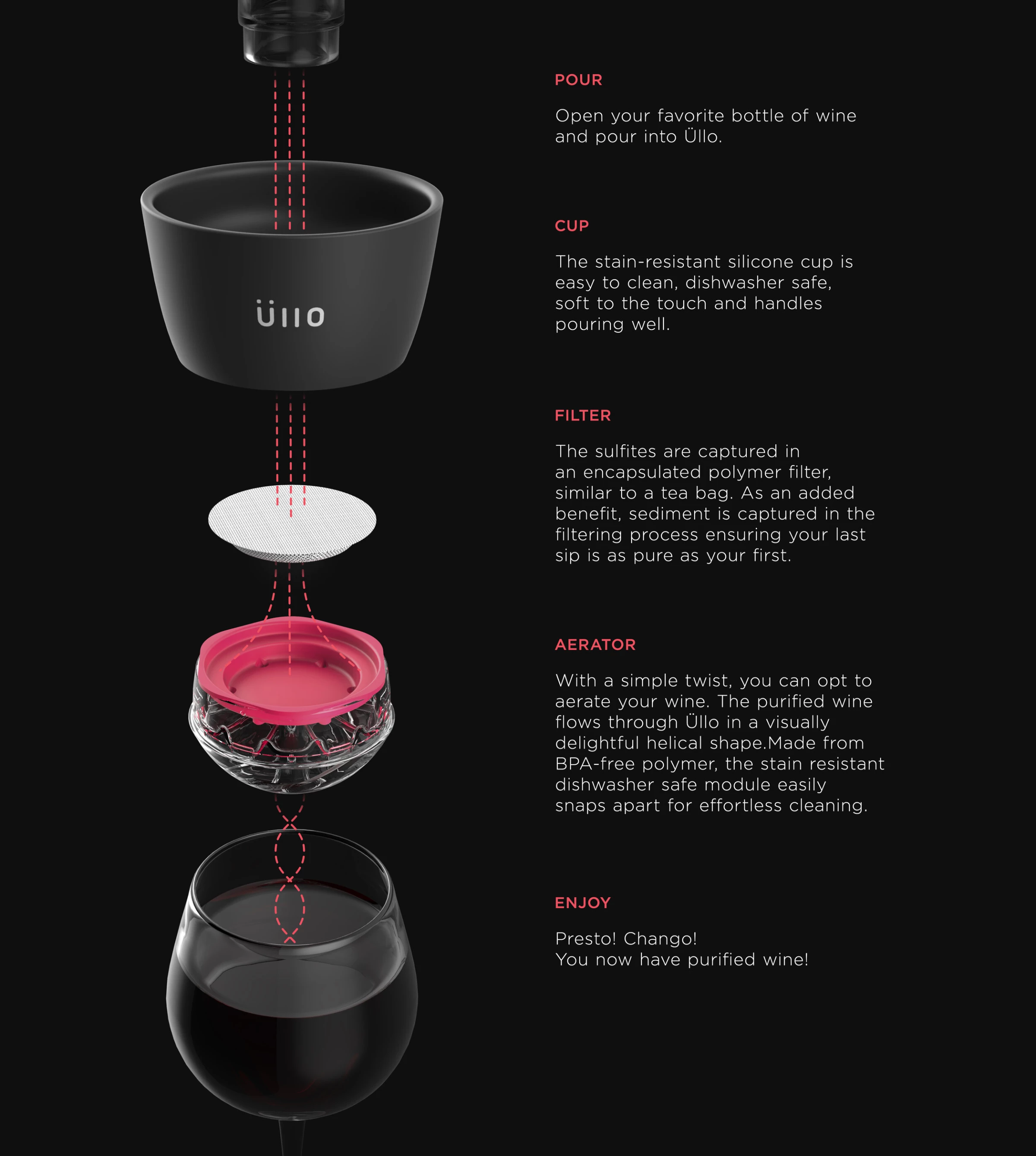
Key Features:
- Steps with clear, linear, progressive flow
- Minimal copy, maximum clarity
- Visual callouts that show where to click, press, twist, or avoid altogether
If an IKEA manual and a Michelin-starred chef’s recipe had a love child, you’d have the step-by-step product usage infographic. It is a visual guide that takes you from “What is this?” to “Got it” in a matter of seconds. No walls of text or unnecessary detours — just a clear, sequential product walkthrough without throwing it against a wall in frustration.
Most people expect step-by-step product infographics in places like tech manuals or the “how to assemble” guides. But this format isn’t just for gadgets and furniture. It works for food, too. Some things don’t need a 2,000-word manifesto, just a really good visual guide.
MNML’s step-by-step product infographic for Üllo is a lesson in persuasive simplicity. No fluff, no excessive detail — just a clear, elegant walkthrough of how the product works. This works because certainty sells. When a product’s function is obvious, the decision to buy feels effortless.
Restaurants, food brands, and meal kit services may all want to take a page from Leegongsam’s playbook. They took a pancake recipe and turned it into a step-by-step infographic by placing ingredients on one side and the process on the other. It’s clean, structured, and has no unnecessary garnish — just simple icons, clear sequencing, and a design that makes you want to cook.
For tech and gadget brands, detailed manuals are a relic — users expect intuitive guidance. Onboarding guides for apps, software, and complex products keep frustration at bay. And when it comes to recipes, DIY projects, and self-assembly kits, clear instructions mean fewer moments of staring at mystery parts in confusion.
3. East Meets West: Product Comparison Infographic Example

Key Features:
- Side-by-side layouts that make comparisons effortless
- Straight-shooting pros and cons, no sugarcoating
- Contrast-focused visuals: colors, icons, and bold text that drive home distinctions
This example of product infographics pits two (or more) products against each other, highlighting differences that actually matter. Premium vs. budget. Model A vs. Model B. Feature-heavy vs. minimalist. It’s a side-by-side fight card, minus the cheap shots and fluff — just the hard truths buyers need to make an informed decision.
Some brands overcomplicate comparison infographics, burying key differences under a pile of numbers and fine print. Yang Liu’s "East Meets West" series proves you don’t need paragraphs to make a point, just strong visuals, a smart concept, and absolute clarity.
Take her minimalist, color-blocked graphic on sound perception in restaurants: one half calm, the other chaotic. No lengthy explanations, no charts — just a sharp, instant contrast that tells a complete story in two colors and a single waveform.
While not a traditional product infographic, this series offers a fresh, out-of-the-box approach to visual storytelling — one that brands can adapt to simplify complex comparisons with minimal copy and maximum impact.
This is the kind of stripped-down, high-impact approach that brands can take when designing comparison infographics. Two visuals. One striking difference.
On the other side of the spectrum, Erva Design’s work for Rebel Coffee isn’t even meant to be a direct comparison, but it shows how contrast can be turned into art. Instead of a dry side-by-side, they use real coffee beans — coarse to fine, raw to roasted — to build a natural gradient that makes the evolution of coffee feel tactile, almost alive.
This is where brands can break out of the template mindset. A skincare company could physically arrange ingredients to show formula differences. A whiskey brand could visualize the aging process using barrels or liquid tones.
In other words, comparison infographics don’t have to be boring. Whether it’s ultra-minimalist and conceptual like Yang Liu or richly textured and organic like Rebel Coffee, the best ones don’t just list differences — they make you feel them.
This format is perfect for tech, appliance, and automobile brands and ideal for subscription plans and service tiers that need to answer the real question: “What am I paying for, and is it worth it?” And lastly, retailers and eCommerce brands looking to upsell premium options, without coming across as pushy, can also benefit from this infographic type.
4. How an Electric Guitar Works: Animated Product Infographic Example
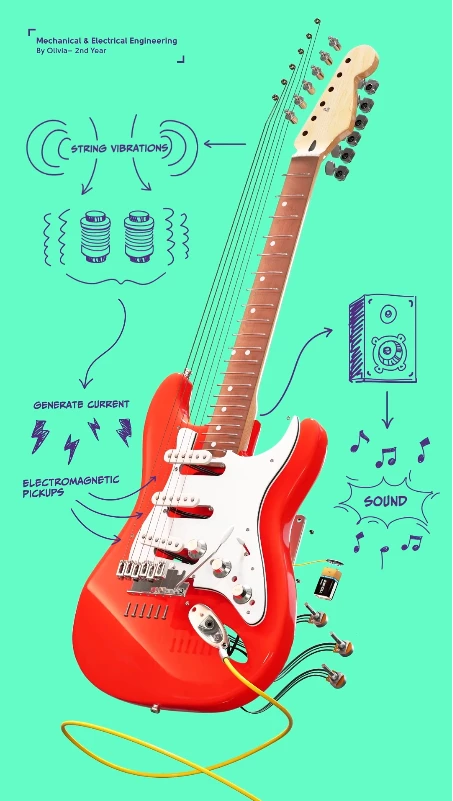
Key Features:
- GIFs, micro-animations, and hover effects that add motion without distraction
- Scroll-triggered interactions
- Data visualization that moves
In 2026, static visuals won’t cut it. If your graphics don’t move or invite interaction, they’ll be forgotten before the page even finishes loading. Interactive and animated infographics breathe life into product information, making everything more dynamic, engaging, and fun.
So, if you want to break something down to build an idea back up, look no further than Richard Parry Design’s animated breakdown of an electric guitar for the University of Auckland.
Piece by piece, the animation pulls apart the guts of the instrument, showing exactly how a few metal strings, a handful of magnets, and a well-placed coil can turn raw tension into pure sound. It drives home the importance of engineering in our daily lives and in the things that move us.
And that’s why this hits. It’s not just engineering made digestible — it’s a reminder that even the most iconic, untouchable things can be broken down, examined, and understood. Strip away the myth, and you find the real magic underneath.
This format would be a good fit for tech startups, apps, and SaaS platforms that want to make UI explanations effortless. Premium eCommerce brands using storytelling to elevate their products also benefit from this type of infographic and lastly, industries where data matters such as education, finance, and science-backed products that need to demonstrate their effectiveness with clarity and credibility will also find this infographic type useful.
5. Infra Suisse Ad: Component Illustration Infographic Example
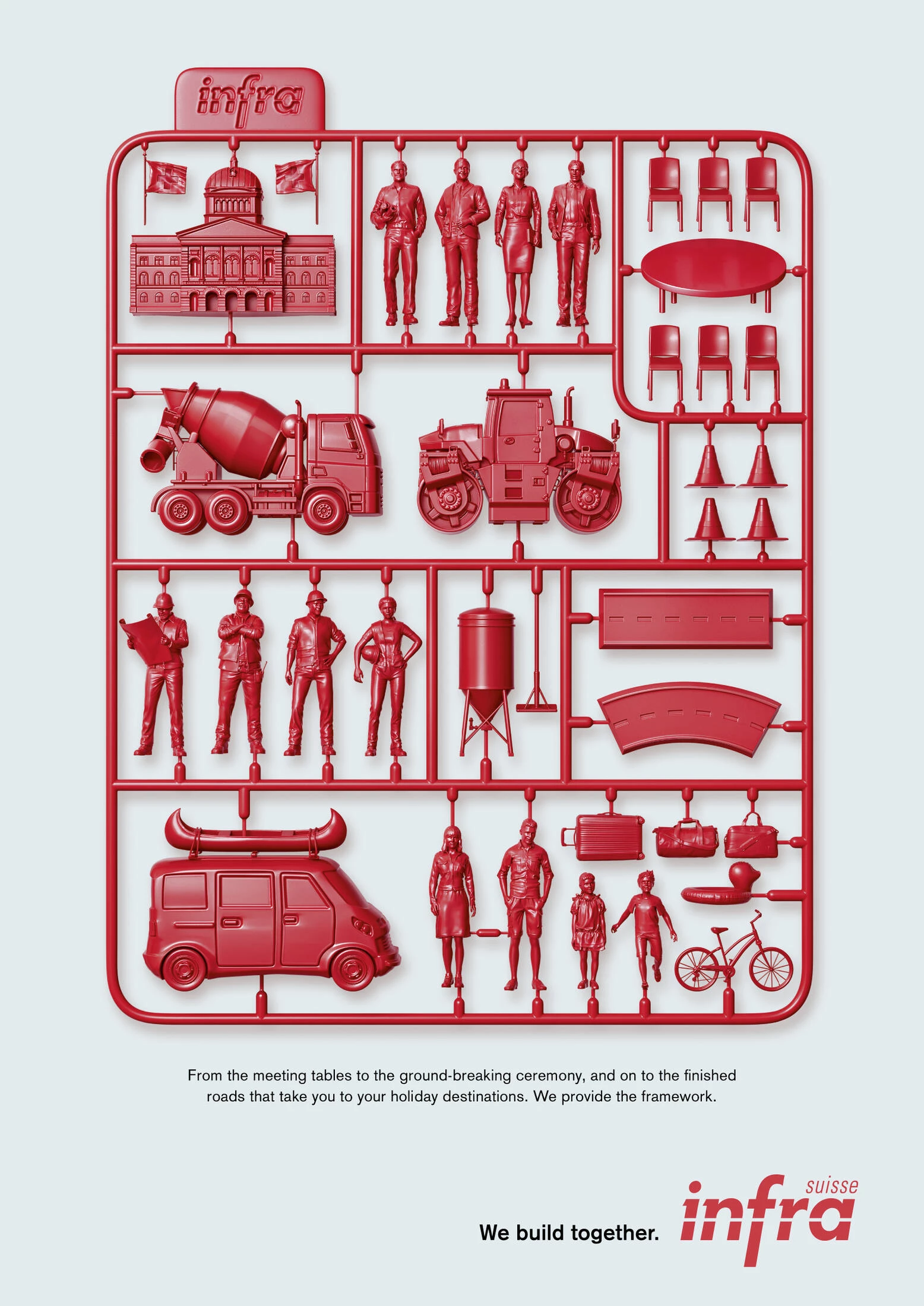
Key Features:
- Exploded views and cutaways to showcase internal components clearly
- Detailed labeling with material specs and functions
- Precise and aesthetic: beautiful enough for marketing, detailed enough for engineers
Think of the component illustration infographic as a product autopsy — taking something apart to show exactly what’s inside and why it matters. It’s not just about specs; it’s about engineering, craftsmanship, and the hidden brilliance under the hood. If an eCommerce breakdown infographic tells you what something does, this tells you how.
A component illustration isn’t just for gadgets, gizmos, and overpriced tech, it’s a storytelling weapon. And KSP Krieg Schlupp Partner Agency’s work for Infra Suisse proves you don’t need a tangible product to make it work.
Here’s an industry that could have gone the lazy route: stock photos of highways, smiling engineers in hard hats, and some vague tagline about “infrastructure.” Instead, they went full plastic model kit, turning the abstract concept of building roads, cities, and communities into something tactile, structured, and “collectible.”
It’s a perfect metaphor: every piece, from government offices to bulldozers to family road trips, connects into a single framework. It makes infrastructure — normally a dull, bureaucratic nightmare — feel like something you could unbox, snap together, and make your own.
That’s the power of an out-of-the-box and well-executed component illustration, it sells an idea so clearly, so cleverly, you don’t even realize you’ve been pitched to.
Some things are better seen than explained. This style is perfect for brands that sell craftsmanship and technology, from industrial design to premium consumer goods. And when it comes to education, a well-placed visual beats a thousand words every time.
How to Design an Effective Product Infographic
Strong infographics thrive on structured layouts, compelling visuals, and data-driven content — elements that separate forgettable designs from the ones that stop a scrolling thumb in its tracks.
They make complex information frictionless, using color, typography, and brand consistency to ensure that every puzzle piece works toward a singular goal: understanding, preferably immediately. Here are the ways to help you do just that:
Step 1. Start with the goal: Are you simplifying, persuading, or selling?
If you don’t know why you’re making an infographic, neither will anyone else. Are you trying to make complex information digestible, convince a skeptical audience, or just sell a product?
Define the goal first. If you don’t, you’ll end up with a cluttered (over-selling) mess, where the only thing missing is a giant blinking "BUY NOW" button.
Step 2. Keep it simple: Clutter kills conversions.
The biggest mistake of a typical (ergo, ineffective) product infographic is trying to say too much. A great infographic isn’t a junk drawer where every detail gets shoved in — it’s a surgical strike.
One core idea, one clean flow of information. If people have to work to understand it, they won’t. No 8-point font. No walls of text. Make it scannable, or don’t make it at all.
Step 3. Make it visually striking: Bold headlines, contrast, and dynamic imagery win.
The internet is a graveyard of forgettable content. Don’t let your infographic be another bland, grayscale tragedy. Big, bold headlines. Sharp contrast. Eye-grabbing visuals that tell a story before the text even kicks in. The goal? Stop the scroll. Make it impossible to ignore.
Step 4. Back it up with accurate data. No fluff.
People can smell marketing BS from a mile away. If you’re making claims, back them up.
Cold, hard stats beat empty adjectives every time. Show, don’t tell — let the numbers do the work. Just don’t overdo it. No one wants to read a research paper disguised as a graphic. Make the data relevant, digestible, and near-impossible to argue with.
Step 5. Optimize for all platforms.
A killer infographic that only works in one format is pretty, but if it’s just that, it can easily go from pretty to... pretty useless.
Your design needs to scale — from an X (formerly Twitter) post to a full-screen presentation. It should load fast, look great on mobile, and not fall apart when resized. The best infographics work everywhere, from a billboard to a smartphone screen.
Where to Find Product Infographic Templates
Not everyone has the time, budget, or talent to create a meticulously crafted, pixel-perfect infographic. Sometimes, you just need a quick, good-enough visual to slap onto a pitch deck, blog post, or social media campaign. Templates solve a lot of the issues for you.
1. Canva
If you need something functional, decent-looking, and done in under 15 minutes, Canva is your best bet. The platform has a ton of free templates, an easy drag-and-drop interface, and enough customization options to make you feel like a designer without actually being one.
- Best for: Social media infographics, blog visuals, and quick presentations.
- Limitations: Overused designs. You’ll see the same templates recycled across the internet.
2. Adobe Stock
Adobe Stock is where you go when you want something polished but don’t have the time to hire a pro.
Their templates are sharp, well-structured, and built by real designers. The catch? It’s not free. You’re paying for quality, but at least you won’t be using the same layout as every Canva-dependent marketer.
- Best for: Professional reports, investor decks, and high-end marketing materials.
- Limitations: Expensive for one-off use, and requires some Adobe know-how to tweak properly.
3. Piktochart
If your infographic needs to be data-heavy without looking like a spreadsheet exploded, Piktochart is the way to go. It’s built for charts, graphs, and clean, structured storytelling. Think of it as Canva’s nerdy cousin—less flashy, but more suited for serious business.
- Best for: Data-driven infographics, case studies, and industry reports.
- Limitations: Not ideal for super-custom branding or high-end design needs.
4. Miro
Miro isn’t your typical plug-and-play template tool. It’s an online whiteboard built for brainstorming, process mapping, and interactive infographics. If you need to visualize workflows, customer journeys, or product roadmaps in a way that’s actually useful for teams, Miro is worth a look.
- Best for: Live collaboration, workflow infographics, and team brainstorming.
- Limitations: More functional than beautiful — don’t expect high-end design aesthetics.
5. Easel.ly
If you need something elementary that does the job, Easel.ly is about as straightforward as it gets. The templates are simple, perfect for breaking down a concept or process, but don’t expect any cutting-edge visuals.
- Best for: Educational infographics, process breakdowns, and internal presentations.
- Limitations: Limited design freedom, outdated aesthetic.
A word of caution: fast doesn’t always mean good. Templates are great for speed and convenience — when “good enough” is actually good enough. Moreover, these templates are used by thousands of people, which means your infographic might end up looking like a hundred others floating around LinkedIn. It’s the price you pay for convenience.
Custom vs. Template: When to Invest in a Designer vs. DIY
If your infographic needs to sell, persuade, or actually stand out, don’t fool yourself — a template won’t cut it. Sure, a drag-and-drop design works for an internal report or a social post that disappears in 24 hours.
But if you’re launching a flagship product, pitching investors, or building a brand, the smarter and ultimately worth-it route is to hire professional infographic designers to do the heavy lifting for you.
A custom-designed infographic doesn’t just look better — it’s strategic, crafted for impact, and tailored to your audience. If you need to turn heads, tell a story, or make people give a damn, invest in real design. Because no one ever remembered a brilliant campaign built on a cookie-cutter template.
Product Infographics: The Bottom Line
If your product is worth selling, it’s worth showing the right way. A great infographic is a weapon that slices through noise, grabs attention before logic can step in, and burns your message into people’s brains before they realize what hit them. It’s the difference between scrolling past and stopping cold. Between confusion and clarity. Interest and indifference.
Half the battle in marketing is making sure people give a damn long enough to listen. The best infographics do that. They don’t beg, they don’t plead — they show. They convince. And more importantly for your brand, they sell.
So, whether you’re using them to educate, persuade, or just smack your audience in the face with the raw, undeniable beauty of what you’ve built, do it right. Because in cramped world we call the online marketplace, the best stories aren’t just told — they’re seen.
Product Infographics FAQs
1. What makes a great product infographic?
A great product infographic isn’t just about looking good — it needs to communicate clearly and quickly. Use bold headlines, eye-catching visuals, and a clean layout with no fluff or clutter. Contrast and clarity are key.
Most importantly, it must serve a purpose. Whether simplifying complex data, highlighting product benefits, or driving sales, every element should be intentional.
2. Where can I find product infographic templates?
Canva, Adobe Stock, and Piktochart offer easy-to-use templates that let you swap text and colors in minutes. Perfect for quick turnarounds.
But if your infographic is central to branding, a sales pitch, or a major marketing piece, invest in a professional designer. Templates save time. Custom design makes an impact. Choose based on your goals.
3. How do product infographics boost conversions?
People don’t read—they scan. Visuals process 60,000x faster than text, helping customers grasp key details instantly. Instead of wading through specs and descriptions, they get a clear, digestible breakdown of why your product matters.
Infographics also build trust. Data, comparisons, and feature highlights make your product feel more credible while reducing decision fatigue. And for SEO? More shares, backlinks, and engagement mean higher visibility — more views, more clicks, more conversions.
4. What industries benefit most from product infographics?
Any industry that needs to explain, persuade, or sell — fast.
- Ecommerce: Cut the fluff — show product specs, comparisons, and features in a way that sells.
- Tech & Electronics: Customers don’t want a manual, they want a visual breakdown that makes sense instantly.
- Healthcare & Wellness: People trust data and visuals over empty claims. Infographics simplify complex benefits.
- Finance & Insurance: Boring, jargon-filled topics? Infographics make them digestible.
- Food & Beverage: Step-by-step recipes, ingredient breakdowns, sourcing maps — it’s all better when visual.
- Automotive & Manufacturing: The "anatomy of" breakdowns are a goldmine for technical products.
If your audience needs a quick, visual reason to care about your product, an infographic is the way to give it to them.