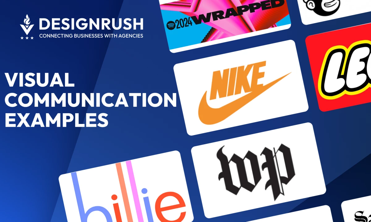
Visual communication is a powerful tool that transcends language, evokes emotions, and drives action. With visual noise at an all-time high, graphic design has become essential for clarity, recognition, and emotional impact.
Let’s look at nine standout examples of design that go beyond aesthetics, each one blends storytelling, branding, and strategy to leave a lasting impression. Dive in for visual ideas that inform, inspire, and engage.
Visual Communication: Key Points
- Spotify Wrapped and Google’s “Year in Search” prove how data visualization can transform raw metrics into shareable, emotional narratives.
- Tiffany & Co. and Nike demonstrate how a single visual element — color or typography — can become a global brand asset with legal and cultural weight.
- LEGO and Mailchimp show how consistent visual identity across platforms can emotionally connect users and build brand recognition.
1. LEGO: Playful Visual Storytelling Through Iconic Brick Design
LEGO’s imaginative and playful visuals are stand out examples of effective visual communication.
Its graphic design approach celebrates creativity and exploration, engaging audiences across ads, digital content, retail environments, and social media.
Each visual touchpoint reflects a sense of wonder that resonates with both children and adults.
At the center of LEGO’s identity are its intricate builds, made entirely from plastic bricks. These creations highlight the brand’s versatility and encourage users to imagine, build, and share their own ideas.
The brand’s use of vibrant color, bold typography, and dynamic layouts adds energy to its messaging and strengthens emotional connection.
These elements help transform simple bricks into vehicles for storytelling and creative expression.
Across all platforms, LEGO maintains a cohesive visual language rooted in imagination and the joy of building, making it one of the most recognizable and emotionally resonant brands in the world.
2. Nike: Brand Power Through Bold Typography
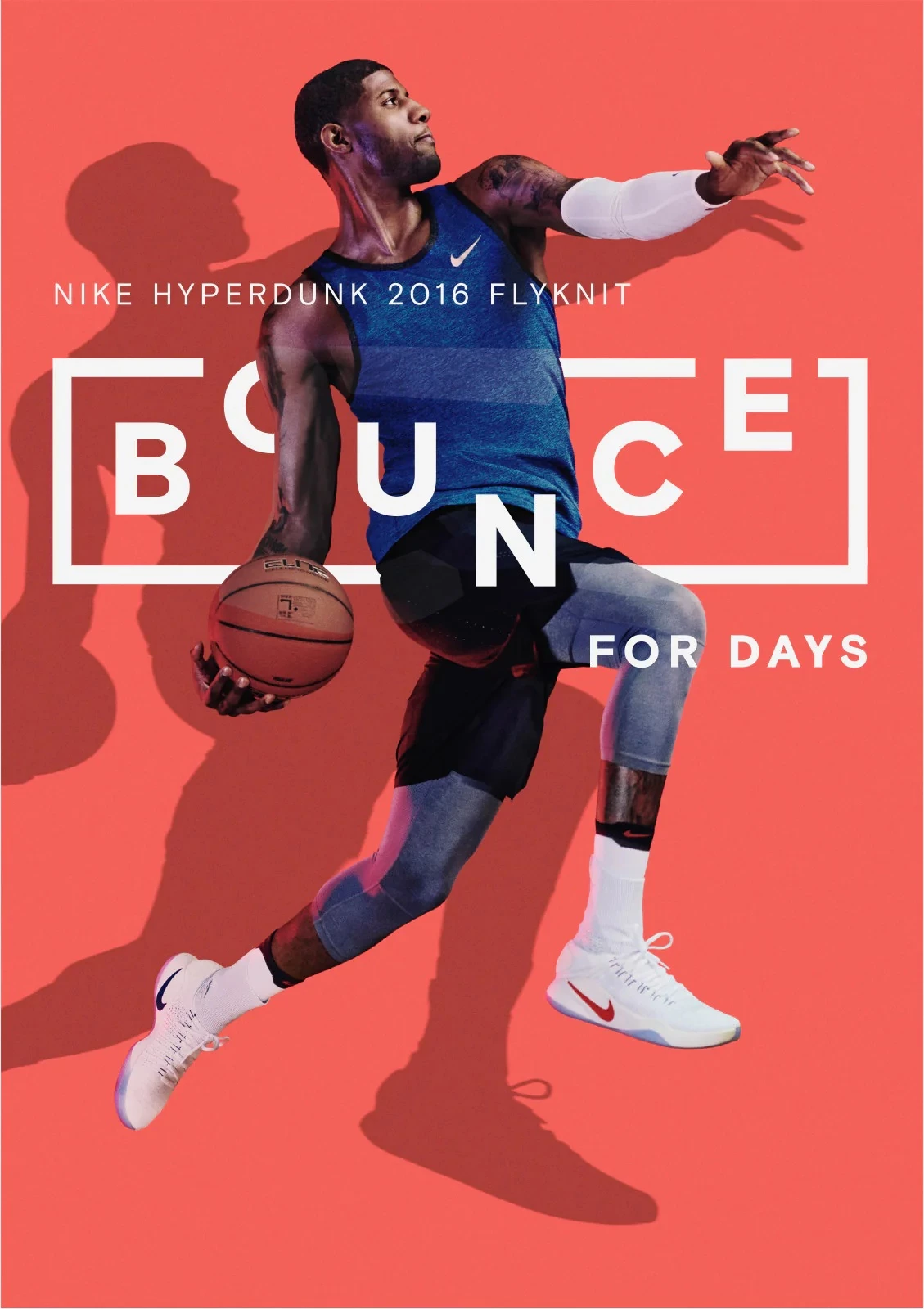
Nike uses bold typography as a central pillar of its visual identity, reinforcing a brand image built on strength, confidence, and motion.
Strong sans-serif fonts, clean layouts, and oversized headlines define its style across campaigns, digital platforms, and in-store displays.
This minimalist, high-impact approach mirrors Nike’s commitment to performance and innovation.
In the iconic “Just Do It” campaigns, bold type is paired with striking imagery of athletes in action. The message is simple, but visually commanding — designed to stop viewers mid-scroll or mid-stride.
Through consistent use of bold type and minimalist design, Nike communicates urgency and drive. Its visual language reflects the determination and resilience at the core of the brand.
3. Tiffany & Co.: Building Brand Identity Through Iconic Colors
Tiffany & Co.’s identity is inseparable from its signature hue — a specific shade of robin’s egg blue first used in 1845 for its annual Blue Book catalog.
Over time, this distinctive color became central to the brand’s packaging, advertising, and in-store design.
In 1998, Tiffany Blue was registered as a color trademark, and in 2001, Pantone standardized it as “1837 Blue,” named after the company’s founding year.
This level of precision underscores how seriously the brand treats its visual identity.
The consistent use of Tiffany Blue conveys elegance, exclusivity, and timeless appeal. Consumers instantly associate it with heritage, quality, and luxury, proving how a single color can carry deep emotional weight.
By exercising strict visual control, Tiffany & Co. has turned color into a powerful branding tool, making its visuals instantly recognizable around the world.
4. Google: Data-Driven Video Storytelling in “Year in Search” Series
Another one of our favorite visualization communication examples is from the world’s biggest search engine: Google.
Each year, Google’s “Year in Search” video series turns billions of queries into a compelling visual narrative.
Since 2010, these annual videos have used search trends, visuals, and storytelling to reflect the year’s defining moments — from global challenges to shared achievements.
By pairing search bar animations with real-world footage and emotionally charged music, the series transforms raw data into relatable stories that feel personal and powerful.
In years marked by crisis or change, themes like resilience and hope emerge, highlighting how people look to search for answers, comfort, and connection.
It’s a masterclass in visual storytelling: blending data, design, and emotion to create content that resonates with a global audience.
5. Spotify Wrapped: Personalized Visual Data in a Mobile
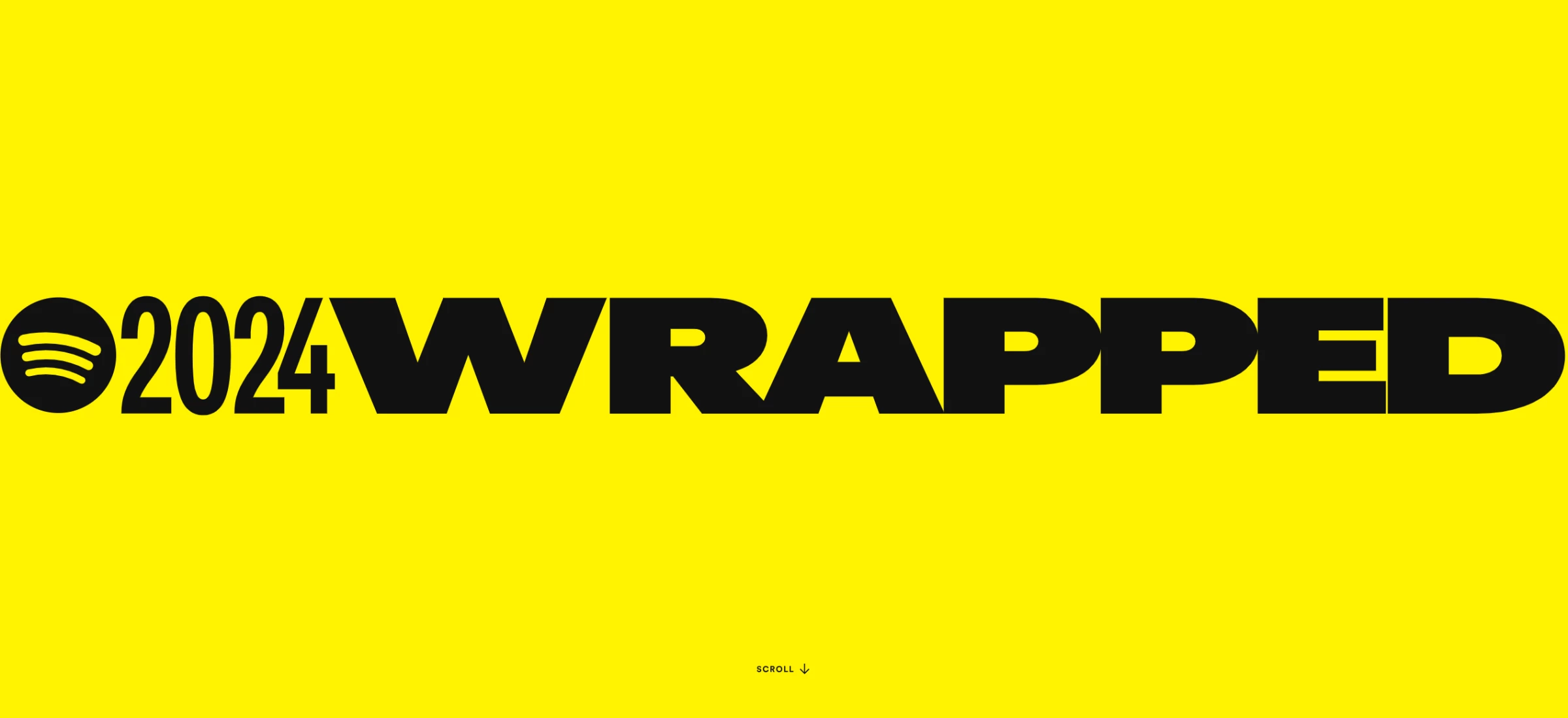
Over 227 million users engage with Spotify Wrapped, the platform’s year-end summary of each listener’s habits.
Wrapped turns personal data into a vibrant, shareable experience powered by bold visuals, playful layouts, and a user-first design approach.
The campaign transforms metrics like top songs, artists, genres, and total listening time into a cohesive story.
Each slide feels curated and celebratory, using dynamic colors and oversized fonts to keep users engaged from start to finish.
Wrapped’s design blends personalization with visual storytelling, making stats feel emotional and memorable.
It’s so much more than a data recap; it’s a brand moment that reinforces Spotify’s commitment to creativity, connection, and community.
6. Mailchimp: Character-Driven Storytelling With Design Consistency
Mailchimp’s visual identity sets a high bar for how graphic design can express brand character, build trust, and deliver functional clarity.
In its 2025 refresh led by the in-house studio WINK, Mailchimp introduced a bold modular system blending expressive illustrations, custom typography, and punchy color blocks.
The result is a brand experience that’s fun, clear, and consistently surprising
Illustrations play a central role, using quirky, abstract characters and fluid shapes to convey motion, creativity, and friendliness. But they’re never just decorative.
In product interfaces and onboarding screens, these elements support UX clarity by guiding attention or reinforcing tone.
Every touchpoint — from a feature tour to a social post — feels uniquely “Mailchimp.” The design system is clever, colorful, and approachable, with just enough edge to stand out without overwhelming users.
7. San Francisco Chronicle: Data-Rich Infographics With Editorial Impact
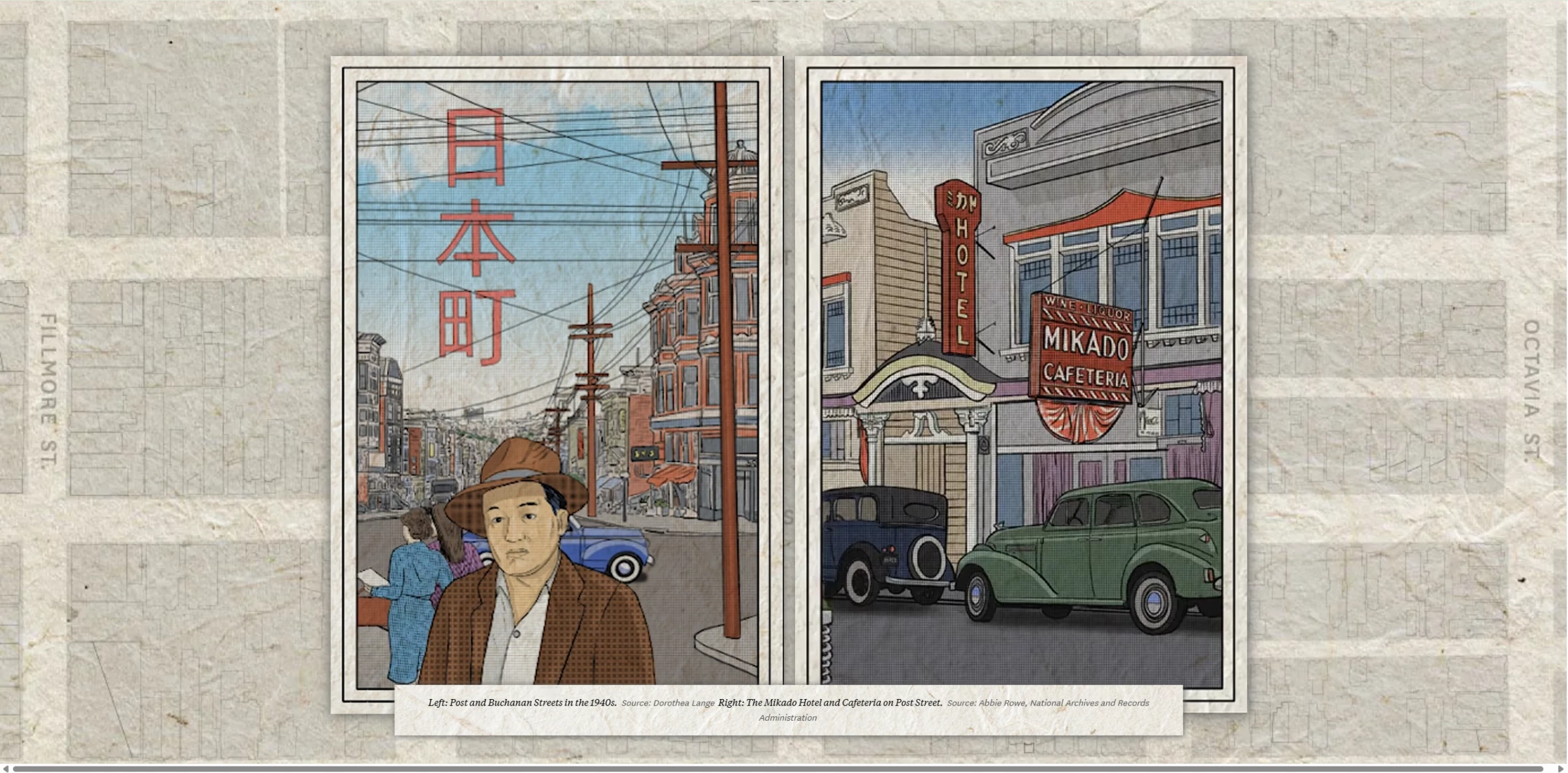
The San Francisco Chronicle has stood out in 2025 for its award-winning use of graphic design in journalism.
Its visual reports merge editorial illustration, stylized maps, and custom infographics to make complex investigations more accessible and emotionally resonant.
In one standout series, the Chronicle used layered graphics and hand-drawn design to explore mass incarceration, racial disparities, and the legacy of Japantown.
These visuals balanced clarity with depth—breaking down data while conveying historical weight and cultural nuance.
What sets this work apart is how graphic design was used as a tool for narrative clarity and reader engagement. Each visual choice served the story, from type hierarchy to color-coded data and spatial design.
The Chronicle’s efforts were recognized with multiple honors from the Society for News Design, including bronze medals for infographics and digital storytelling.
8. The Washington Post: World-Class Visual Journalism in Digital Format
View this post on Instagram
In 2025, The Washington Post was named the World’s Best-Designed Digital Publication by the Society for News Design — a testament to its leadership in graphic storytelling and editorial design.
The Post’s digital experience blends longform journalism with rich visuals, responsive layouts, and interactive graphics.
Each story is enhanced by carefully considered design elements: custom illustrations, immersive data visualizations, and elegant typography that guide the reader through complex narratives.
Graphic design is treated as an integral part of the reporting shaping how stories unfold, how data is understood, and how readers connect with the content.
Design choices are deliberate, enhancing clarity while preserving journalistic integrity.
This cohesive and reader-centric approach earned the Post top honors for design excellence in both function and form.
9. Billie: Experiential Brand Design With Scratch-and-Sniff Posters
Billie, known for challenging beauty norms, pushed graphic design into new territory with its 2025 “Feel Good, Smell Good” campaign.
The brand placed scratch-and-sniff posters near Penn Station in NYC, blending pastel gradients, bold type, and interactive scent panels to create a tactile design experience.
The visuals were simple but striking — an oversized armpit, paired with phrases like “Feel Good, Smell Good,” invited both curiosity and interaction.
Each element was intentional: from color choice to placement, reinforcing Billie’s inclusive, body-positive identity.
The campaign gained recognition from top creative platforms like Famous Campaigns, Trend Hunter, and DesignRush.
It was celebrated not just for its originality, but for showing how graphic design can extend beyond visuals to shape how audiences feel, engage, and remember.
Visual Communication Examples: Key Takeaways
Graphic design operates at the intersection of storytelling, strategy, and identity. The strongest examples are intentional, deeply aligned with brand values, and built to connect across platforms and cultures.
What distinguishes great design today isn’t style alone, but clarity of purpose. When executed well, it becomes a language of its own.
![]()
Our team ranks agencies worldwide to help you find a qualified partner. Visit our Agency Directory for the Top Graphic Design Companies, as well as:
- Top Visual Communication Companies
- Best Graphic Design Companies in Dallas
- Top Illustration Agencies
- Top Design Agencies
- Top Digital Design Agencies
Our design experts also recognize the most innovative design projects across the globe. Visit our Awards section to see the best & latest in design.
Visual Communication Examples FAQs
1. How does graphic design strengthen brand identity?
Graphic design makes a brand recognizable and trustworthy.
Through consistent use of color, type, layout, and imagery, it translates abstract values into visual form, building emotional resonance and reinforcing brand memory.
2. How does visual communication adapt across platforms?
Visual communication adjusts to how content is consumed. On social media, it emphasizes clarity and shareability.
On websites, it supports user journeys through layout and interaction. In advertising, it distills messaging into bold, immediate impressions. Effective visual work adapts to its environment without losing coherence.
3. What are some common mistakes in visual communication?
Inconsistency is one of the biggest pitfalls — shifting styles, cluttered visuals, or disconnected messaging confuse audiences.
Other issues include ignoring accessibility, misjudging tone, or overloading designs with information. Strong visual communication is clear, intentional, and user-aware.