Standout Features:
- Whimsical heart-shaped icon
- Approachable bold typography
- Yellow for warmth and optimism
The logo transformation of A Steady Space by Tyche Digital Agency is nothing short of a branding glow-up. What once felt bland and forgettable is now a vibrant, emotionally resonant identity that instantly captures attention.
At the core of this shift is a black and yellow logo that combines approachability with empowerment. The heart-shaped icon sets the tone immediately; it’s friendly, human, and unmistakably unique. Its rounded edges can also be associated with positivity and warmth.
This small yet powerful mark is a visual shorthand for the brand’s values: connection, care, and transformation.
Typography is crucial to the brand’s visual clarity, too.
The bold sans-serif typeface is clean and contemporary, reflecting a grounded confidence. This choice ensures the brand remains accessible and relevant across both print and digital environments.
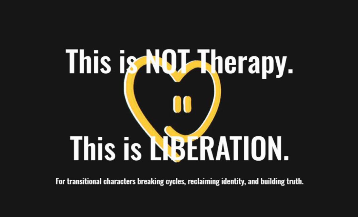
The brand color leans heavily into yellow. And not just any yellow, but a soft, optimistic tone that radiates positivity. It injects life into the brand while reinforcing themes of personal growth and emotional wellness.
This yellow also highlights the tagline “Empowerment, One SHIFT at a Time,” spotlighting the brand’s mission in a way that’s memorable and meaningful.
Visually, the layout is smart and balanced. The icon and logotype are centered and weighted evenly, making the logo feel cohesive and intentional.
Paired with messaging that’s just cheeky enough to stick, the overall design has presence without trying too hard. It’s the kind of brand identity that invites curiosity and builds trust.
Ultimately, Tyche Digital Agency created a visual branding for A Steady Space that’s as impactful as its mission. The result is a brand that not only looks the part but finally feels like home — for both the founders and the people they serve.
Tyche Digital Agency’s branding for A Steady Space transforms a forgettable logo into a warm, human-first identity. A heart-shaped icon, bold typography, and soft yellow tones come together to signal connection, care, and emotional empowerment.
It’s the kind of glow-up that proves branding isn’t just visual — it’s visceral. Our team has ranked the top agencies that know how to turn brand values into memorable design systems.
Visit our Agency Directory for the Top Logo Design Companies, as well as:
We also recognize design work that balances simplicity with precision. Visit our Awards section to explore the best & latest in logo designs.