Standout Features:
- Fluid, dynamic figure representing movement
- Harmonious use of green tones
- Clean and simple typography
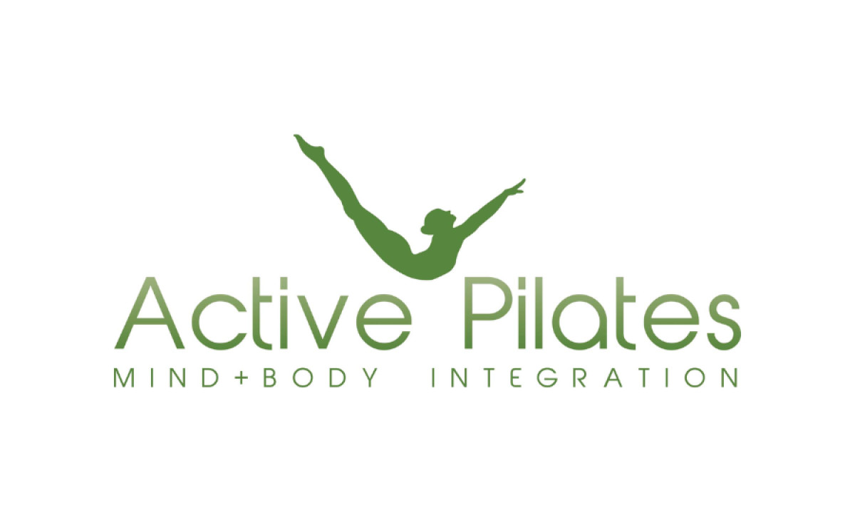
Active Pilates is a health and wellness brand that emphasizes the integration of mind and body through Pilates exercises. The logo designed by HAZO reflects this holistic approach with its fluid and dynamic elements, creating a visual representation of the brand's core values.
The most striking feature of the Active Pilates logo is the elegant figure in motion. The silhouette of a person in mid-pose communicates the active nature of Pilates, while the dynamic lines of the figure convey flexibility and balance, core elements of the practice. The graceful form of the human figure also creates a sense of lightness and flow, echoing the philosophy of integrating mind and body.
The use of green throughout the logo is particularly effective. Green is universally associated with health, vitality, and renewal, reinforcing the wellness aspect of Active Pilates. The choice of a soft, earthy tone evokes a sense of calm and naturalness, aligning with the company’s focus on mental and physical well-being.
The minimalistic typography complements the logo's visual elements, offering a clean and modern touch. The font choice emphasizes the brand's commitment to clarity and simplicity, which mirrors the holistic and accessible nature of Pilates itself.
Overall, HAZO’s design for Active Pilates successfully merges the active, dynamic qualities of Pilates with a calming and balanced visual language. This health and wellness logo is a seamless reflection of the brand’s identity, striking the perfect balance between motion and tranquility.