Standout Features
- Geometric, sharp icon
- Bold typography with contrasting colors
- Versatile, animated logo
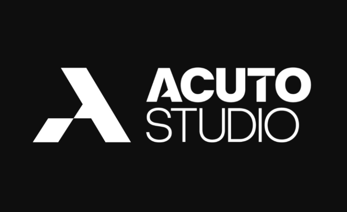
Acuto Studio, a professional sports photography studio by Riccardo Testi, needed a logo to convey strength and precision. Minal Studio designed a sharp, geometric logo that perfectly reflects Testi's focus on competitive sports and his Italian heritage. The word "Acuto" is embodied in the design’s clean, angular forms, highlighting speed and agility.
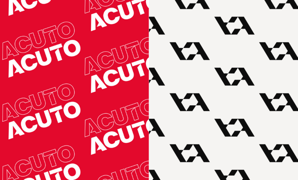
The geometric, sharp icon is built from angular shapes, representing the precision and energy of sports. It’s simple yet dynamic, making it versatile for use as both a logo and a pattern. This geometric approach captures the essence of the studio's photography style: focused, clear, and impactful.
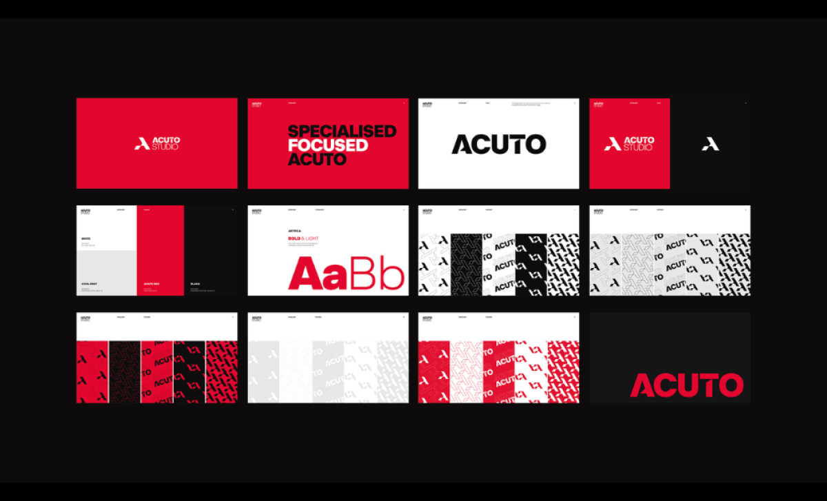
The bold typography with contrasting colors enhances the logo’s strength. The typography, with its sharp edges, mirrors the icon’s geometric precision. The use of red and white creates a strong, energetic contrast, making the logo stand out in various contexts while maintaining its professional appeal.
Lastly, the animated version of this professional services logo adds dynamism to the brand, perfectly aligning with the fast-paced nature of sports. This animation brings the logo to life, making it even more engaging in digital applications and highlighting Acuto’s modern, active identity.
In conclusion, the Acuto Studio logo by Minal Studio is a strong representation of the brand’s focus on sports photography. The sharp, geometric design, bold typography, and animated version ensure a versatile and professional brand identity that stands out in a competitive field.