
Standout Features:
- Abstract symbol
- Clean sans-serif typography
- Simple but impactful color palette
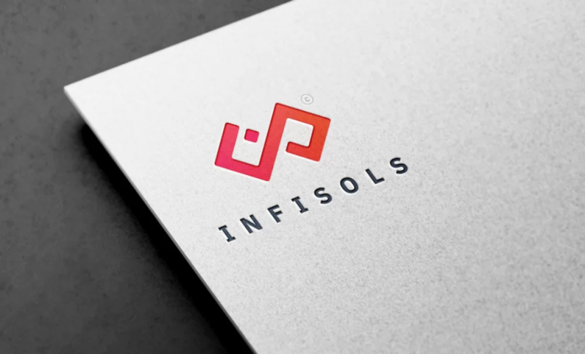
The Infisols logo, designed by Freelance UKHub, serves as the website and mobile app development company’s symbol. With just a wordmark and an icon beautifully balanced together, it's simple, straightforward, and gets the job done. It’s a strong template for any service-related brand seeking to project a contemporary and professional image.
The logo features an abstract symbol composed of two interconnected, angular shapes — diamonds forming a broken infinity symbol. The shapes are stylized and create a sense of movement or flow. Its sharpness also lends a high-tech language, which doesn’t hurt considering it represents a development company.
It also utilizes clean sans-serif typography. The brand name "INFISOLS" is presented in all caps in a clean, almost futuristic sans-serif typeface. The letters are bold and evenly spaced, plus it’s modern and legible — checkmarks across the board for a great, effective logo.
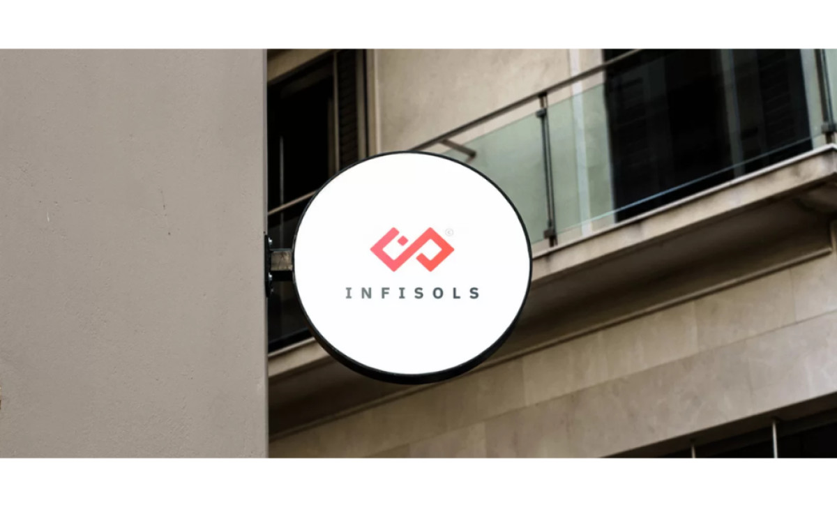
Additionally, the logo primarily uses a stark crimson color in its icon. Pair this with a bold gold background, and you’ve got something striking and impressionable. Still, it’s understated enough that it works on any surface, be it on a signage outdoors or on company merch.
In other words, yielding a highly impactful logo doesn’t mean you have to stray from what works. Leverage color psychology, shape language, and font connotations well, and you get a professional services logo that is unique, and memorable — just like Infisols.
-preview.jpg)