Team Behind the Design
Logo Design Analysis
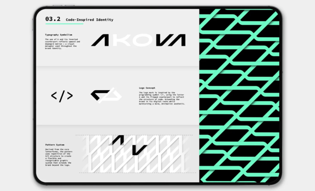
Modern professional services logos benefit from design languages that feel intelligent and efficient.
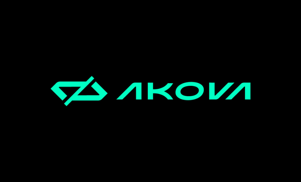
AKOVA taps into that aesthetic with code-driven symbolism and custom typography.
- Concept & Symbolism: The mark’s coding-inspired </> structure forms a clever emblem rooted in developer culture. I like how this abstraction avoids clichés while still clearly signaling the brand’s technical foundation.
- Typography & Letterforms: The custom diagonal cuts and geometric proportions mirror the logic of code and interface design. I appreciate how these shapes build a rhythmic, futuristic wordmark that feels purpose-built for a development brand.
- Color & Contrast: The neon-aqua on deep black delivers a high-impact cyber aesthetic. I find this palette effective because it feels energetic and technical without blending into traditional blue-heavy tech identities.
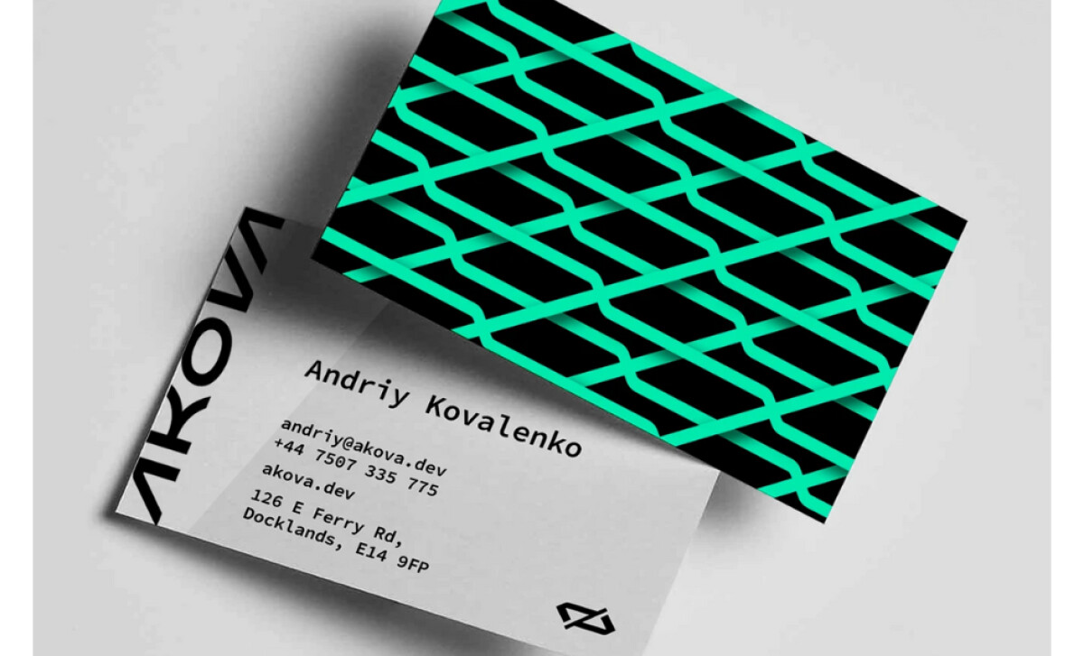
- Pattern Construction: The modular line pattern drawn from the logo’s angles creates a dynamic, circuit-like texture. I like how it extends the brand vocabulary, giving AKOVA expressive assets for both digital and print.
What Brands & Agencies Can Learn from AKOVA
This project shows how developer-centric brands can use coding language and geometric structure to build a distinct identity.
1. Use Design Language Familiar to the Industry
Integrating coding symbols or structural forms can build instant recognition for tech-focused audiences. When done with abstraction rather than literal icons, it feels modern and avoids visual clichés.
2. Custom Letterforms Strengthen Brand Differentiation
Purpose-built typography creates a signature look that stock fonts can’t match. For professional services, this handcrafted approach adds credibility and signals technical craftsmanship.
3. Extend Geometry Into a Scalable Pattern System
Patterns derived from logo angles reinforce brand consistency across business cards, headers, and digital assets. This modularity helps small or emerging firms look polished and cohesive from day one.
About DesignRush Featured Designs
At DesignRush, we review hundreds of agency projects every month ranging from branding to digital experiences. These featured selections highlight work that excels in creativity, relevance, and execution.
Exceptional entries often advance to our Monthly Design Awards, which spotlight standout achievements across the industry.
Check out more standout work across categories:
- Best Logo Designs
- Best Website Designs
- Best App Designs
- Best Print Designs
- Best Packaging Designs
- Best Video Designs
For a full list of design agencies and related services, see our Agency Directory.