Team Behind the Design
Logo Design Analysis
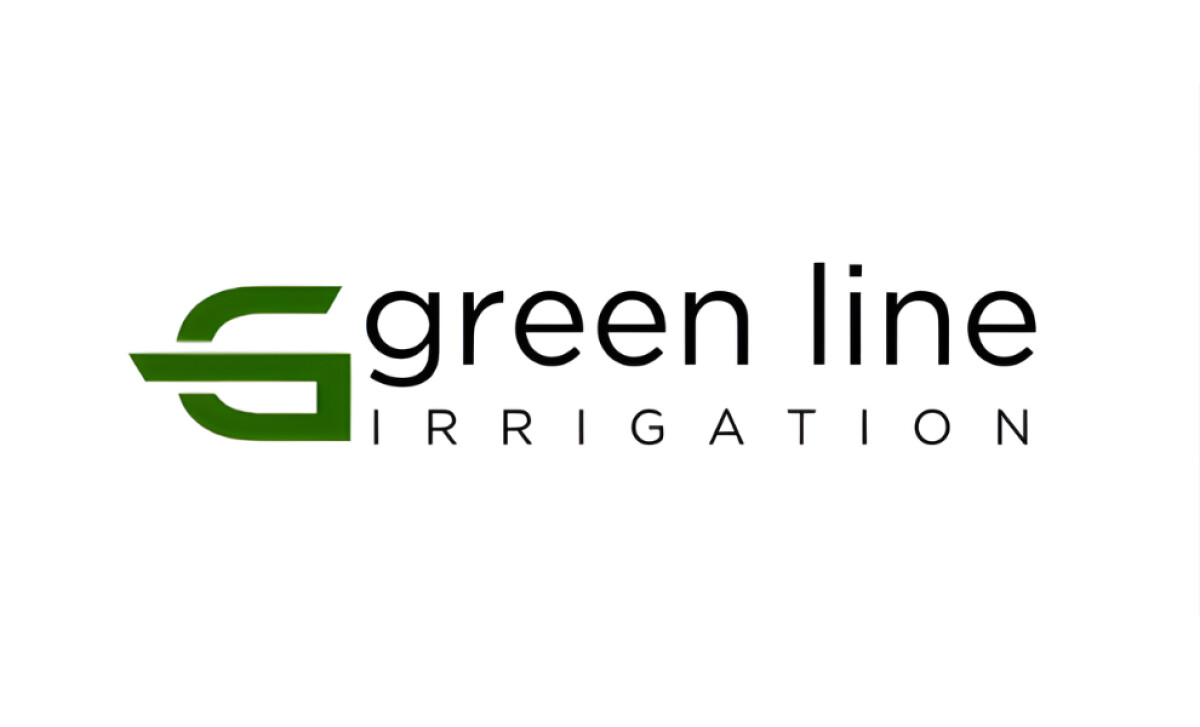
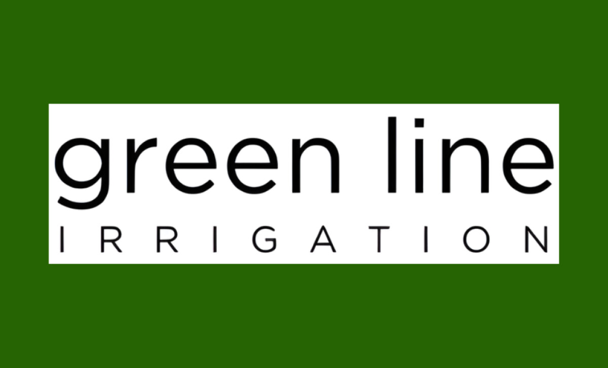
I appreciate how M | H Studio's logo design for Green Line Irrigation finds harmony between nature and structure.
The design feels fluid yet stable, which fits perfectly with a company specializing in irrigation and growth systems.
- Concept: The stylized “G” serves as both an initial and a symbol of direction. Its forward-slanting shape feels dynamic, while the inner line evokes the motion of flowing water, a clever nod to irrigation and sustainability.
- Typography: The lowercase sans-serif type communicates modern professionalism. It balances the boldness of the icon, giving the overall logo a composed and confident tone.
- Color Palette: The rich green immediately suggests freshness, growth, and trust. It’s grounded but not overly bright, aligning well with the brand’s focus on eco-conscious solutions.
- Balance: The spacing and proportional relationship between the icon and text demonstrate thoughtful composition. The word “irrigation” in uppercase provides contrast and structure, reinforcing the technical aspect of the business.
What Brands & Agencies Can Learn from Reel Oarsome
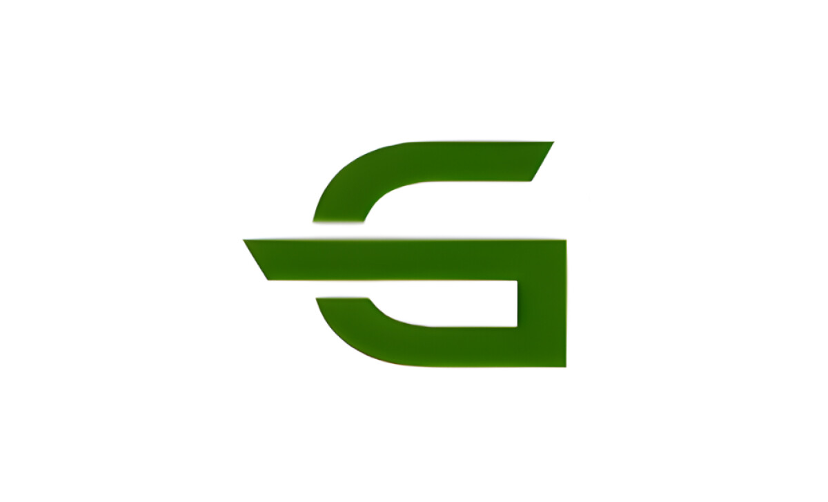
M | H Studio’s design for Green Line Irrigation shows how minimalism can communicate both movement and meaning. It is proof that simplicity, when guided by intent, can make a brand feel modern and credible at the same time.
1. Let Form Reflect Function
The curved “G” icon feels alive with motion. It mirrors the company’s focus on flow and direction, turning a single shape into a story about growth and precision.
2. Use Color to Build Trust
The deep green feels organic but deliberate. It connects naturally to the environment while signaling dependability and care. This approach shows how a restrained palette can express both character and clarity.
3. Keep the System Balanced
Typography, icon, and spacing all work in quiet harmony. The composition feels stable, which reinforces the professionalism behind the brand.
About DesignRush Featured Designs
At DesignRush, we review hundreds of agency projects each month to uncover standout work in branding, digital, and visual design. The featured designs represent some of the most compelling executions, standing out for clarity, creativity, and technical precision.
Top-performing projects often advance to our Monthly Design Awards, gaining wider industry recognition.
See more creative projects across categories:
- Best Logo Designs
- Best Website Designs
- Best App Designs
- Best Print Designs
- Best Packaging Designs
- Best Video Designs
For a full list of design agencies and related services, visit our Agency Directory.