Standout Features:
- Expressive calligraphic script
- Minimalist black and white presentation
- Direct focus to Oud tradition
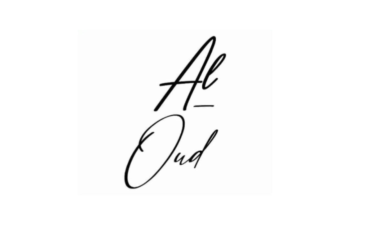
Al-Oud Luxury, which is a perfume brand drawing heavily on the distinguished Oud heritage found in Dubai and Oman, worked with FrontToBack Development specifically to create its sophisticated brand logo. The main task was capturing a unique feeling of elegance that hinted at historical artistry. The agency achieved this in a couple of ways:
Firstly, what really makes this logo work is the beautiful script used for the name ("Al" over "Oud"). It's fluid and expressive, featuring graceful curves and changing line thickness. Hand-written, calligraphy-like flourishes create that artistic feel, which all instantly suggest luxury while still maintaining a personable identity.
Complementing the intricate script is extreme minimalism in the logo's construction. It consists only of the name itself in a timeless black and white palette — no extra icons are involved here. This puts all the attention squarely on the elegance of the calligraphy. An understated, “need-I-say-more” confidence like this is key in luxury design.
Finally, this design strategically leverages the power already packed into the brand name. It’s intrinsically linked to the main ingredient and the heritage of regional perfumery — that checks off category and origin instantly. When you combine this meaningful name with the culturally resonant script style, the logo communicates authenticity all on its own.
This logo really drives home just how incredibly powerful only using typography can be in branding, especially when it's chosen carefully and executed perfectly. For luxury logo brands, letting an evocative script style carry the entire identity can convey authenticity and exclusivity without needing any extra symbols cluttering things up.