Standout Features:
- Elegant serif typography with a distinctive accent
- A holistic, culturally significant emblem
- A versatile and natural, earth-toned color palette
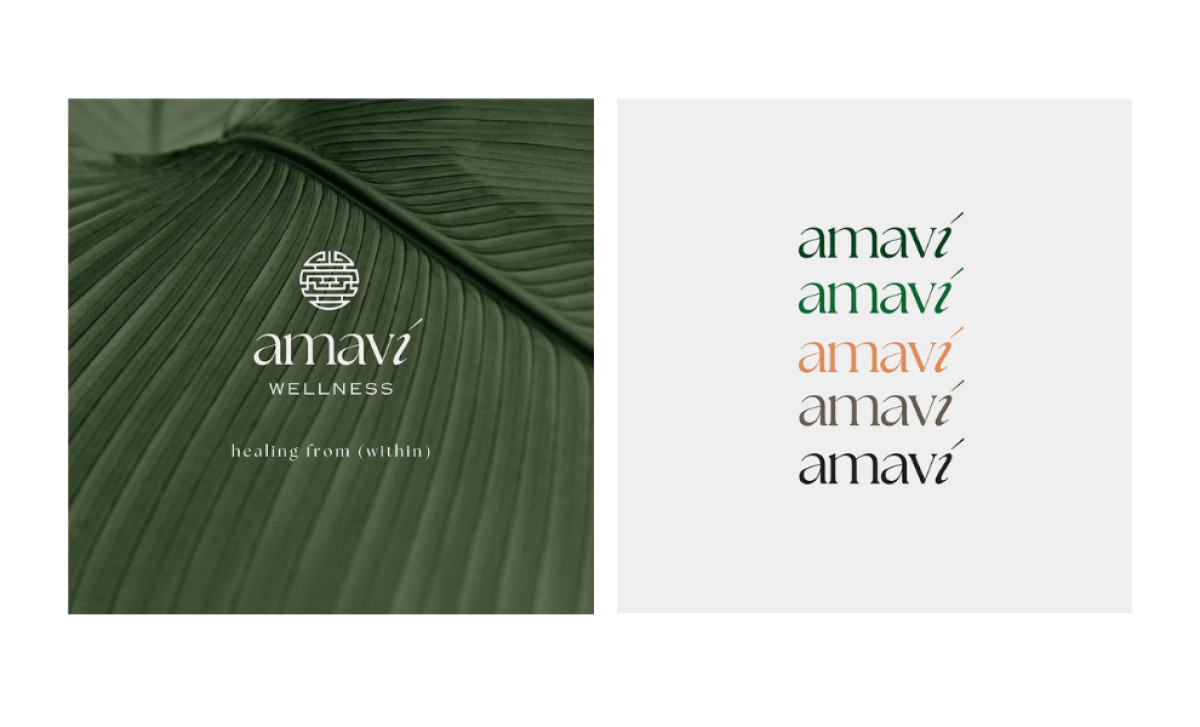
How do you visually represent a blend of Eastern and Western wellness philosophies? Amavi Wellness, a company that uses therapies like acupuncture, cupping, facials, and laser services, sought Rayn Design & Marketing Studio to come up with a logo that says everything they offer and believe in at first glance.
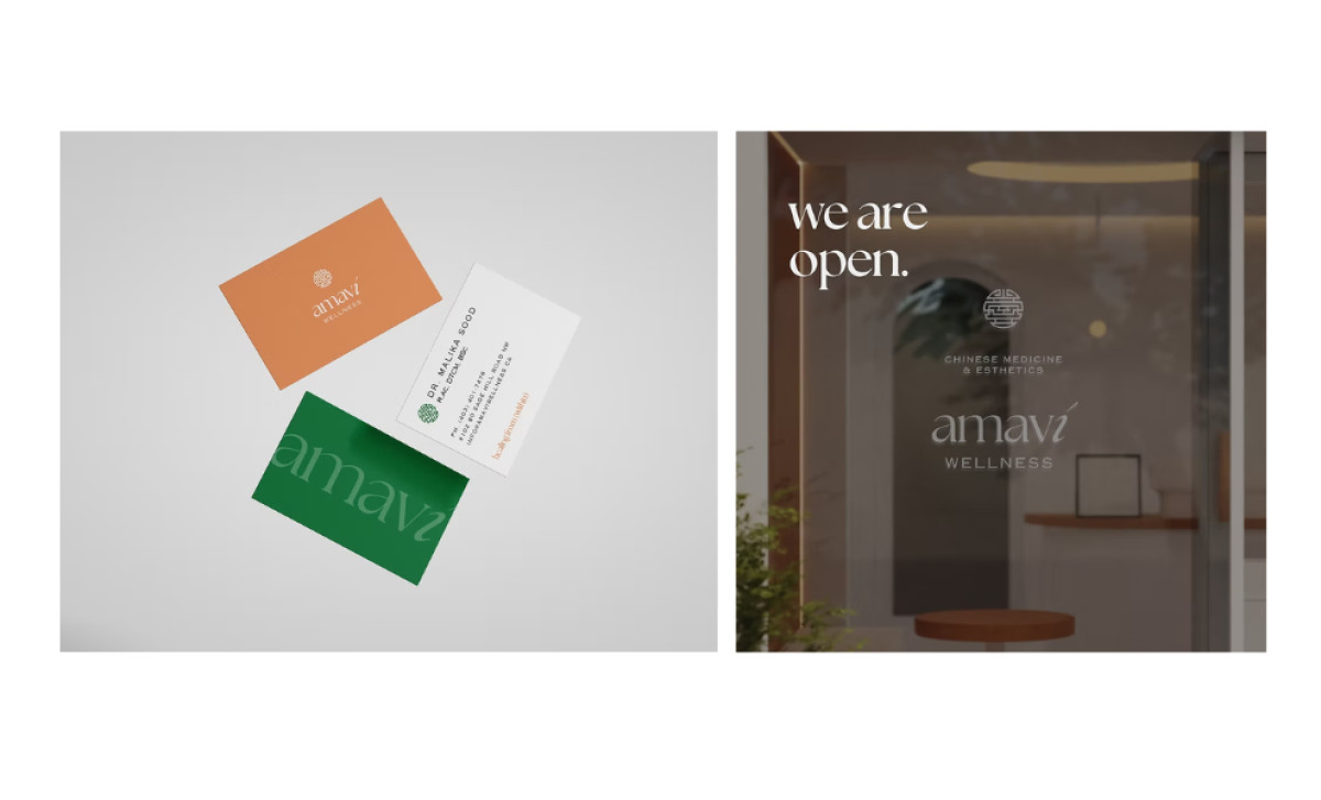
What's notable about the Amavi Wellness logo is that the brand name "amaví" is presented in a modern serif typeface with an acute accent mark over the "i." Conversely, the "wellness" part of the name is in a clean, sans-serif font, providing a contrast, while the sub-tagline "healing from (within)" uses a smaller, lighter sans-serif.
A circular emblem is placed above the "amaví" brand name, with a stylized, geometric pattern that suggests traditional Eastern motifs. This emblem is a key design element, used on the logo, the storefront window, and certain marketing materials. More importantly, it reinforces the brand's unique selling proposition.
Furthermore, the Amavi Wellness logo uses a natural, earth-toned color palette. The main colors are a deep forest green — representing growth and healing — and a monochrome version. These colors are used consistently across the logo, business cards, storefront signs, and marketing materials.
This health and wellness logo teaches us that translating a business’ unique value proposition doesn’t have to be complicated. This logo highlights that intentionality in design and well-considered visuals have the capacity to communicate far beyond words.