Team Behind the Design
Logo Design Analysis
A good health and wellness logo design balances meaning, clarity, and form, and those elements set the emotional base for a brand.
Cura achieves this through a mix of classical cues and modern restraint, giving the mark a steady, dependable feel.
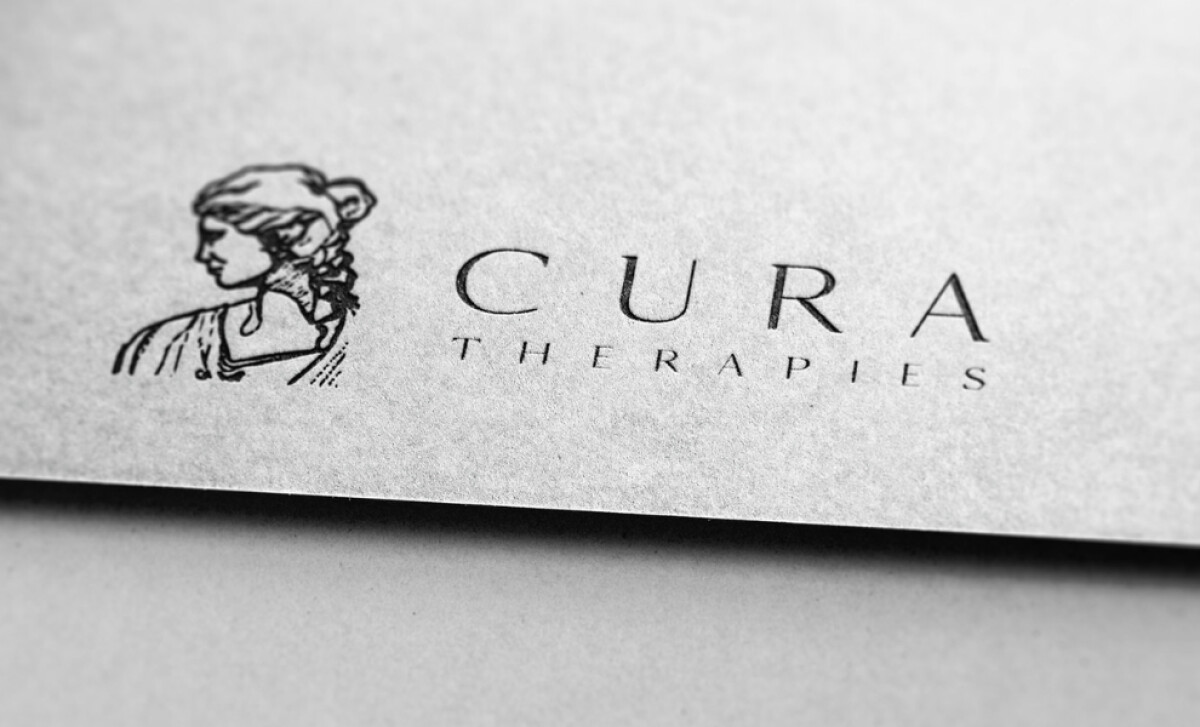
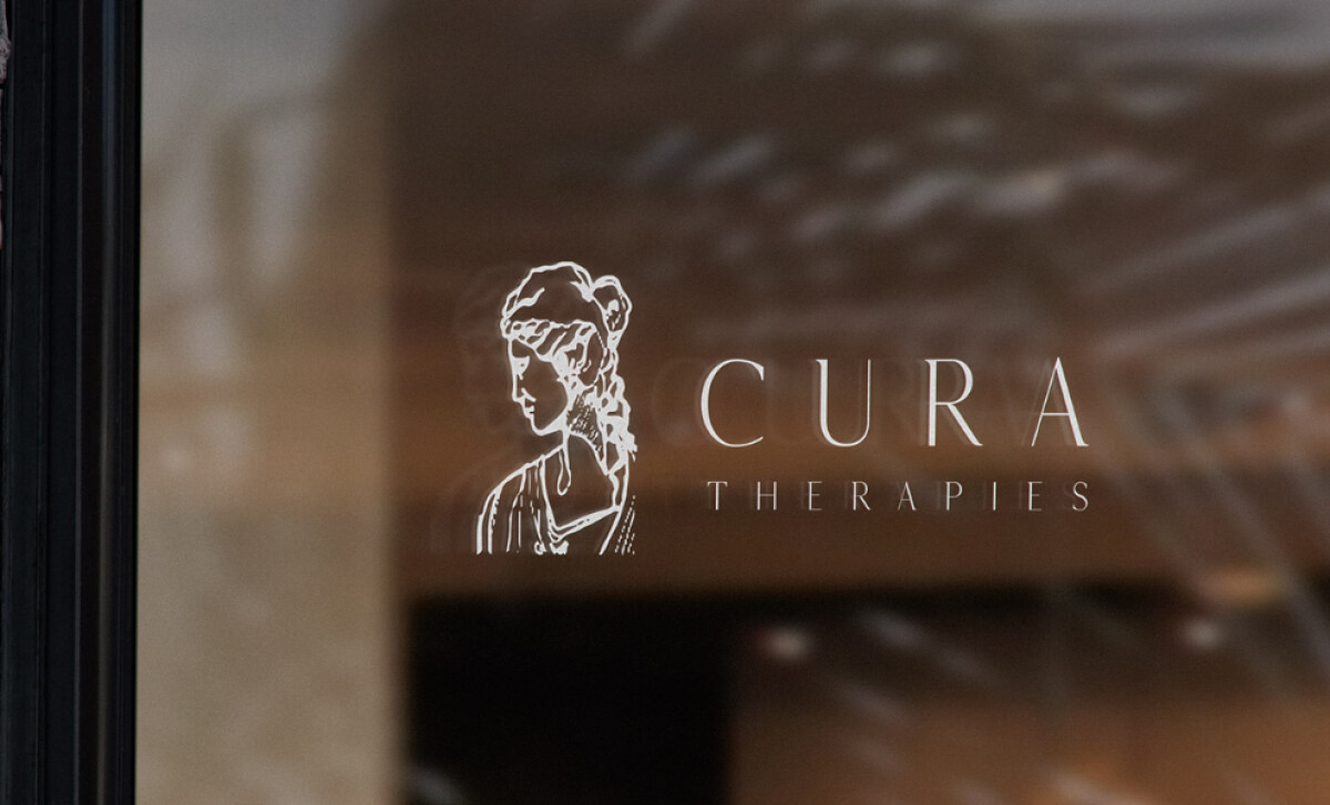
- Concept & Illustration: I appreciate how the classical line-art portrait anchors the identity. The soft contour work suggests humanity and gentleness without feeling sentimental, which can be difficult to achieve in mental health branding.
- Typography: The high-contrast serif creates a refined, peaceful tone. I appreciate how the wide spacing and slender forms give the wordmark breathing room, reinforcing the sense of emotional space Cura aims to provide.
- Composition: The horizontal lock-up strikes a balanced relationship between symbol and wordmark. I like how neither element overwhelms the other; the mark feels harmonious, which fits the theme of emotional equilibrium.
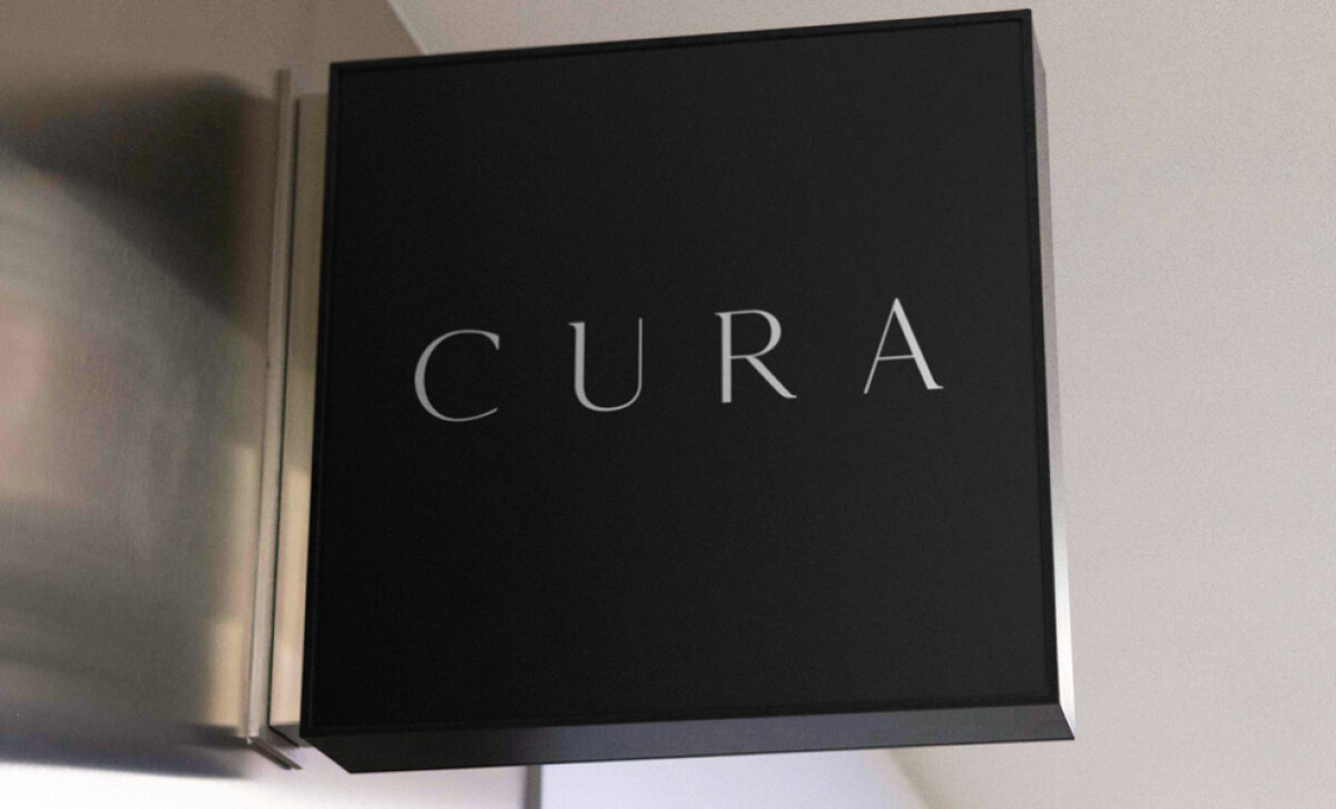
- Scalability & Reproduction: The monochrome execution supports the brand well. The logo reads clearly at small sizes and adapts nicely to signage, print, and digital environments without losing its sensitivity.
What Brands & Agencies Can Learn from Cura Therapies
Here are a few lessons from how this logo supports the health and wellness category:
1. Use Symbolism to Build Emotional Resonance
Hand-drawn or illustrative marks can convey warmth and humanity. When done with restraint, they help wellness brands feel more personal and trustworthy.
2. Choose Typography That Reflects the Brand’s Emotional Tone
High-contrast serif typefaces can express calm, confidence, and clarity. This is especially effective for therapeutic services where readability and emotional sensitivity matter.
3. Design Flexible Logo Systems for Real-World Use
A mark that works in monochrome and adapts across signage, packaging, and digital platforms ensures long-term consistency. Flexibility is key for growing wellness practices.
About DesignRush Featured Designs
At DesignRush, we evaluate hundreds of projects each month. Featured selections stand out for clarity, craftsmanship, conceptual depth, and execution across digital and brand experiences.
The strongest examples move on to our Monthly Design Awards, highlighting best-in-class creative work.
Check out more standout work across categories:
- Best Logo Designs
- Best Website Designs
- Best App Designs
- Best Print Designs
- Best Packaging Designs
- Best Video Designs
For a full list of design agencies and related services, see our Agency Directory.

-preview.jpg)