Standout Features:
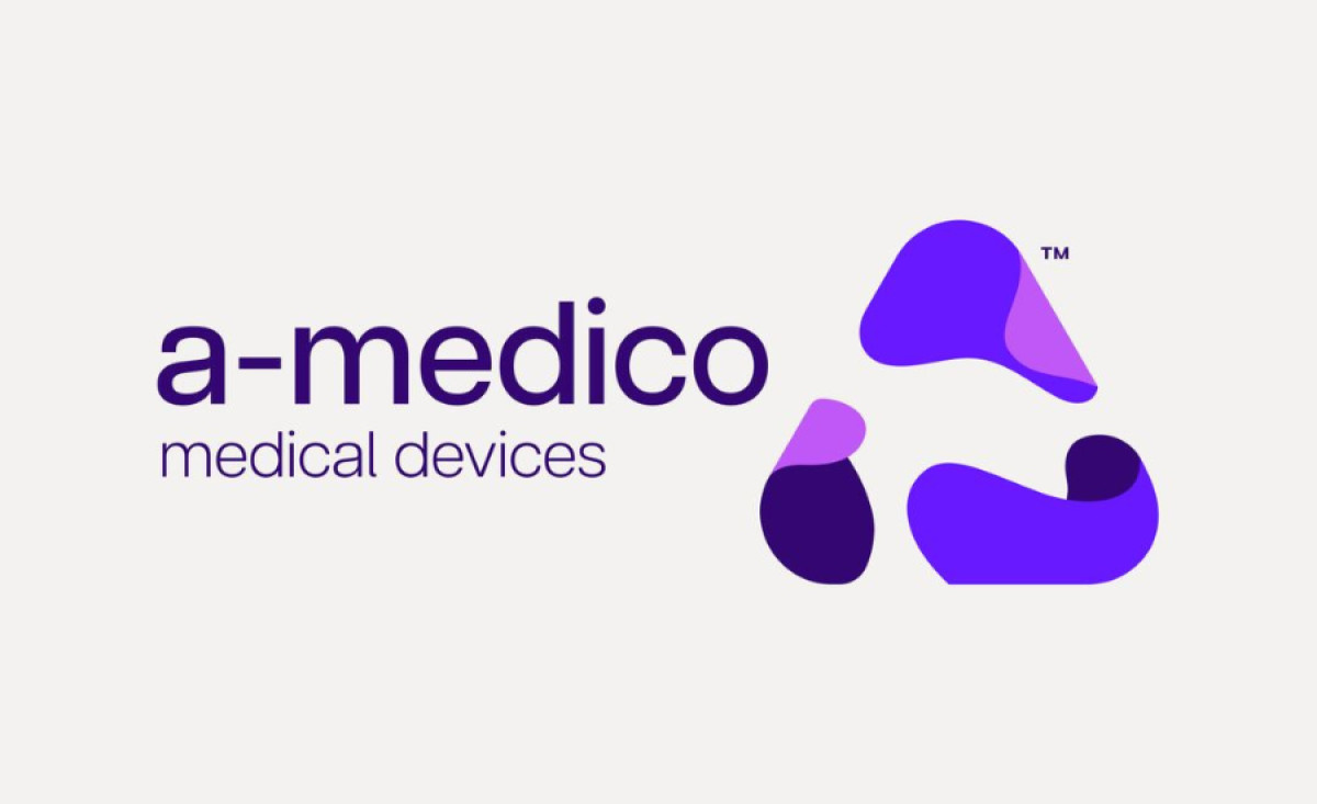
- Abstract "A" symbol
- Multilayered purple palette
- Modern sans-serif typography
A-MEDICO needed a visual identity that reflected its mission to bring diagnostics and treatments to remote and underserved communities. Design studio &then rose to the challenge, crafting a logo that embodies the organization's innovative spirit and technological ambition.
At the heart of the logo is an abstract "A" symbol, suggesting the seamless integration between technology and the community. The shape resembles a recycling symbol, reinforcing themes of renewal and interconnectedness. These qualities align with A-MEDICO's goal of expanding access to healthcare.
In a field dominated by blues and greens, a purple palette is bold and symbolic. This color, often symbolizing honor and visionary thinking, conveys a refreshing and inclusive touch, honoring the brand's promise to support underserved populations.
Lastly, the agency used lowercase, sans-serif typography to emphasize the brand's modern and approachable persona. This font style aligns with contemporary communication styles and complements the organization's forward-thinking nature.


-preview.jpg)