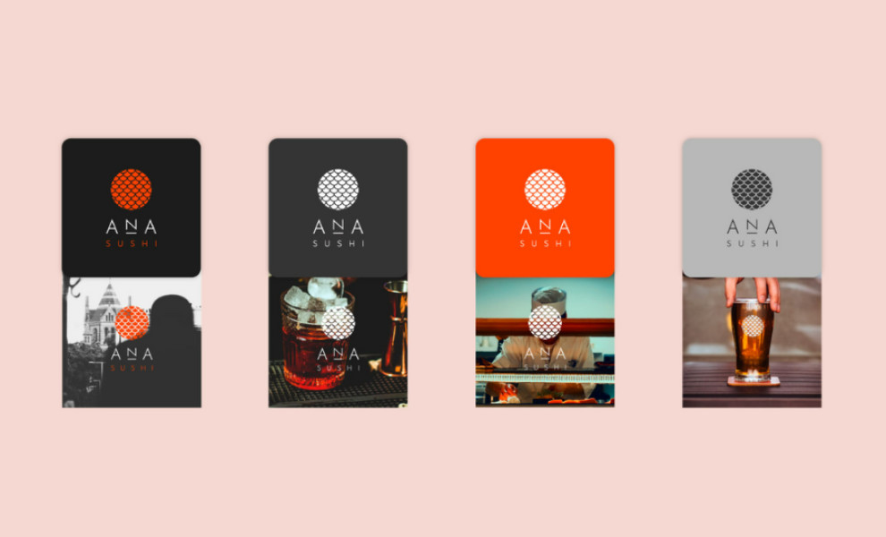
Standout Features:
- Vibrant orange theme
- Thin sans-serif typeface
- Symbolic fish scale icon
ANA Sushi’s logo design by Julian Rojas Dattwyler embodies a modern, streamlined aesthetic that pays homage to traditional Japanese cuisine.
Its bold and bright orange color creates a visually striking identity that stimulates the palate and exudes energy. This color story aligns with the brand's focus on using fresh, raw ingredients while adding a contemporary twist.
The thin sans-serif typeface complements the minimalist approach, ensuring easy readability and a sophisticated look. It reflects the simplicity and elegance inherent in Japanese cuisine while remaining accessible and appealing to a broad audience.
But what truly represents the brand stunningly is the circular icon featuring a fish scale pattern — a subtle yet meaningful element in the logo. It adds a touch of cultural authenticity and reinforces the brand's connection to its culinary roots.


