

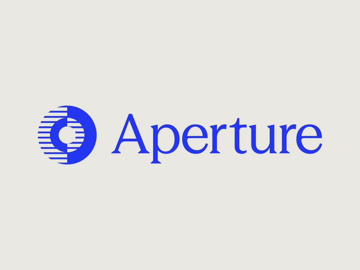
Logo Designed by
Numinous Numinous

Aperture Capital

Aperture Capital Logo Design by Numinous
Numinous created Aperture Capital’s logo identity around the idea of clarity, conviction, and long-term thinking. Inspired by the concept of an aperture, the mark symbolizes partial visibility paired with strong conviction, reflecting the firm’s patient investment philosophy. The broader identity positions Aperture as a serious and enduring private equity brand built for longevity.
Warm cream presentation folder showcases restrained ink brand typography.
Cream collateral folder displays the dual-textured aperture logo
Close-up showcases the half-striated, half-solid circular logo design.
Deep ink card highlights the firm's conviction-based mark
This website uses a colour palette of 4 colours
  • #2436F2
  • #8DDFB7
  • #332F2E
  • #F5E26C
Technologies & Tools
Description
Team Behind the Design
  • Agency: Numinous
  • Client: Aperture Capital
  • Category: Logo Design
  • Location: Boston, Massachusetts, United States
  • Project Brief: Create a logo identity that reflects Aperture Capital’s long-term investment philosophy, intellectual rigor, and disciplined private equity positioning.

A private equity logo design communicates longevity before it communicates anything else. Numinous Agency's identity for Aperture Capital does that through a mark that encodes the firm's central thesis: half striated, half solid, reading simultaneously as a camera aperture and a statement about conviction. Clarity is partial. Conviction is total.

The creativity is in the conceptual precision. A single mark carries the firm's contrarian investment philosophy, its patience for long holds and its belief in operator continuity, without any of that needing to be explained.

The typographic system, documentary photography and restrained palette of warm cream, deep ink and a single high-conviction blue give the identity room to travel. From a business card to an annual letter to environmental signage, nothing in the system competes with the mark: everything extends it.

The identity speaks to three distinct audiences simultaneously: limited partners, founders considering a sale and operators running portfolio companies. Handling that range without softening the message for any of them is the hardest thing a B2B brand system has to do, and this one does it.

Vote for the best design in this year's Design Awards and help decide which projects deserve top recognition. Every vote contributes to celebrating creativity and craftsmanship across categories like web, branding, product, and digital design.
Aperture Capital Logo Design by Numinous

Aperture Capital

Designed byNuminous
AXIA Energia Logo Design by Tátil Design

AXIA Energia

Designed byTátil Design
Athelo Logo Design by Senu Studio

Athelo

Designed bySenu Studio
Balance Logo Design by Studio AIO

Balance

Designed byStudio AIO
Wellington Educated Logo Design by Stanley Street

Wellington Educated

Designed byStanley Street
La Famiglia - Gucci Logo Design by Affaire

La Famiglia - Gucci

Designed byAFFAIRE
Hoopla Logo Design by Self-titled

Hoopla

Designed bySelf-titled
Belle&George Logo Design by Abmo

Belle&George

Designed byAbmo
Redheads Logo Design by Oliver Grace

Redheads

Designed byOliver Grace
View All BestLogo Designs

Ready to elevate your designs?