- Agency: Numinous
- Client: ACE Resource Network
- Category: Print Design — Health & Wellness
- Location: Boston, Massachusetts, United States
- Project Brief: Design a print identity system that reflects ACE Resource Network’s mission to connect organizations, support trauma-informed care, and inspire nationwide collaboration through clear, human-centered visual communication.
Health and wellness print design usually fights to be seen, but ACE Resource Network built its whole system to do the opposite. The identity works from a single brief, a brand that says "there you are" rather than "here I am," and every printed piece serves that idea instead of shouting over it.
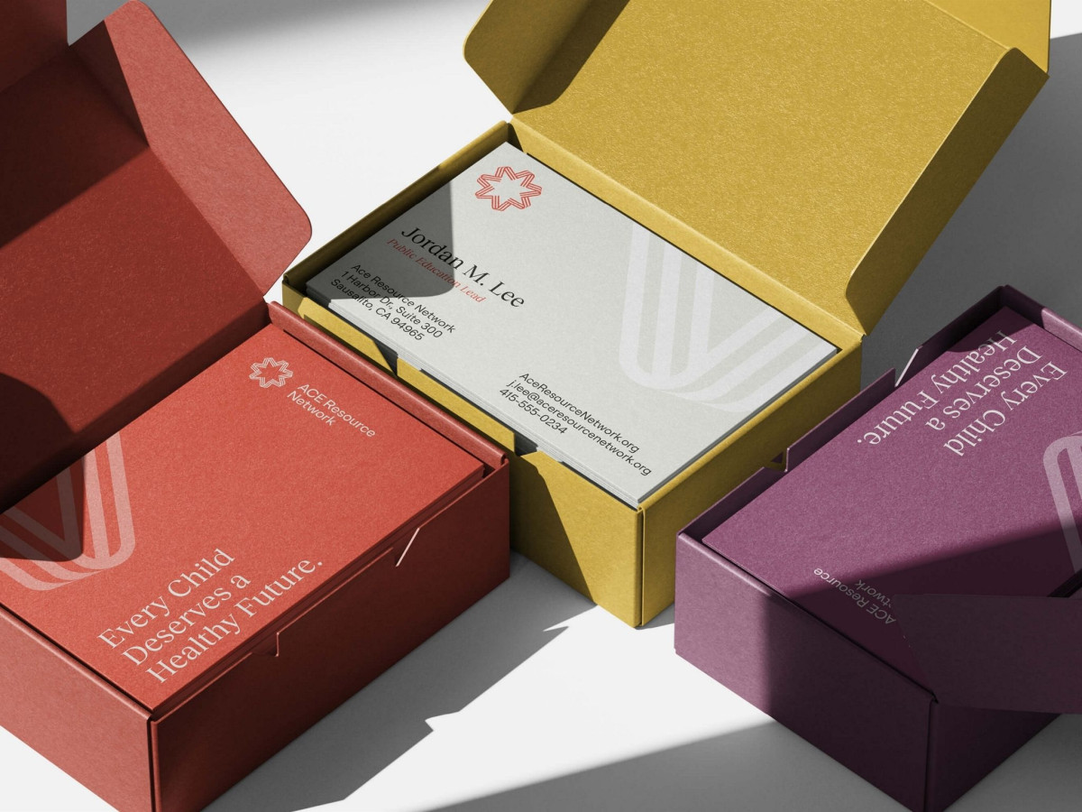
A woven eight-pointed mark carries the concept. The threads read as both a force multiplier connecting states and a north star guiding a shared cause, so one symbol holds the organization's dual role as connective system and guiding light.
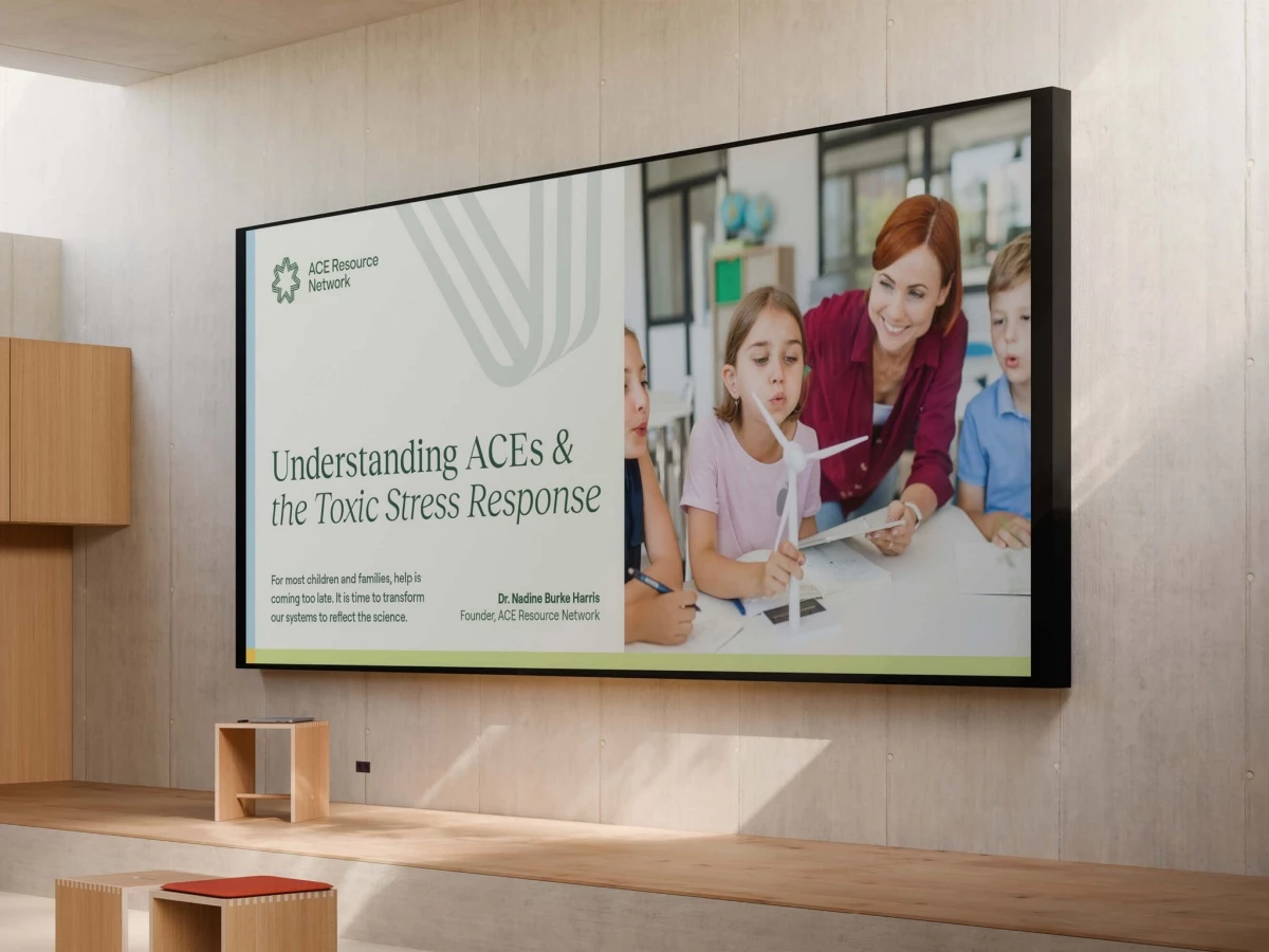
The palette gives the system range without noise. Deep reds, ochre, plum, blue, and sage rotate across business cards, boxes, and brochures, letting each piece feel distinct while the recurring mark and clean type hold the family together.
The typography stays quiet and human throughout. A soft serif handles headlines like "every child deserves a healthy future," pairing scientific credibility with warmth, which matches a brand meant to be the infrastructure others build on rather than the loudest voice in the room.