With the global yacht market projected to grow from $8 billion to $17 billion by 2034, at a steady 8–9% annually, brands need more than visual appeal. They need a design language that conveys value, authority, and trust. Halobrand® delivered just that for Eternal Luxury, crafting a logo defined by geometric precision and timeless restraint. More than decoration, it’s a scalable identity system that reflects engineering excellence and signals long-term brand equity.
Key Insights for Brands:
- Use archetypal shapes (diamonds, circles, stars) to signal trust and permanence
- Prioritize angular geometry when aiming to increase premium perception
- Keep typography minimal for timelessness, clarity, and versatility across luxury formats
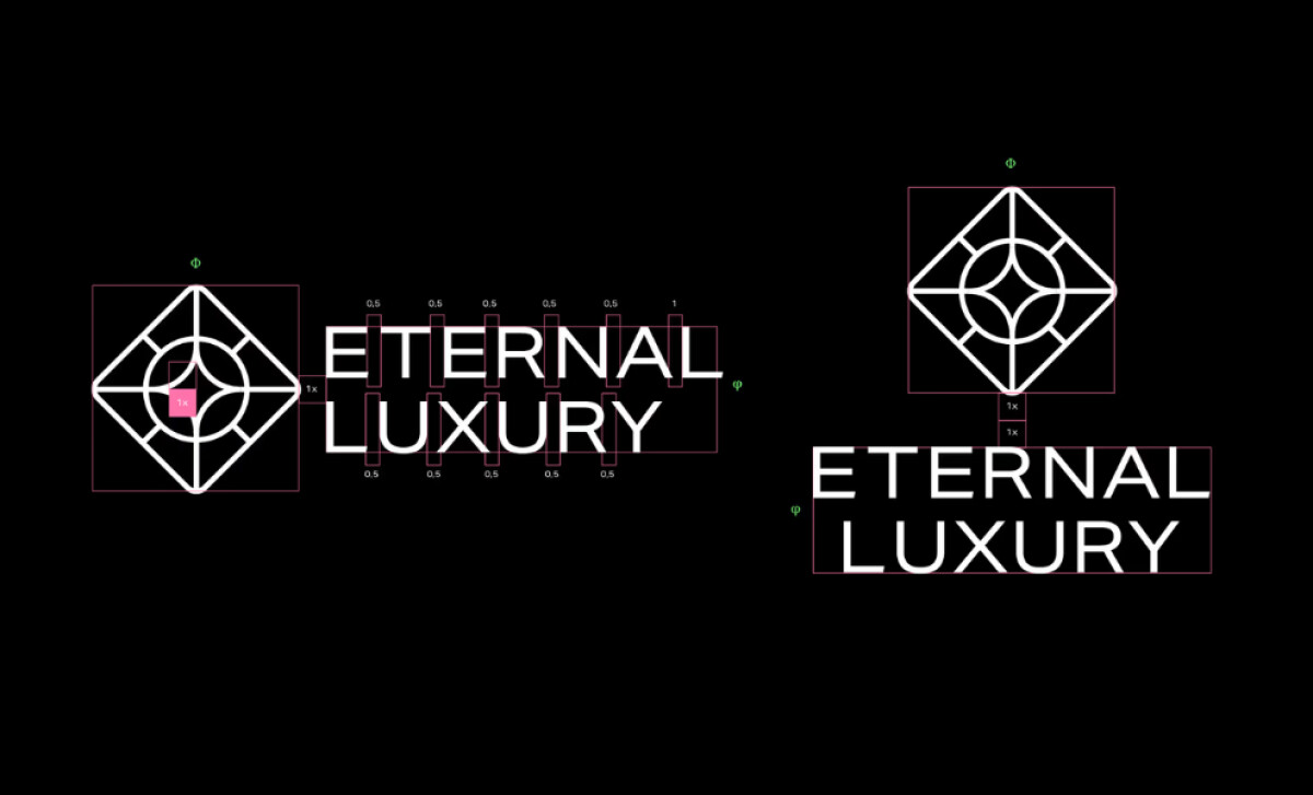
Halobrand® Uses Geometry in its Monogram to Signal Authority and Prestige
Rather than relying on predictable maritime motifs, Halobrand created an identity rooted in geometric abstraction and balance.
The combination of symbolic shapes (diamond, circle, and star) in this luxury logo is grounded in behavioral and market psychology. A 2021 study on visual cognition confirms that geometric motifs tap into subconscious associations of trust, structure, and permanence.
In luxury categories, where purchase decisions are emotionally charged and high-risk, such shapes act as visual cues that reassure buyers of the brand’s credibility and legacy value.
Brands that use clear, meaningful symbols in their logo designs see stronger brand recall and buyer preference. According to recent studies, symbols that express a brand’s deeper values can boost purchase intent by making the brand feel more trustworthy and emotionally resonant to consumers.
Dynamic Elements in External Luxury’s Logo Enhance Purchase Intent
Dynamic elements in logos, such as radiating lines or implied motion, have been proven to trigger stronger emotional and cognitive responses.
A recent 2025 study found that dynamic, well-structured logos increased engagement and recall in luxury contexts. These logos stimulate visual interest and convey vitality, which helps form positive brand associations more quickly.
In Eternal Luxury’s logo, the radial extensions around the core shapes mimic solar rays and compass needles, invoking energy, movement, and directionality. This design subtly suggests forward-thinking innovation — a key brand promise in marine tech and luxury design.
Halobrand® Engineers Typography With Precision and Applies Color to Define Luxury
The Eternal Luxury logotype features a custom serif typeface built with architectural precision. Its sharp contrast and calibrated flares mirror the structural clarity of yacht design — controlled, deliberate, and built to perform. This engineered approach aligns with how luxury is cognitively perceived.
In fact, a 2023 study found that consumers associate angular, geometric logos with higher-end brands compared to rounded forms. Halobrand®’s professional design taps directly into that perception, using hard edges and exacting proportions to reinforce Eternal Luxury’s premium positioning.
Color extends that narrative. The brand system uses a disciplined range of deep multi-tonal colors — each carefully paired with light linework or reversed logos to maintain clarity and contrast. This palette forgoes predictable gold accents in favor of controlled tones that feel grounded, modern, and quietly opulent. The result is a color system that signals prestige without pretense, perfectly suited for an audience that values understatement over spectacle.
Build brands with every curve. Explore the best fonts for logos that leave a lasting impression.
The Brand System Extends Seamlessly Across Touchpoints for a Cohesive Luxury Experience
Halobrand®’s work doesn’t stop at the logo. They developed a full brand identity system that pulls from the emblem’s core geometry to create patterns, textures, and layouts.
From guest welcome kits to staff apparel, every extension of the brand feels deliberate, precise, and premium. It’s branding as experience — seamless, immersive, and designed to reinforce a lifestyle as much as a product.
This modularity is key. It allows the Eternal Luxury brand to maintain visual integrity while adapting to different scales and contexts, an essential feature in the luxury market, where every touchpoint matters and inconsistency erodes value. This kind of end-to-end thinking sets professional logo design agencies apart from one-off branding shops.
“Halobrand® gave us the strategic edge we were looking for with their sharp-minded approach and critical ideas."
- Bahadır BaskanCo-Founder & COO, Eternal Luxury
Halobrand®’s Eternal Luxury logo design is branding stripped to its essentials — subtle, strong, and surgically precise. Every detail serves a purpose, every decision reinforces value. It’s not only beautiful, it’s built to last too.
For brands playing to win in high-stakes markets, this is the benchmark. Eternal Luxury’s identity doesn’t just belong as this month's best logo design — it defines what that list should look like.