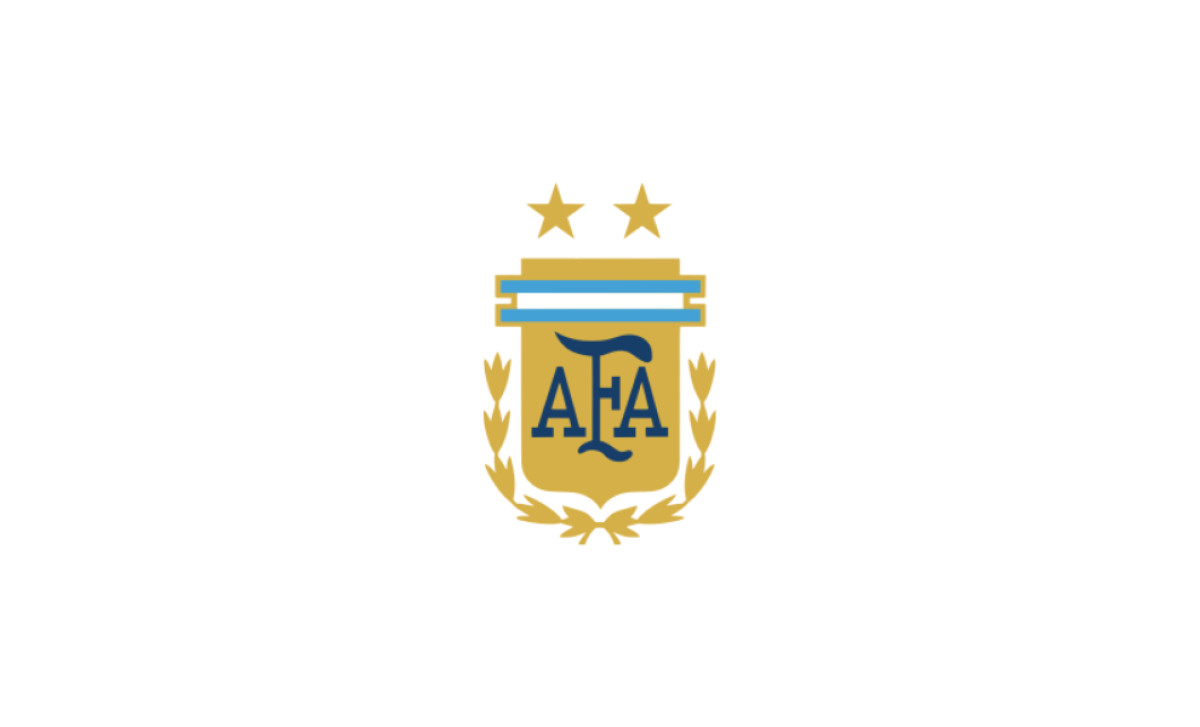
Right now, as Argentina prepares to defend its title at the 2026 FIFA World Cup, the crest on the jersey carries three stars. One for 1978, one for 1986, one for 2022. The third went on within hours of the final whistle in Qatar.
That makes the Albiceleste badge the most recently updated major national crest in football. Italy, Brazil and England settled their marks generations ago. Argentina's is still moving, and a fourth title would move it again. Every element on it had to earn its place, the same standard behind strong logo design in any category.
The story starts in 1930, on a blazer, with no badge at all.
1930 to 1934: A Flag, Not a Badge
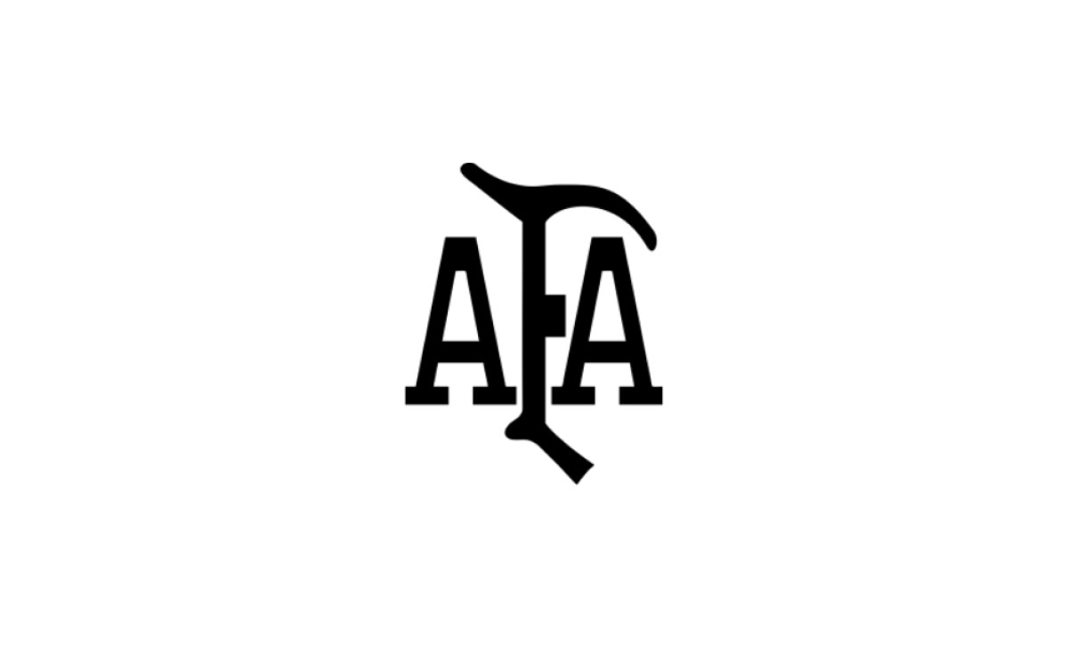
The first mark was a monogram, not a badge. Three black serif letters spelled AFA, with the F sharing its central stroke with the two A's and its top bar curving to the right. There was no shield, no laurels and no color beyond black.
Players wore the national flag on their blazers and exchanged pennants before each match. The federation had a logo, but the team had no crest on its chest.
1934: One Letter on the Blazer
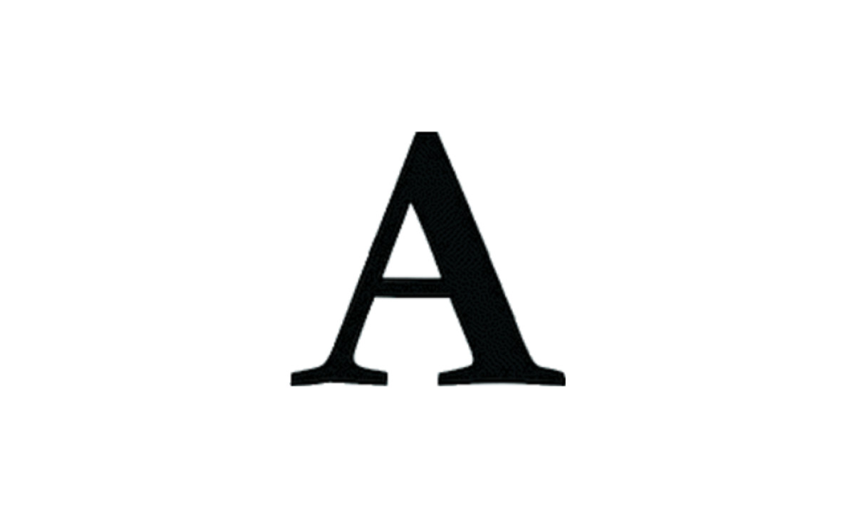
The 1934 squad reduced the mark to a single black serif capital "A." The letter stood in for the full name and nothing more.
It was a placeholder, not an identity. The federation still had no emblem its players carried into a match.
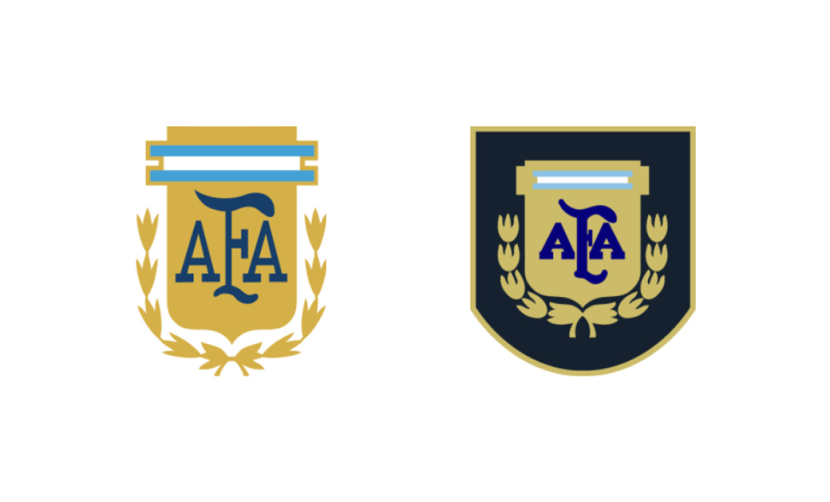
1958 to 1966: The Shield Debuts
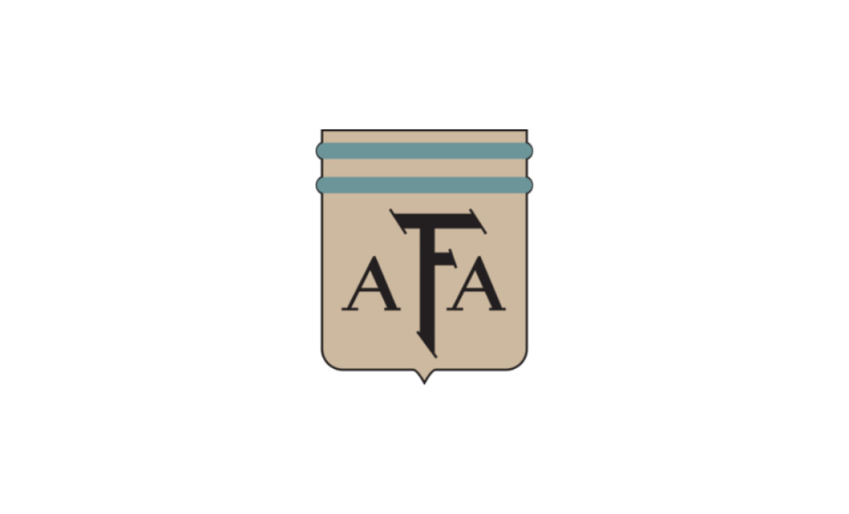
The first true shield arrived at the 1958 World Cup in Sweden. It was tan, with two teal horizontal bands across the top and the black interlocking AFA letters set in the center.
There were no stars and no laurels. The body was not yet the gold or the blue and white fans know now. This was the bare structure, a shield and the monogram, that everything later would build on.
1966 to 1974: Gold and Laurels
In 1966 the shield turned gold, gained a sky-blue-and-white striped cap and picked up green laurel wreaths down both sides. The interlocking AFA stayed black at the center.
This is where the crest started to look national. Gold body, blue-and-white top, the victory laurels framing the letters.
1976 to 1978: The Badge Reaches the Shirt
The crest first appeared on a jersey in 1976, for a friendly against the Soviet Union. The version from this period dropped the laurels and used a clean gold shield with a thick black outline, the blue-and-white cap and black AFA letters.
So the badge belonged to the federation before it lived on the shirt. That gap shapes the rest of the story.
1978 to 1982: First Title, No Star
Argentina hosted and won the 1978 World Cup, beating the Netherlands 3-1 with Mario Kempes leading the line. The tournament mark (left) used a gold shield with a gold-and-white outline and white AFA letters. The 1978 to 1982 version (right) returned to the black outline and black letters.
Neither carried a star or laurels. The first title was won, but the badge did not record it yet.
1982 to 1990: Blue Shields and the Maradona Years
The 1982 redesign (left) brought the laurels back and set the gold inner shield against a deep navy outer shield, with the AFA letters now in blue. The 1986 to 1990 version (right) kept the layout on a lighter royal blue. Argentina won again in Mexico in 1986, with Diego Maradona scoring the Hand of God and the Goal of the Century in the same quarter-final against England.
Two World Cups now sat in the cabinet. The crest still showed none of them. The titles kept arriving ahead of the design.
1990 to 2002: The Gold Shield on Open Laurels
The 1990 to 2002 mark (left) dropped the outer shield and set the gold inner shield on open gold laurel branches, with blue AFA letters and a blue-and-white cap. The 1999 to 2001 variant (right) placed that same build on a dark navy field. Argentina reached the 1990 final and lost to West Germany.
Both stayed star-free. Twelve years passed and the badge still told nothing of 1978 or 1986.
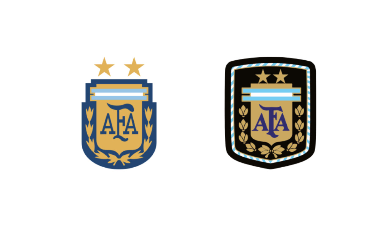
2004 to 2010: Two Stars Arrive
The wait ended at the 2004 Copa América. Two gold stars appeared above the shield, one for 1978 and one for 1986, set side by side over the gold-shield-on-laurels layout. The first star reached the badge more than two decades after the title it marked.
This is the version that set the modern template. Shield below, stars above, the count made visible at last.
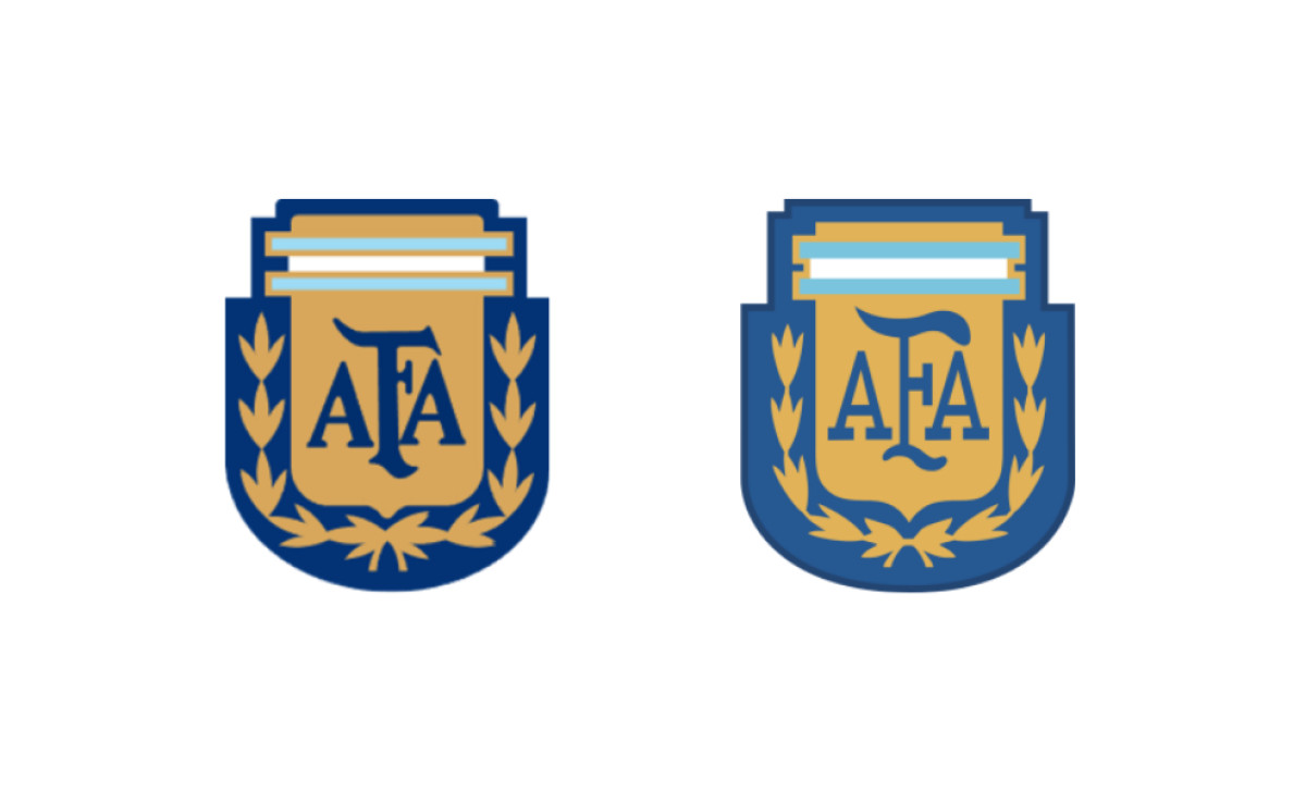
2010 to 2011: Refinements and the Jersey Patch
The 2010 mark (left) set the gold shield and laurels back against a navy outer shield, keeping the two gold stars. The 2011 version (right) reshaped the whole thing into a rounded jersey patch, a black field with a blue-and-white striped border, gold laurels and blue AFA letters.
The structure stayed put. The badge had its shape and worked within it.
2011 to 2022: Stars on the Shield
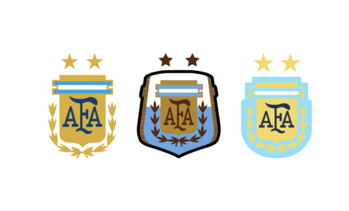
The standard 2011 to 2022 crest (left) kept the gold shield on gold laurels, blue-and-white cap, navy AFA and the two gold stars above. The 2014 World Cup variant (middle) ran in muted cream and sky blue with brown stars and lettering, and the 2015 variant (right) used a sky-blue shield with navy letters. Lionel Messi defined the era without a senior title to show for it.
The design waited again. The team kept reaching finals while the star count held at two.
2022 to 2024: The Third Star
Argentina beat France on penalties on December 18, 2022, and the three-star crest reached championship kits almost at once. The Football Kit Archive logs two close 2022 to 2024 variants. Both add a third gold star and arrange the three in a triangle, two outer stars with a raised one in the center, above the familiar gold shield and laurels.
The contrast tells the whole story. The first star took 26 years to reach the badge. The third took hours.
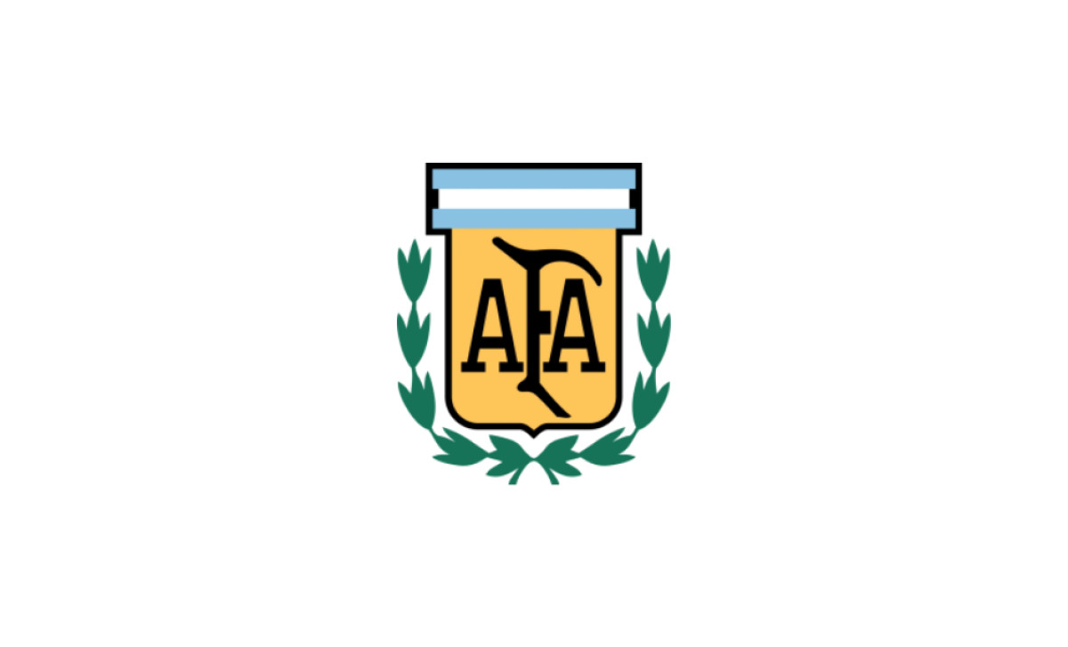
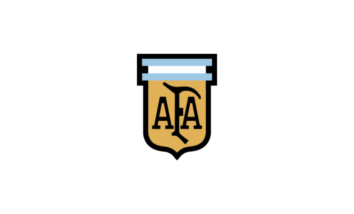
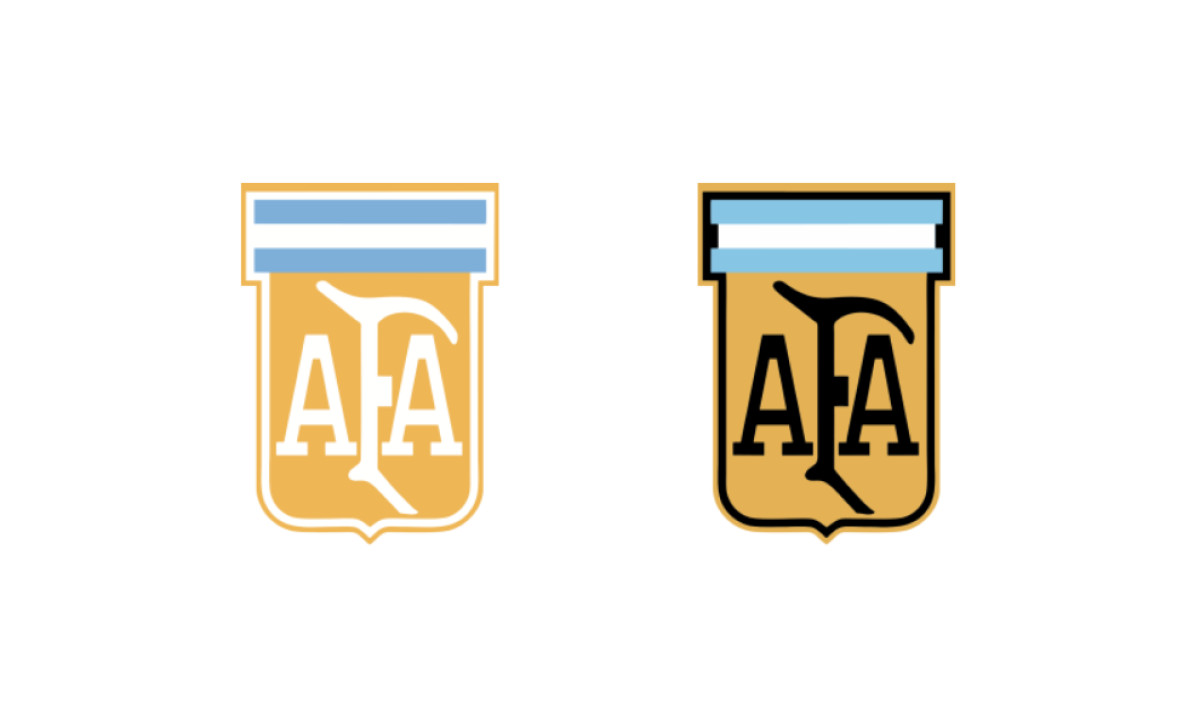
2024 to Present: The Flat Redesign
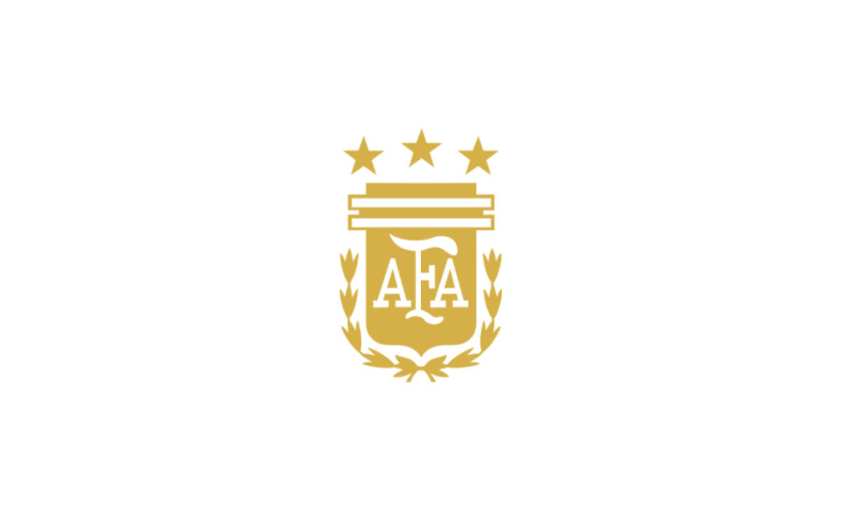
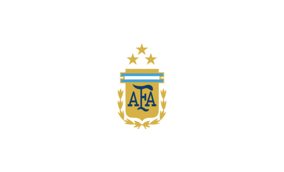
For the 2024 cycle the federation flattened the crest. The version in use today strips the shading to a single gold tone, simplifies the cap to flat white-and-gold outlined bars and sets the interlocking AFA in white on the gold shield. The three gold stars sit above in a shallow arc, the center star raised slightly over the two outer ones, with the gold laurels framing both sides.
This is the current era. Three stars, a cleaner shield, the count still open.
What's in the Current Argentina Badge
Good logo design makes every element justify its place. The current crest passes that test because the federation spent decades adding only what it had earned.
Gold shield: the body that has anchored the mark since the 1966 redesign, framed by a blue-and-white striped cap.
AFA monogram: the ligatured federation initials, the oldest element on the badge, in use since 1930.
Laurel wreath: the victory frame, present since 1966 and constant since the 1982 redesign.
Three stars: 1978, 1986 and 2022, the three World Cup titles, each added well after the win except the last.
Flat finish: the 2024 work cut the shading toward a cleaner, outlined treatment built for screens and small sizes.
What this badge really is, when you look closely, is a counter. Most national crests record a finished history. The strongest of them grow without reinvention, the lesson behind Real Madrid's century of restraint and Liverpool's slow refinement of the Liver Bird.
Argentina's is different. It is still adding. A fourth title in 2026 would force a real decision, because three stars sit cleanly in a shallow arc above the shield and a fourth breaks the balance. The federation would face the layout Brazil and Italy already manage, a block or a wider spread.
That is the rare part. This is a major national badge whose history is not closed. It is still counting.

Looking to apply the same approach to your growing market? We can connect you with the right creative partners.
Browse our Agency Directory to find the most capable agency that can help elevate your brand:
And if you’re curious for more inspiration, don’t miss our other features on standout logo designs in sports.