Liverpool Football Club, founded in 1892, has built an identity synonymous with excellence, passion, and tradition in football. A key part of this identity is its Liverpool logo, which has undergone multiple transformations over the decades.
From intricate early designs to the simplified Liverpool crest we see today, the club’s badge evolution reflects historical influences and modern branding trends.
Liverpool Logo Design Details
Liverpool FC’s Liver Bird logo is a bold, unmistakable emblem of the club’s identity. The Liver Bird remains the central focus, representing Liverpool’s history and deep connection to the city.
The striking red color reinforces the club’s energy and presence, a defining trait both on and off the pitch. Paired with the clean "L.F.C." typography, the design strips away excess detail, creating a strong, recognizable mark that honors tradition while remaining versatile for modern use.
Significance of the Liver Bird
The Liver Bird, a mythical creature based on a cormorant, has symbolized Liverpool for centuries, representing the city’s maritime heritage. Thought to be based on a cormorant or an eagle, the Liver Bird is depicted holding a sprig of seaweed in its beak, signifying Liverpool’s maritime heritage. It is prominently featured atop the Royal Liver Building, one of the city’s most iconic landmarks.
Liverpool Logo History
The Liverpool logo history features multiple redesigns, each reflecting a specific era in the club’s development. Below, we break down the major iterations of the Liverpool crest and how it has evolved.
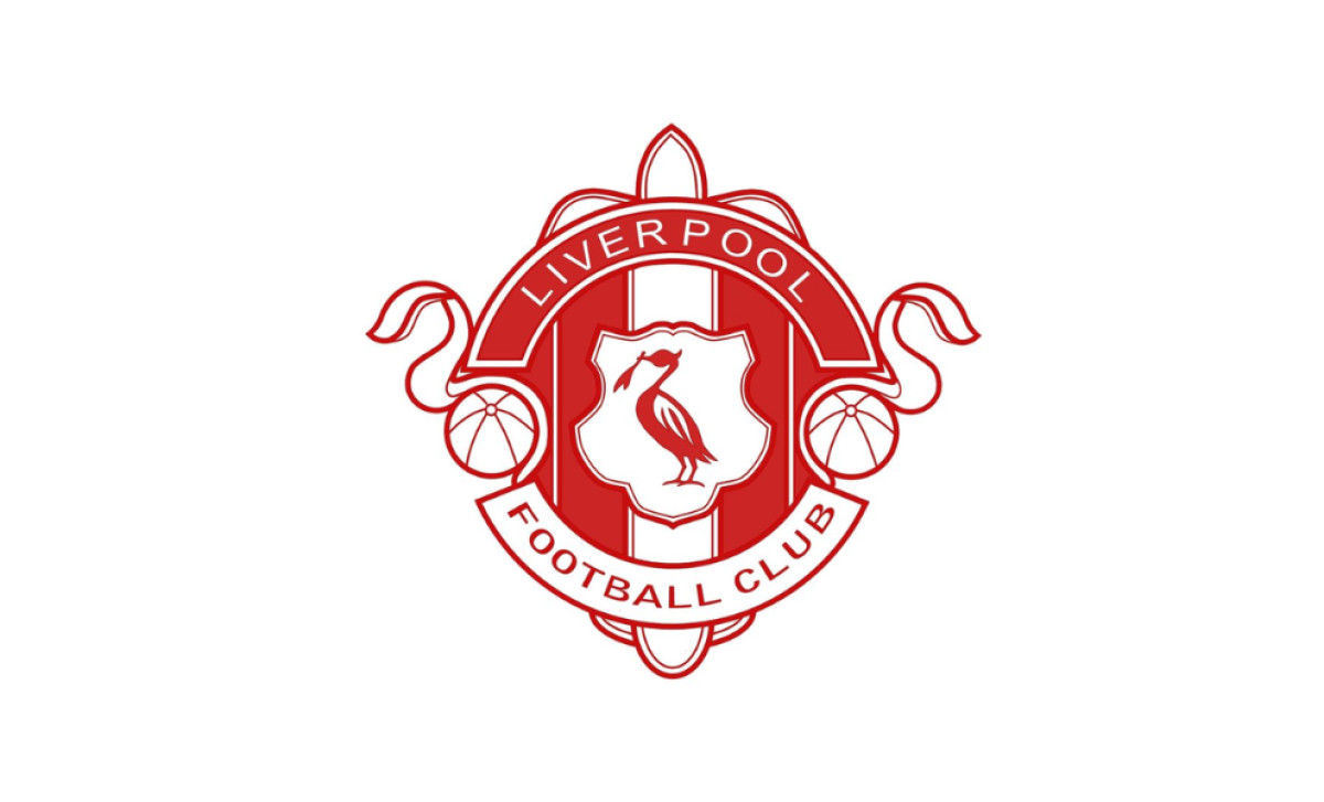
1892: The Original Liverpool Coat of Arms

Liverpool FC’s first logo was directly inspired by the Liverpool city coat of arms, featuring an intricate heraldic design. It showcased a shield with the Liver Bird, flanked by mythological figures (a Neptune-like guardian of the sea and a Triton blowing a conch), reinforcing Liverpool’s maritime heritage. A ribbon banner at the bottom carried the club’s name in an ornate style, while the top of the crest bore the Latin motto, “Deus Nobis Haec Otia Fecit” (God has granted us this ease).
This design firmly tied the club to the city’s identity, emphasizing tradition and civic pride. However, its intricate detailing made it impractical for sports branding. While historically significant, this version lacked the adaptability needed for kits and merchandise, leading to later refinements.
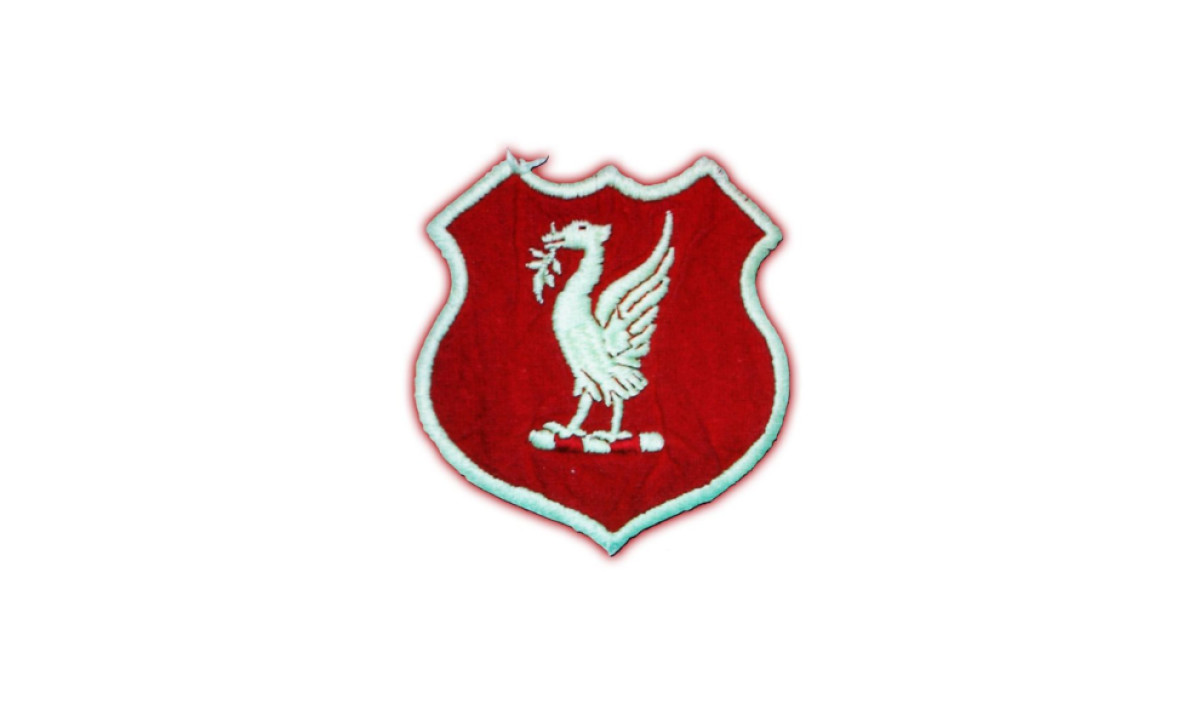
1940s: A More Simplified Badge
By the 1940s, Liverpool FC refined its crest into something sharper and more purposeful. The ornate figures of the original design were dropped, leaving the Liver Bird as the undisputed focal point within a streamlined shield.
Footballs were added, making the football club’s identity unmistakable. The result was a cleaner, more structured emblem — one that felt more at home on a football kit than a coat of arms.
1950s – The First Simplified Liver Bird Emblem
The 1950s marked a turning point in Liverpool’s visual identity, as the club fully embraced a simplified, emblematic approach. The design featured the Liver Bird in a more stylized form, standing atop a rolled-up maritime scroll, a continued nod to Liverpool’s seafaring heritage. The bird itself was more refined and pronounced, with its wings spread upward in a sharp, angular fashion, adding a sense of movement and authority.
The shield shape remained, reinforcing the club’s sense of tradition and strength. The red and white color scheme was carried over from previous versions, ensuring continuity, with a bold red background and a contrasting white Liver Bird.
1955: Addition of Club Initials
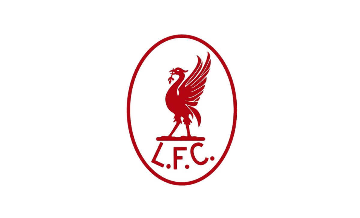
In 1955, the club refined its crest by adding “L.F.C.” initials beneath the Liver Bird, marking the first time the team’s name was explicitly represented on its badge. The bird itself became more stylized, and the overall design was enclosed within a white oval with a red border, giving it a distinct frame.
This version enhanced brand recognition while maintaining a minimalist approach. The Liver Bird remained central, ensuring continuity with the club’s identity. Still, adding the club’s initials helped cement its association with Liverpool FC rather than just the city itself.
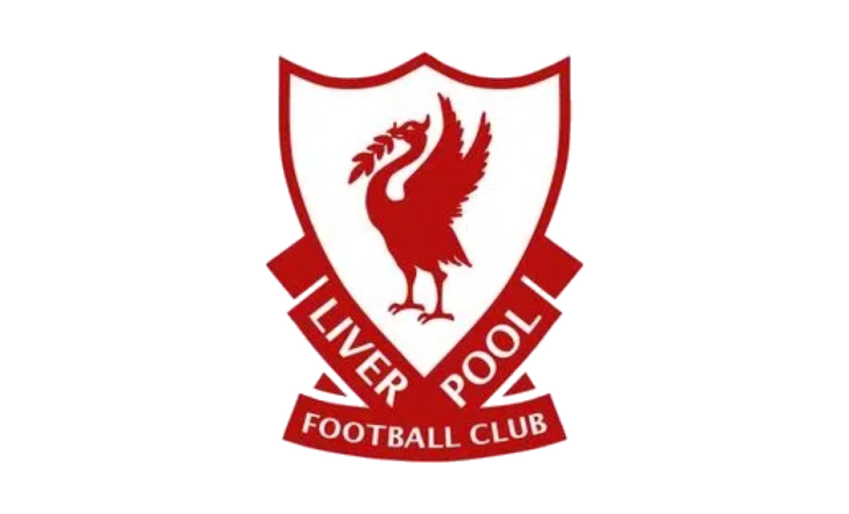
1968–1987: Streamlined Design
This logo introduced a sharper, more angular version of the Liver Bird, marking a shift toward a bolder and more modern identity. Unlike earlier iterations, this Liver Bird featured elongated wings with pronounced feather details, giving it a more aggressive stance. The bird retained its signature seaweed in its beak, while its legs appeared more structured and firmly planted, emphasizing strength and stability.
Beneath the Liver Bird, the club’s initials, "L.F.C.", were displayed in a wide-set, slanted font, adding a contemporary touch that aligned with the club’s growing stature. The red-on-white color scheme remained, ensuring strong visibility across kits and merchandise. This version of the badge became iconic during the club’s most successful era, coinciding with Liverpool’s dominance in English and European football.
Explore 35 of the most iconic logos and their branding impact.
1987–1992: Reintroduction of the Shield
For the first time since the 1940s, the club’s full name — “Liverpool Football Club” — was incorporated into the crest, split across a ribbon banner at the shield's base. This was a significant branding shift, as earlier versions had only included the initials "L.F.C." The typography was bold and capitalized, emphasizing Liverpool’s stature as a dominant force in English football.
1992–1993: Centenary Crest with "You'll Never Walk Alone"
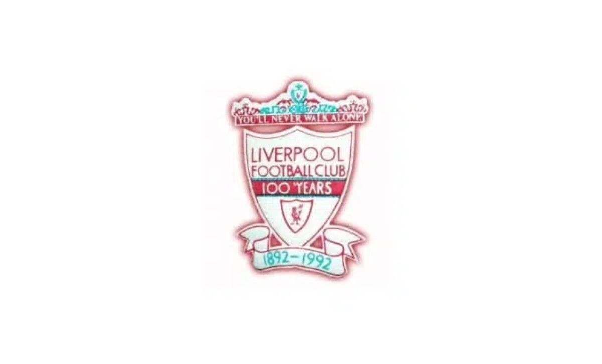
To mark Liverpool FC’s 100th anniversary, the club unveiled a commemorative crest in 1992 that introduced several symbolic and historical elements for the first time. At the top of the design, the Shankly Gates were incorporated, featuring the club’s famous anthem, “You’ll Never Walk Alone,” inscribed in bold lettering.
The shield remained the focal point, featuring the Liver Bird in its traditional stance, but it was now flanked by scroll banners marking the centenary years (1892–1992). A bold “100 YEARS” inscription was placed centrally, making it clear that this was a special-edition badge.
While the core red-and-white color scheme remained intact, this version introduced green as a third accent color for the first time, appearing in the decorative elements of the Shankly Gates.
Significance of the Shankly Gates
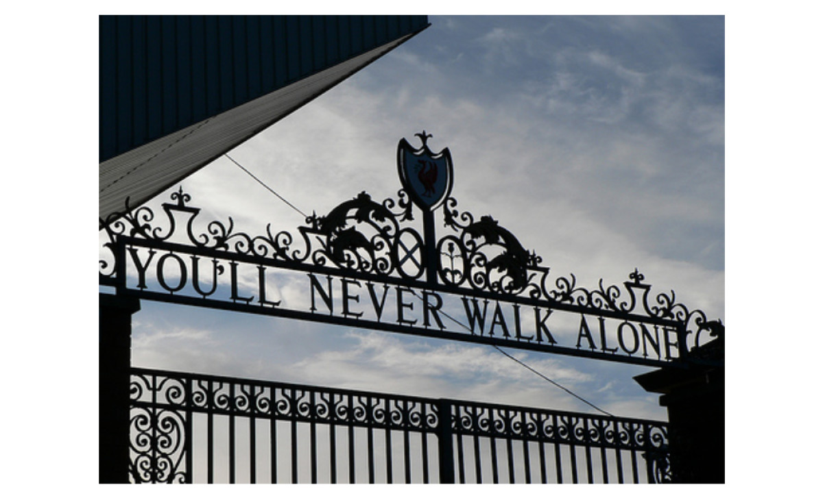
The Shankly Gates constitute a formal entrance to Anfield Stadium, the home ground of Liverpool Football Club, and serve as a memorial to William 'Bill' Shankly, the club's celebrated manager during the mid-20th century.
1993–1999: Simplified Shield with Eternal Flames
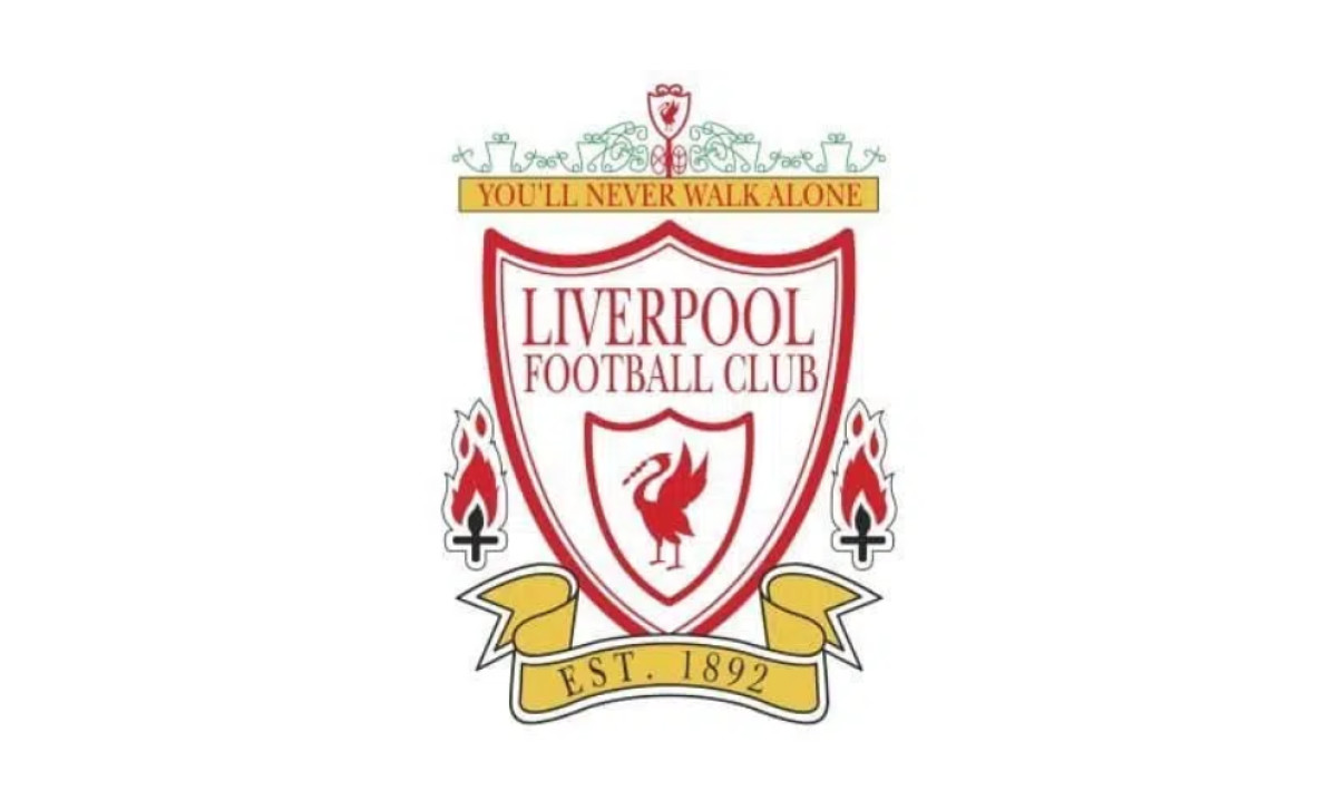
Following the centenary celebrations, Liverpool FC again tweaked its crest in 1993. The most notable update was the addition of the eternal flames outside the shield, a lasting tribute to the 96 victims of the Hillsborough disaster. These flames, positioned on either side of the shield, served as a solemn but powerful memorial, ensuring that their memory remained an integral part of the club’s identity.
The Shankly Gates and the "You'll Never Walk Alone" banner remained at the top of the crest, reinforcing Liverpool’s ethos of unity, resilience, and unwavering support. The green detailing in the Shankly Gates, first introduced in 1992, was retained. Below the shield, a golden ribbon inscribed with "EST. 1892" was introduced, marking the club’s founding year and adding a touch of prestige and heritage.
1999–Present: Modernized and Stylized Shield
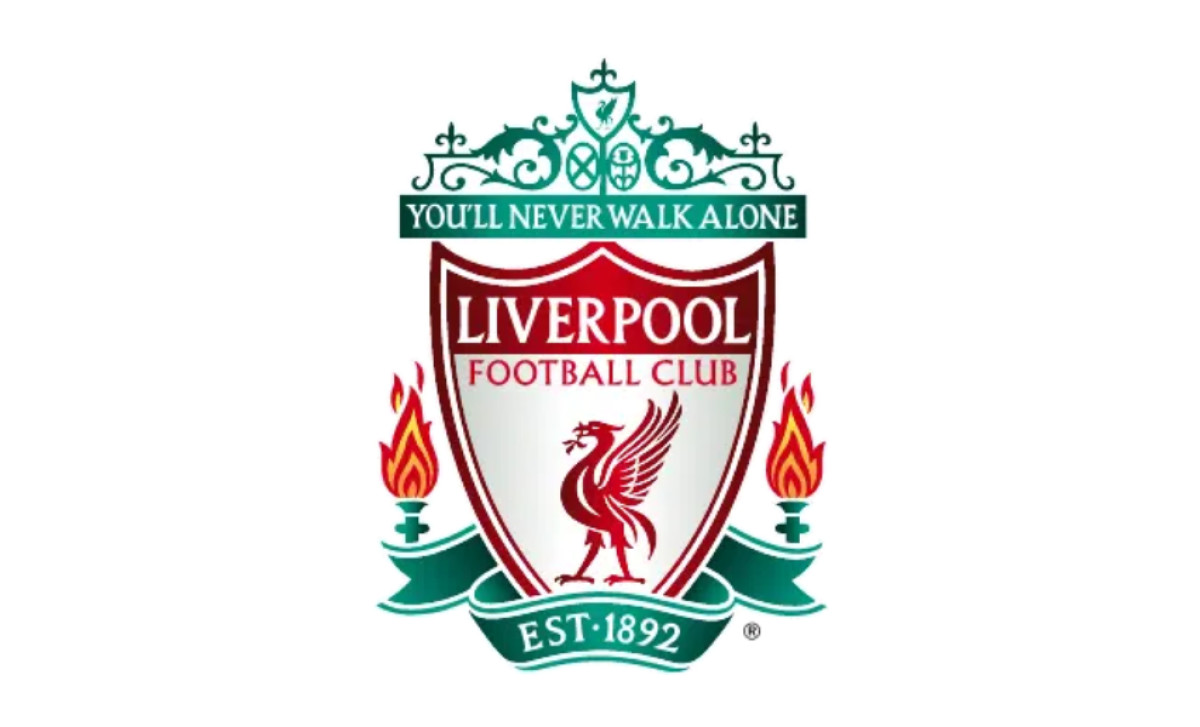
In 1999, Liverpool FC refined its crest again, creating a sleeker, more adaptable emblem. The Liver Bird’s lines were sharpened, giving it a powerful, more defined presence, while the club’s name remained in bold, uppercase typography for clarity and impact. The color palette was deepened, with richer reds symbolizing tradition, vibrant greens representing renewal, and white and gold accents enhancing contrast.
Key elements from past versions were streamlined without losing their significance. The Shankly Gates and "You’ll Never Walk Alone" banner were adjusted for better legibility, while the eternal flames — honoring the Hillsborough victims — were made bolder. The "EST. 1892" inscription at the base was set within a cleaner green banner, reinforcing Liverpool’s long-standing heritage.
2017: 125th Anniversary Retro Logo
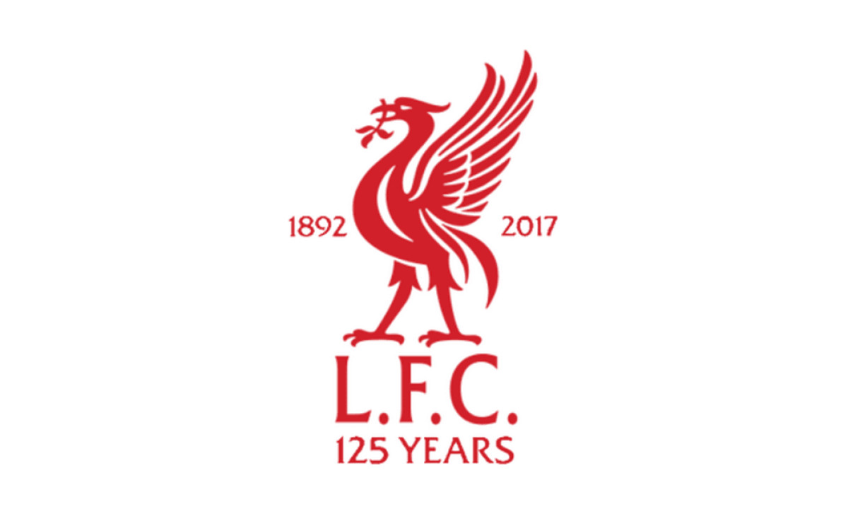
For its 125th anniversary, Liverpool FC introduced a special edition crest that stripped away modern embellishments in favor of a clean, heritage-inspired design. The emblem featured the Liver Bird in its purest form, standing tall and defiant, clutching its traditional seaweed. The years "1892" and "2017" flanked the iconic figure, marking the club’s historic milestone. Below, “L.F.C.” and “125 YEARS” were inscribed in a bold, understated typeface, reinforcing the anniversary's significance.
This design was a direct nod to the club’s early badges, particularly the 1968–1987 iteration, which similarly showcased a minimalist Liver Bird without a shield or external elements. The crest paid homage to Liverpool’s legacy by adopting this stripped-down aesthetic while maintaining a sleek, contemporary feel.
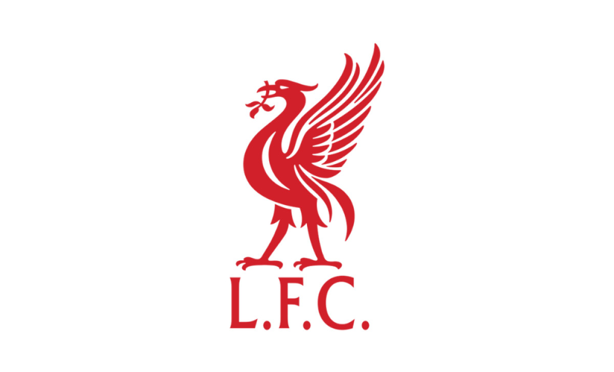
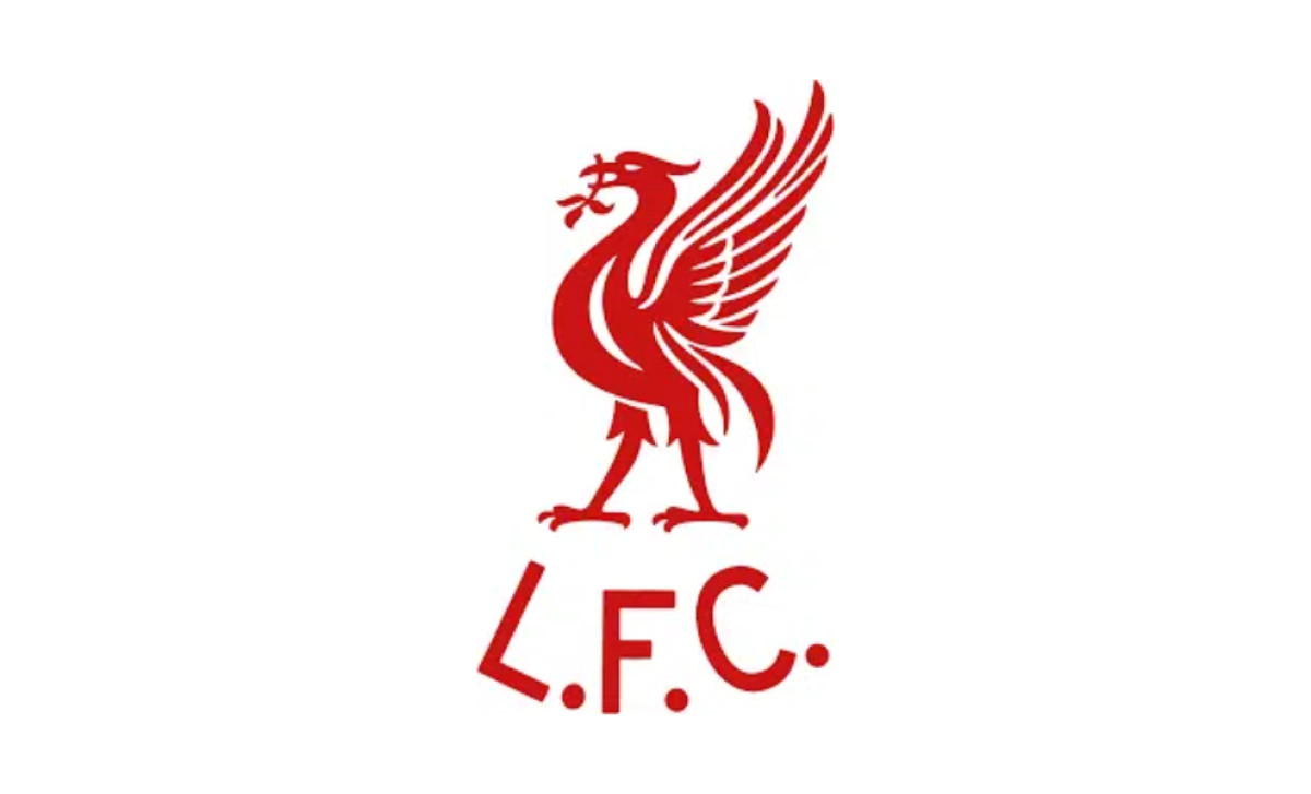
2012–Present: The Minimalist Liver Bird Badge
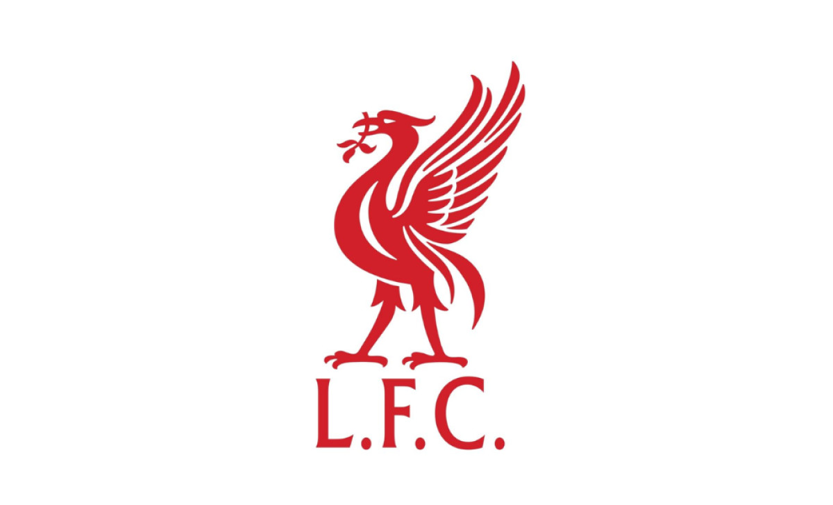
Reminiscent of the 1968–1987 badge, this design embraces simplicity, clarity, and timeless elegance. Removing shields, banners, and decorative elements offers a clean, unembellished tribute to the club’s legacy while ensuring a modern, globally recognizable identity.
Liverpool Logo: A Timeless Football Emblem
The Liverpool logo has seen a remarkable journey, evolving from a complex coat of arms to a globally recognized football emblem. The Liver Bird, though a simplified symbol in its most recent form, has remained a constant, symbolizing the club’s deep connection with the city of Liverpool.
Today’s Liverpool FC badge represents more than just a club — it embodies a legacy of success, resilience, and an unwavering fan base.
