Standout Features:
- Modern logo redesign
- Integrated brand name initial
- Sleek and professional typeface
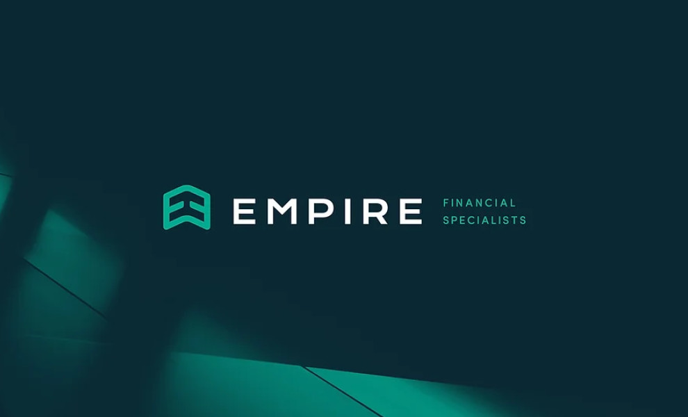
Empire’s logo is designed by Nektar Design is one of the best finance logo designs. The whole illustration already exudes business excellence, development, and sustained growth at first glance.
The company is dedicated to upward progress, as shown by its logo symbol. It features an upward arrow illustrated via a vector icon with an outlined detail. And it’s not your regular icon, too.
If you look closely, the arrow is made up of two intertwined and mirrored letters Es, highlighting the brand name’s initial. Visual representation, check!
Sitting beside this magnificent illustration is the Empire brand name, written in a straightforward yet futuristic typeface to show that the company is future-proof and always at the top of its game.
The designers also added the word “financial specialists” in place of a tagline. You see, even with a simple logo, you can instantly create brand awareness and educate the consumers about the nature of your business!