Standout Features:
- Elegant custom serif typography
- Grid-based logo construction
- Luxurious gold foil application
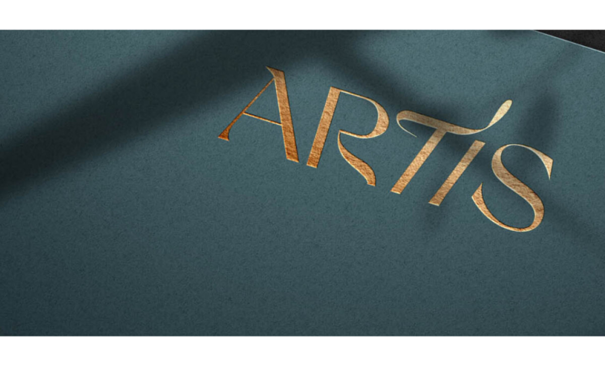
The Artis logo, designed by Noyk, embodies refined sophistication and cultural richness. Created for a restaurant nestled in the historic heart of Brașov, Romania, Artis blends local heritage, craftsmanship, and culinary art into a singular brand identity. The logo’s graceful serif characters and golden visual accents honor both history and modern sensibilities.
The most distinctive feature of the Artis logo is its custom-designed serif typography. Each letterform is meticulously drawn, combining sharp strokes with ornamental curves — especially evident in the “R” and “S.” These refined, high-contrast strokes evoke a sense of timeless elegance and echo classical calligraphy traditions.
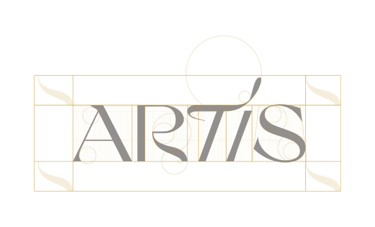
The development of the Artis logo follows a precise geometric grid system, as revealed in its design blueprint. Circles define the proportions and spacing, reflecting the brand’s attention to detail. This structured foundation not only ensures balance and harmony in the logo but also aligns with the restaurant’s narrative of craftsmanship and intentionality.
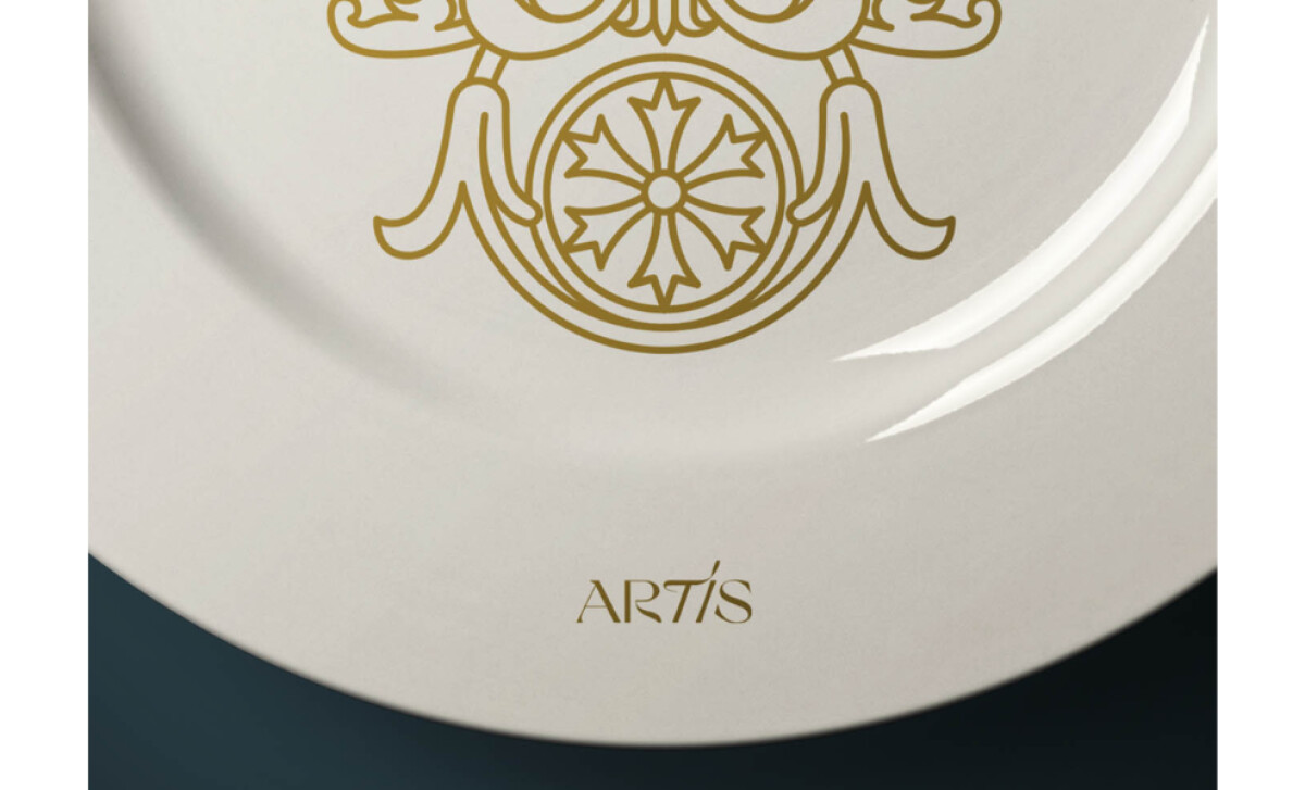
In its applied form, the Artis logo is often showcased in gold, as seen in menu designs and branded items like fine dishware. This luxurious color treatment amplifies the elegance of the logo and enhances its physical presence. Gold, long associated with prestige and timelessness, aligns perfectly with the upscale yet artistic character of the brand.
The Artis hospitality logo encapsulates the spirit of a brand that values artistry, heritage, and hospitality. Through its elegant custom typography, grid precision, and premium gold application, the logo becomes a visual metaphor for the curated experience Artis offers. It invites guests into a world where history and design merge seamlessly.