Team Behind the Design
Logo Design Analysis
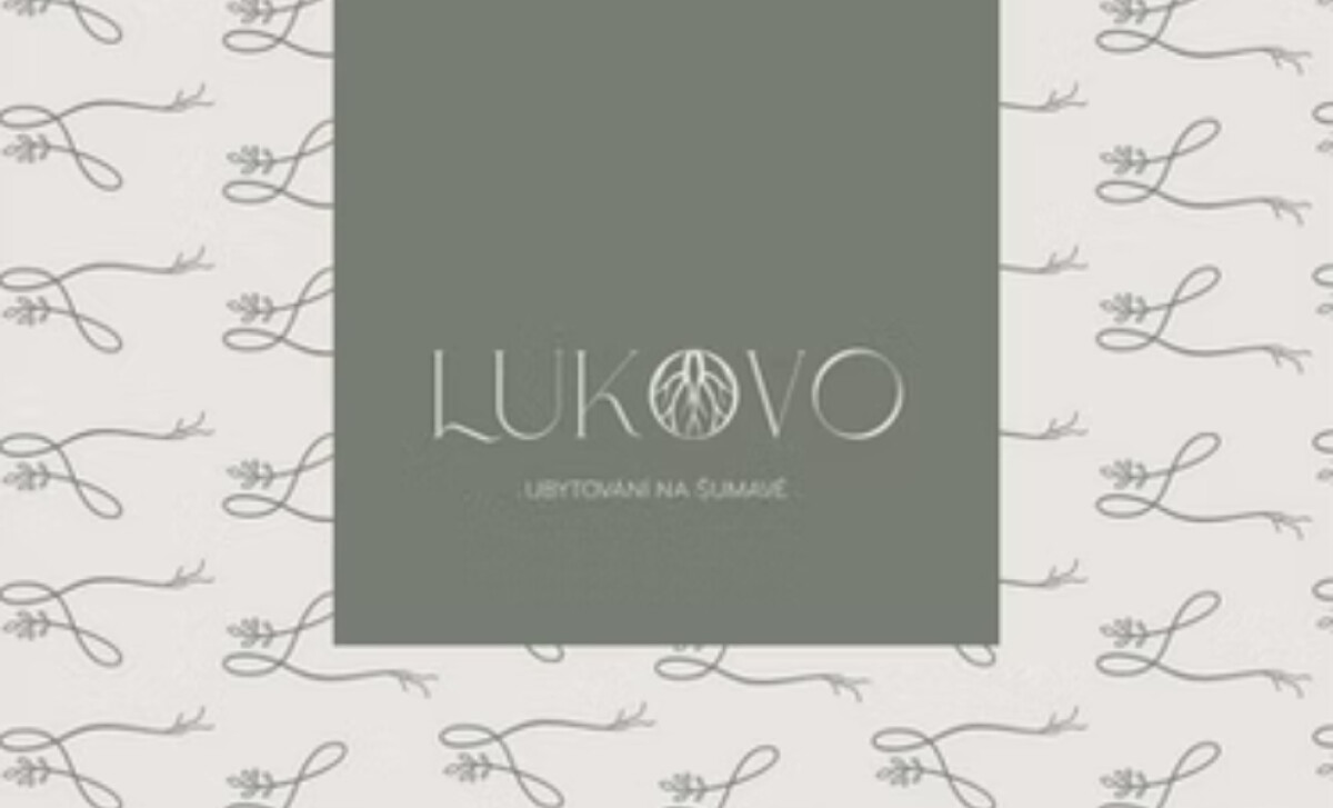
In hospitality logo design, it’s often the blend of elegance and natural symbolism that builds emotional resonance.
LUKOVO’s identity follows that principle, pairing delicate organic cues with a boutique serif system to create a calm, grounded, premium presence.
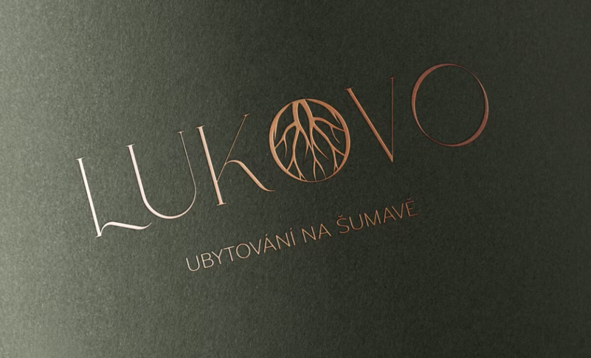
- Concept & Symbolism: The root-inspired “O” creates a meaningful anchor within the wordmark. I like how its branching lines add depth without disrupting the logo’s balance, grounding the brand in nature while still feeling polished.
- Typography & Letterforms: The high-contrast serif gives the identity height, grace, and a quiet sense of luxury. I appreciate how the fine stroke transitions help position LUKOVO as a refined retreat rather than a rustic stay.
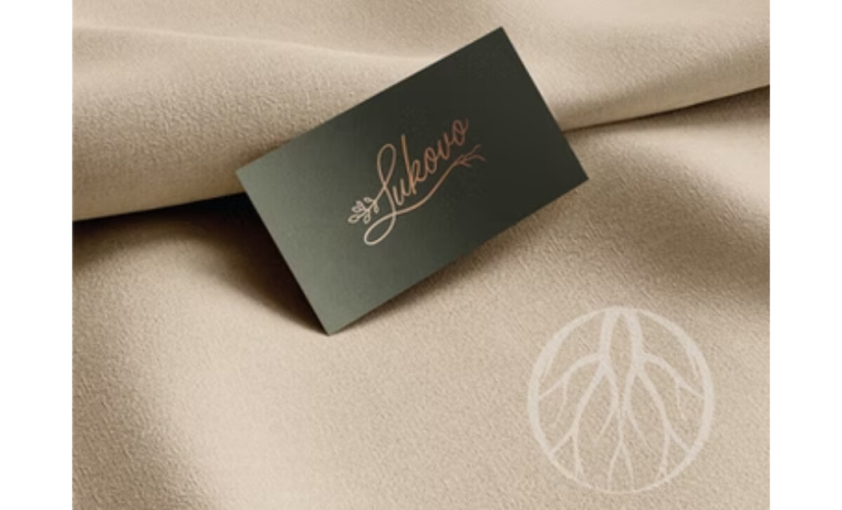
- Color & Finish: The warm copper-rose foil used across printed assets enhances the brand’s premium tone. This metallic warmth works beautifully against dark surfaces, and I find it effective in creating tactile, memorable first impressions for guests.
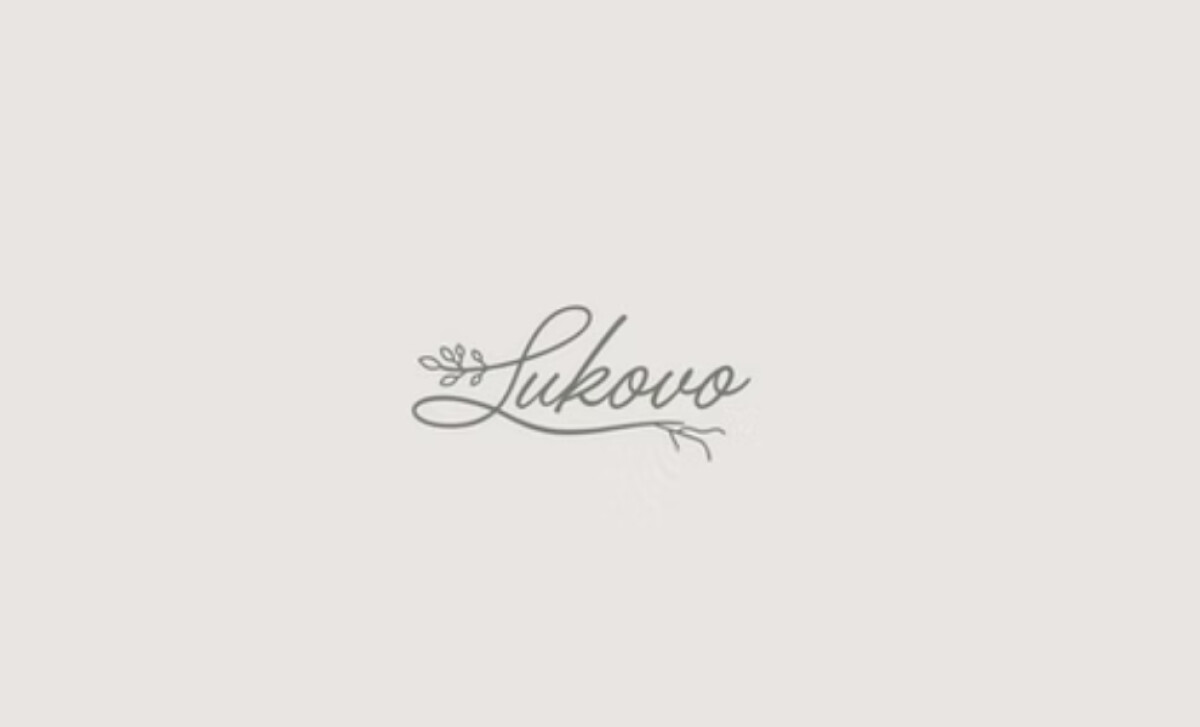
- Script Variant & Expression: The organic script version introduces a softer, more personal tone. I like how the branching detail in the initial “L” ties back to the main root motif, creating cohesion across the system.
What Brands & Agencies Can Learn from LUKOVO
LUKOVO’s identity demonstrates how organic symbolism and refined typography can work together to evoke atmosphere and intention.
1. Let Natural Motifs Create Emotional Anchors
Incorporating roots, branches, or regional elements can deepen a brand’s sense of place. These details help communicate values and environment without relying on literal illustration.
2. Balance Elegance With Warmth
High-contrast serif lettering paired with earthy tones can create a premium feel that still feels inviting. This balance is especially effective for boutique accommodations seeking distinction without formality.
3. Use Secondary Variants to Expand Brand Expression
Script marks, submarks, and subtle patterns give hospitality brands flexibility across touchpoints. These variations help adjust tone — soft for personal moments, strong for primary signage — while staying visually unified.
About DesignRush Featured Designs
At DesignRush, we evaluate hundreds of projects each month. Featured selections stand out for clarity, craftsmanship, conceptual depth, and execution across digital and brand experiences.
The strongest examples move on to our Monthly Design Awards, highlighting best-in-class creative work.
Check out more standout work across categories:
- Best Logo Designs
- Best Website Designs
- Best App Designs
- Best Print Designs
- Best Packaging Designs
- Best Video Designs
For a full list of design agencies and related services, see our Agency Directory.


