- Agency: Like Minded Studio
- Client: Crown Melbourne
- Category: Logo Design
- Location: Surry Hills, Australia
- Project Brief: Create a logo conveying a music-driven bar identity through bold typography and cultural references for strong recognition.
A pop-up venue brand lives or dies in a single glance. Asahi Otoya, Like Minded Studio's identity for a summer vinyl bar at Crown Melbourne, makes its case immediately.
Like Minded Studio built the concept into the type choice itself.
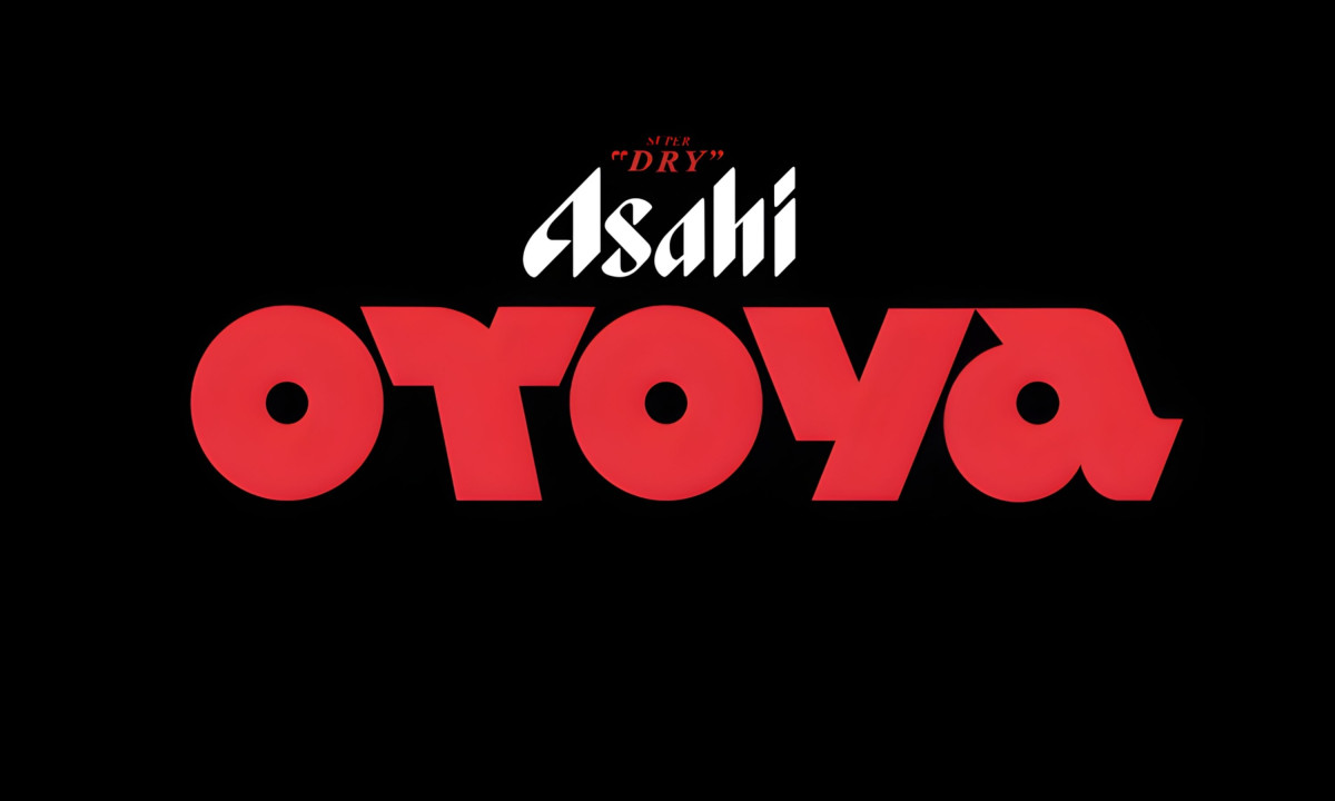
Module, a typeface by Type Department, gives the Otoya letters a vinyl quality through oversized circular counters at display size. The wide, heavy forms pull from both record label design and Tokyo neon culture. The two references sit in the same mark without either one taking over.
The typographic pairing earns its tension. The Asahi wordmark sits above in a high-contrast blackletter, a deliberately old-world choice against the bold modernity of the Otoya logotype. One is maximally decorative, the other maximally geometric. The red and black palette holds them together on its own.
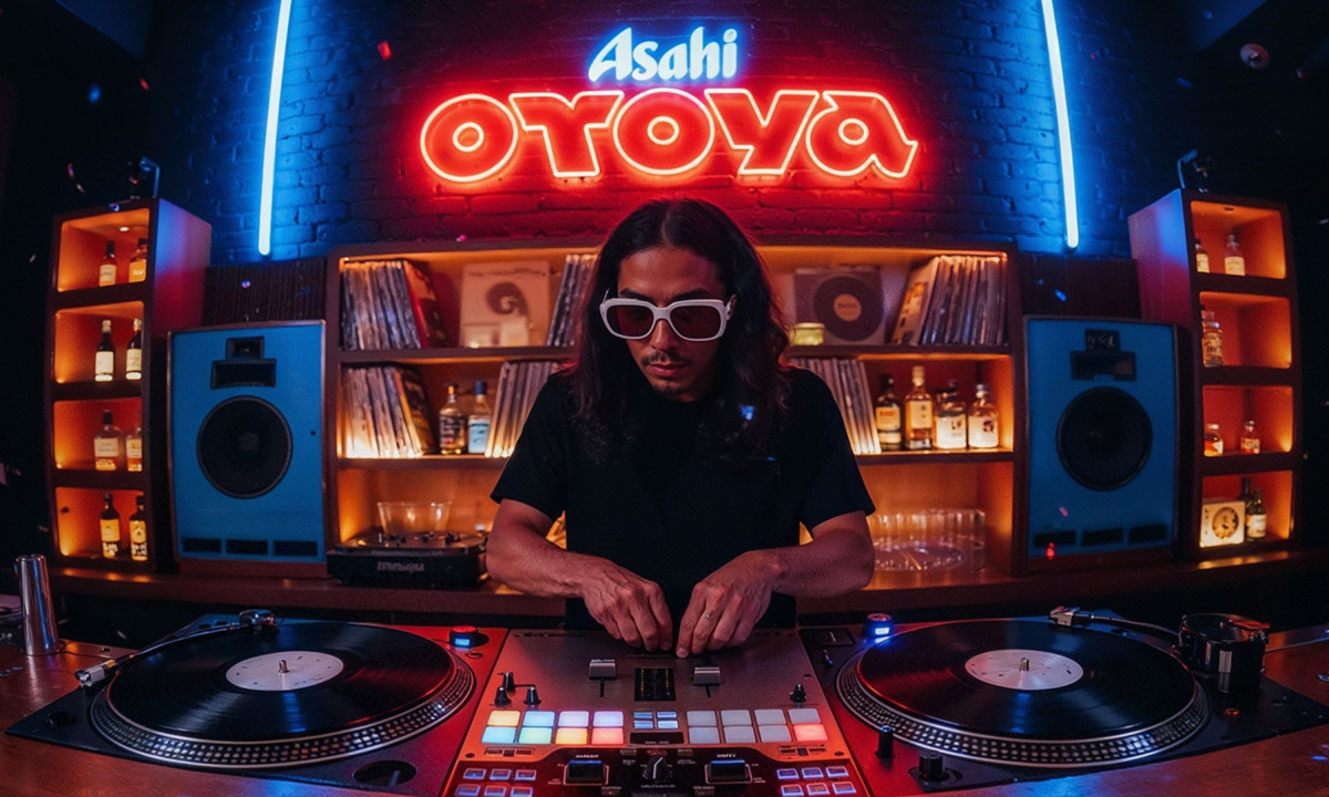
The logo translates cleanly across every application, from neon signage to vinyl-shaped coasters, because the core letterforms are strong enough to carry the concept without additional decoration.
That scalability is the mark of a logo built for a venue environment, where the identity has to read across physical surfaces, low-light conditions, and merchandise simultaneously.
What Like Minded Studio made is a hospitality logo where the typography does all the storytelling. For a vinyl bar rooted in izakaya culture, that's the right call.