Standout Features:
- Retro car imagery
- Bold, vintage typography
- Classic color palette
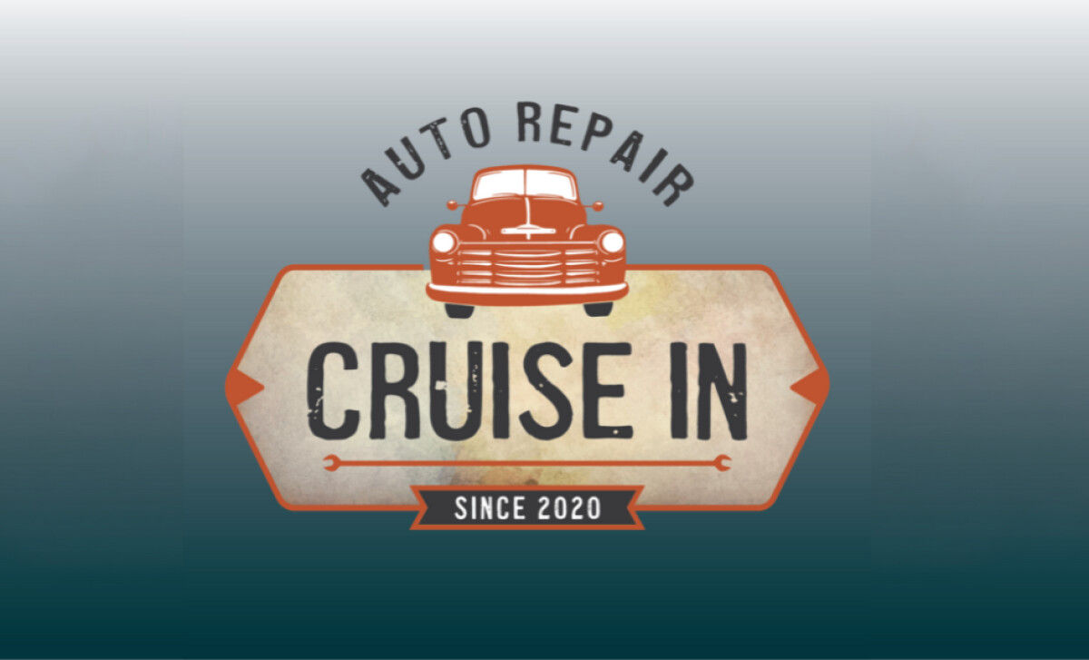
The Auto Repair Cruise In logo by Hard Row Design & Marketing, LLC cleverly combines retro automotive themes with a professional look. The logo uses vintage elements to evoke nostalgia while maintaining a modern, approachable feel for an auto repair business, capturing both craftsmanship and customer trust.
The logo features a stylized car from a bygone era, instantly reminding viewers of classic automotive design. This imagery conveys both expertise in auto repair and a sense of history, making the logo relatable and visually memorable for automotive enthusiasts.
The typography of the logo is bold and distressed, reflecting a retro yet rugged feel. The large, clean font makes the business name stand out, ensuring easy readability, while the vintage touch adds personality and reinforces the company’s legacy in auto repair.
The combination of earthy, warm tones like orange and beige, contrasted with the deep blue gradient, creates a timeless look. The colors evoke reliability and professionalism while offering an inviting, approachable feel to the overall logo design.
Auto Repair Cruise In logo’s retro car imagery, bold typography, and meaningful use of tools create a strong visual identity that resonates with customers. For businesses looking to build a memorable brand, applying the best logo design principles like those seen here, will foster customer loyalty and recognition.