Standout features:
- Clever dual-meaning concept
- Strong geometric iconography
- High-contrast motivational color palette
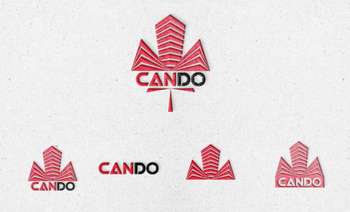
At the crossroads of construction excellence and brand storytelling stands CANDO, a company whose name itself carries deep meaning. Tocographic Inc captured this perfectly with a logo design that symbolizes strength, engineering prowess, and unstoppable ambition.
The genius of the CANDO logo lies in its layered meaning. "Can do" in English conveys action and positivity. Simultaneously, “Cando” in Farsi means beehive. The logo’s shape, resembling a stylized maple leaf combined with upward-pointing structures, nods both to Canadian pride and to the beehive’s architectural connotations.

The emblem utilizes sharp lines and symmetrical patterns to create a sturdy, geometric figure that mimics skyscrapers or stacked construction blocks. The clever alignment and mirroring effect deliver an immediate impression of structural integrity and precision — core qualities for a construction firm.
Red dominates the visual identity, with subtle gradients adding dynamism and energy. Red universally symbolizes action, strength, and determination — perfect for a brand that champions “I can do” attitudes. On the other hand, the black accenting provides grounding and sophistication.
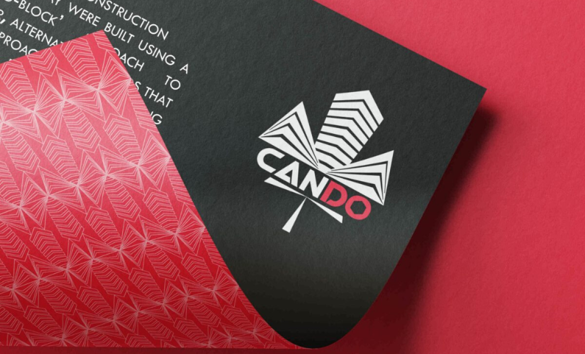
The result is a brand identity that feels simultaneously aspirational and grounded, reflecting the company's commitment to excellence in the construction industry. If you're looking to build a brand presence that balances storytelling with strategic visual impact, CANDO’s professional services logo is a blueprint for success.