Team Behind the Design
Logo Design Analysis
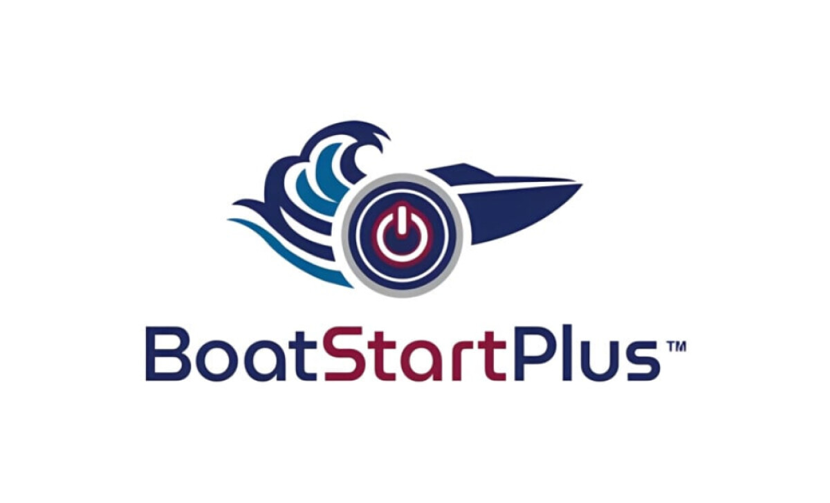
BoatStartPlus, a next-generation supercapacitor system that ensures reliable engine starts for recreational boaters.
Carbon3Sixty, Inc takes what could have been a purely functional mark and gives it a sense of readiness that fits both the product and the marine lifestyle it supports.
- Concept: What stood out to me right away was the integration of the boat silhouette with the power symbol. The wave curve adds energy, while the circular form feels stable, like the calm surface of water before ignition. It tells the whole story in one glance: motion, activation, and control.
- Typography: I really like how the logotype supports the icon rather than competing with it. The sans-serif font feels engineered and trustworthy, but the spacing keeps it approachable. Highlighting “Start” in red not only reinforces the ignition idea but also gives the logo a natural visual rhythm.
- Color & Emotion: The navy, bright blue, and red palette feels patriotic while evoking trust, motion, and energy. Strong contrast gives it a clean, confident expression of American craftsmanship.
- Scalability & Application: Whether on a compact label or a trade show booth, the logo scales effortlessly. Its circular geometry maintains clarity across digital, packaging, and embroidered uses, ensuring a strong presence at any size or format.
Impact & Recognition
The BoatStartPlus rebrand made its public debut at IBEX 2025 (International BoatBuilders’ Exhibition & Conference) in Tampa, Florida — the leading showcase for marine innovation.
The launch generated an impressive market response:
- Six boat builders and marine dealers requested product samples for testing immediately after seeing the new identity.
- Trade show visitors responded enthusiastically, noting the logo’s instant clarity and strong name recognition.
This positive reception confirmed the rebrand’s success as one of the best professional services logos today.
Collaborator Input
For an inside look at the project, here are takeaways from the creators.
Word from the Agency
“The logo’s design approach — combining boat iconography, wave motion, and power symbolism — resonated with both technical buyers and end consumers, achieving the difficult balance required for dual-market appeal.”
— Carbon3Sixty Design Team
What Brands & Agencies Can Learn from BoatStartPlus
The BoatStartPlus identity shows how thoughtful professional services logo design can turn technical innovation into a clear, emotionally resonant brand experience. Here are a few takeaways for design teams and marketers.
1. Design a Logo That Explains Itself
Integrating visual cues like motion or function helps users instantly understand what a product does. Clear symbolism builds trust and speeds recognition.
2. Balance Precision with Personality
Combine structured geometry with expressive elements to humanize technical products. This approach makes innovation feel both credible and approachable.
3. Use Color to Build Connection
A purposeful palette can reinforce origin, emotion, and brand story. Strategic color choices help transform a functional mark into something people remember.
About DesignRush Featured Designs
At DesignRush, we review hundreds of agency projects each month to uncover standout work in branding, digital, and visual design. The featured designs represent some of the most compelling executions, standing out for clarity, creativity, and technical precision.
Top-performing projects often advance to our Monthly Design Awards, gaining wider industry recognition.
See more creative projects across categories:
- Best Logo Designs
- Best Website Designs
- Best App Designs
- Best Print Designs
- Best Packaging Designs
- Best Video Designs
For a full list of design agencies and related services, visit our Agency Directory.
-preview.jpg)