Standout Features:
- Sophisticated serif and sans-serif typographic pairing
- Dramatic hierarchy created through visual weight
- Minimalist line framing for a polished, emblematic feel
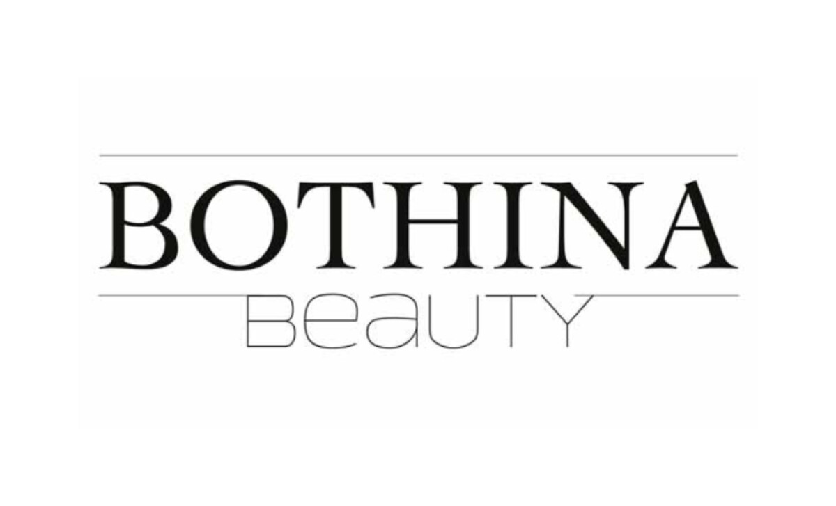
WAL Werbeagentur’s design for the Bothina Beauty logo showcases a purely type-based solution for a high-end beauty studio. In a sector where elegance and authority are key, this identity leverages sophisticated font pairing and minimalist framing.
A key feature is the juxtaposition of two font families. The primary name, "BOTHINA," uses a bold, classic serif with an editorial feel. The word "BEAUTY" is rendered in a light, geometric sans-serif. This intentional pairing demonstrates a nuanced understanding of how typefaces can communicate elegance.
Getting this pairing right is crucial, as reports show that 75% of consumers believe the ‘look and feel’ of a logo can make or break a company’s success.
The logo uses dramatic visual weight to establish a clear hierarchy. "BOTHINA" is presented in a heavy, commanding font. The much lighter and smaller "BEAUTY" acts as a refined counterpoint. This confident application of typography ensures the primary brand name is immediately recalled.
A minimalist line framing technique adds structure and a sense of deliberate composition. Two clean, horizontal lines enclose the "BOTHINA" name. Their thinness matches the stroke weight of the "BEAUTY" text, creating a cohesive look. This gives the logo the feel of a distinguished, classic nameplate.
A key insight from the Bothina Beauty logo is the power of minimalist framing and subtle details in elevating a typographic design. The clean horizontal lines and the consistency in stroke weight create a polished, emblematic feel, proving that even simple graphic elements can make a difference.