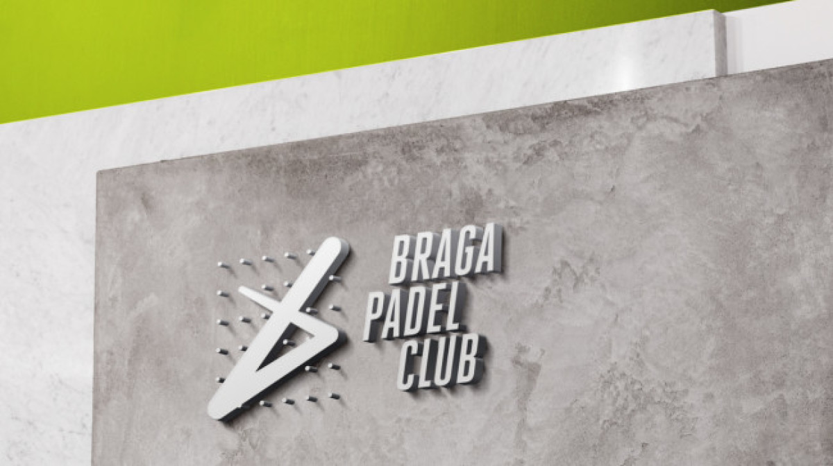
Standout Features:
- Creative dotted grid illustration
- Overlaid gradient icon
- Athletic font and color palette
Sports logos are pretty straightforward, but that didn’t stop Joao Loureiro from thinking outside the box. Literally.
The logo he created for Portugal’s Braga Padel Club sports a boxed illustration with a swooping icon that cuts through the design. And it isn’t just for show; it’s also made up of visual elements that aptly represent the most vital aspects of Padel.
The main symbol features a deconstructed square frame of a dotted grid that visualizes the court and how the game is played. On top of the frame sits a simple yet recognizable shape that serves numerous purposes: it imitates the ball’s movement, represents a Padel racket, and forms the brand name’s initial – the letter B.
That’s three meaningful symbols in one illustration!
But what instantly catches the eye is that refreshing green color. The gradient style is not only visually pleasing; it also creates the illusion of movement. It proves that you can still bring a logo to life, even with a static image.
Overall, it’s fresh, dynamic, and action-packed – the perfect visual identity for a sports club!