

- Agency: Studio AIO
- Client: Balance
- Category: Logo Design — Health & Wellness
- Location: Kuwait City, Kuwait
- Project Brief: Create a health and wellness logo design that reflects Balance’s premium food subscription experience through harmony, sophistication, and modern lifestyle branding.
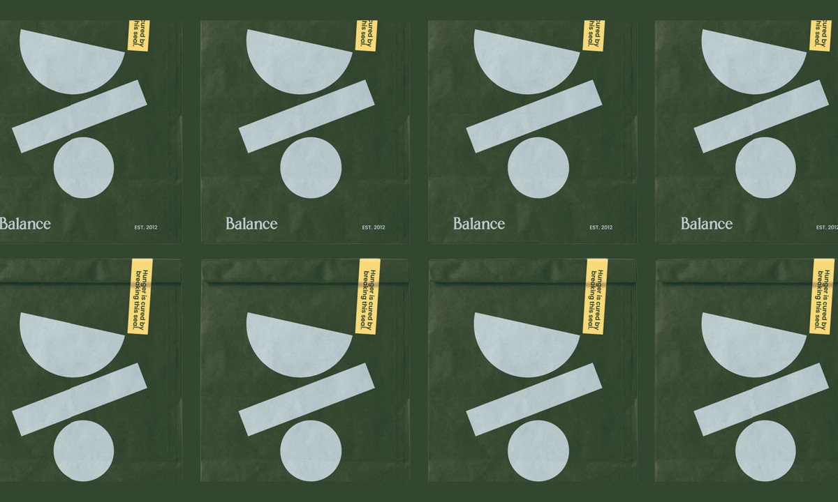
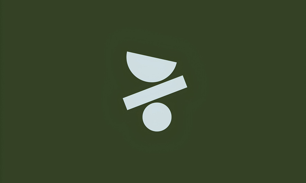
A health and wellness logo carries its concept furthest when the symbol does the philosophical work before the name does. Studio AIO's design for Balance builds from that premise, centering the system on a minimalist mark: a half-circle, a diagonal bar and a circle, three geometric shapes held in deliberate tension that reads immediately as equilibrium.
"The logo is very strong, the concept is very clear and unique."
- Lucia Barbaresso, Design Awards Jury
Deep forest green forms the primary surface across packaging and brand collateral, with pale ice blue handling the mark itself. Yellow appears as a punctuation color on cup carriers and seal stickers, warm enough to catch the eye without breaking the system's restraint.
The wordmark uses a custom serif that sits between stability and fluidity, grounded enough for a premium brand and relaxed enough for one built around intentional living. Copy like "Life isn't about perfection, it's about the Balance" and "Hunger is cured by breaking this seal" runs in small type across packaging surfaces, adding personality without competing with the mark.
"Clever, fun, and interesting."
- Beth Seitzberg, Design Awards Jury
The geometric symbol scales consistently from a dark green logo card to mustard yellow cups and olive delivery bags. Studio AIO builds an identity specific enough to carry a philosophy and flexible enough to travel across every surface a subscription brand touches daily.
"Complete alignment from concept to logo to promo items, packaging, and perks — wonderful work!"
- Andrea Owsinek-Brucker, Design Awards Jury