Standout Features:
- Playful and approachable typography
- Clever and fun visual elements
- Vibrant color scheme
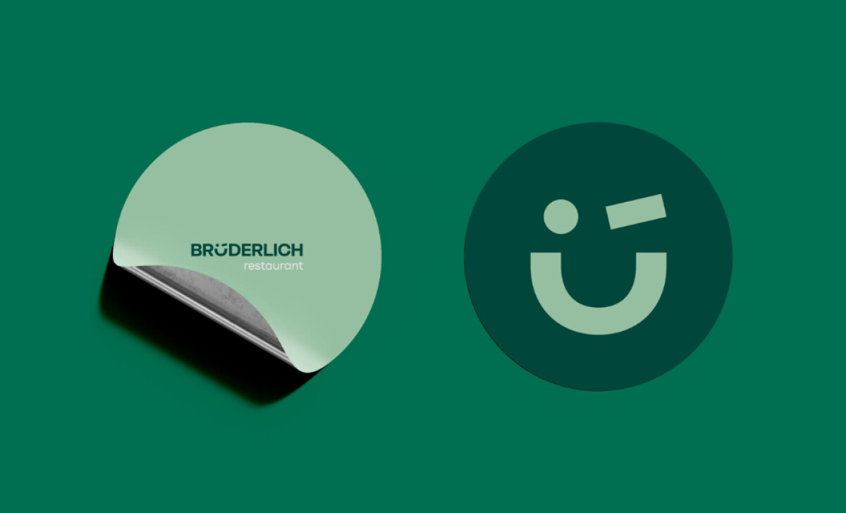
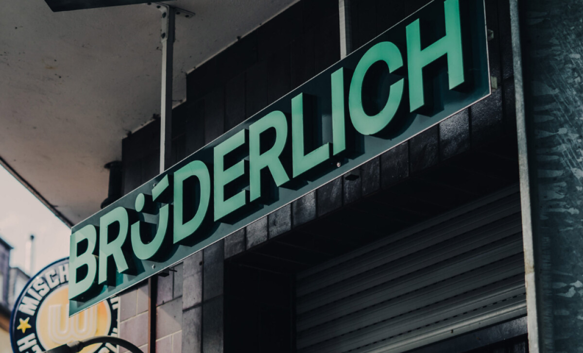
Brüderlich Restaurant, owned by brothers Till and Felix Feldkamp, offers a cozy, fun dining experience with a variety of beers and dishes that cater to every craving. Designed by just<less®, the logo for Brüderlich cleverly embodies the restaurant’s warm and lively atmosphere.
The typography in the Brüderlich logo is approachable and friendly, with a subtle playfulness that perfectly matches the restaurant’s casual, social vibe. The rounded, bold letterforms make the brand feel welcoming, ideal for a place where friends gather to enjoy a meal together. The font's clean lines also ensure the name is easily legible.
One of the most intriguing aspects of the Brüderlich logo is the use of an icon that doubles as a smiley face within the wordmark itself. The “Ü” letterform is cleverly turned into a winking face, which not only creates visual interest but also directly speaks to the concept of brotherly camaraderie and fun.
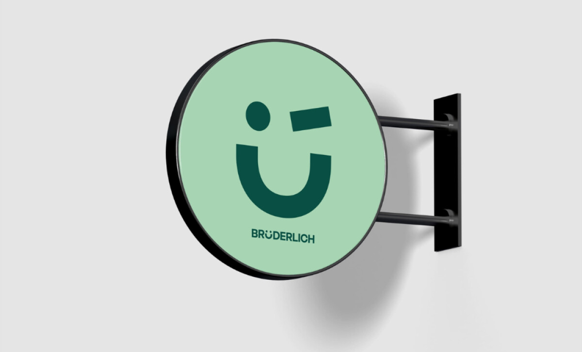
The green tones in the Brüderlich logo is a standout feature. Green often symbolizes vitality and community — qualities that align with the restaurant’s mission to create a lively, welcoming space. The green also has a subtle connection to beer (a primary offering of the restaurant), making it feel more aligned with the brand’s focus on fun, social gatherings.
The Brüderlich Restaurant logo by just<less® is a perfect example of how a well-executed logo can capture a brand's essence in a simple yet impactful way. Whether you’re grabbing a cold beer with friends or enjoying a delicious meal, this restaurant logo promises a fun and communal dining experience.