Standout Features:
- Geometric elegance
- Dynamic yet balanced shape
- Minimalist and modern typography
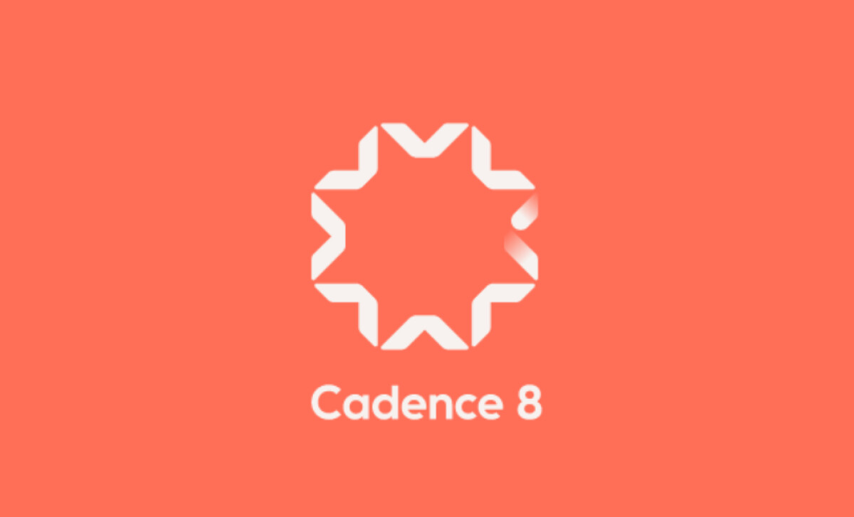
Cadence 8, a consulting firm specializing in Active Travel and Project Management for multinational organizations, required a logo that reflects their sophisticated approach to business. Toartle, the agency behind the design, delivered a modern, minimalist logo that combines geometric elegance with a dynamic sense of motion.
The Cadence 8 logo stands out with its geometric precision. The eight-pointed shape conveys a sense of structure and order. This clean, geometric form aligns well with the consulting firm’s values, emphasizing precision and reliability — qualities critical in their work with multinational clients. Plus, the logomark makes the brand easy to remember.
The logo's shape, while symmetrical, also feels dynamic — almost as if it's in motion. This reflects the "Active Travel" aspect of Cadence 8’s services, suggesting that the company is forward-thinking and agile. The subtle rotation of the design gives the impression of energy and fluidity, while the overall balance ensures that the logo remains composed.
The sans-serif font complements the logo’s minimalist style, enhancing its readability and making it perfect for digital media or print. The choice of a simple, bold typeface ensures that the brand name is legible and impactful, while the white font contrasts effectively with the vibrant background, allowing the logo to stand out in any setting.
The Cadence 8 logo not only represents the company’s professionalism but also its forward-thinking, agile approach. For businesses looking for one of the best professional services logo design or branding that communicates precision and motion, the Cadence 8 logo is an excellent example to draw inspiration from.