Standout Features:
- Unique abstract symbol with mirrored letter forms
- Elegant, clean sans-serif typography
- Monochromatic color palette with a pearlescent variant
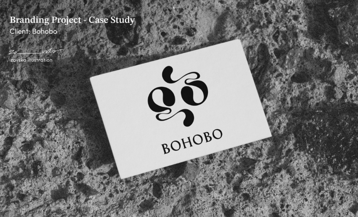
BOHOBO, a London-based design studio making a name for itself with innovative, 3D-printed eco-friendly homeware and fashion pieces, uses a logo made by Zovska Illustration to communicate the nature of its product and its sustainability goals in one unique design.
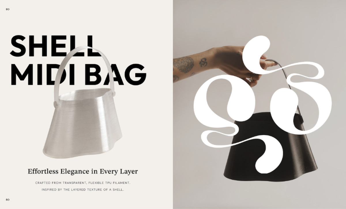
The primary logo comprises two mirrored, flipped, and stylized letter-like forms arranged within a square. While abstract, these forms subtly evoke the intricate, layered structures characteristic of their 3D-printed products, such as the Shell Midi Bag, which is constructed out of filaments made from seashells.
In addition to the abstract symbol, the eCommerce logo incorporates the "BOHOBO" name in a clean, sans-serif typeface, providing a readable counterpoint to the more complex symbol. Type contrast like this is commonly utilized by professional logo designers to balance an otherwise complicated icon.
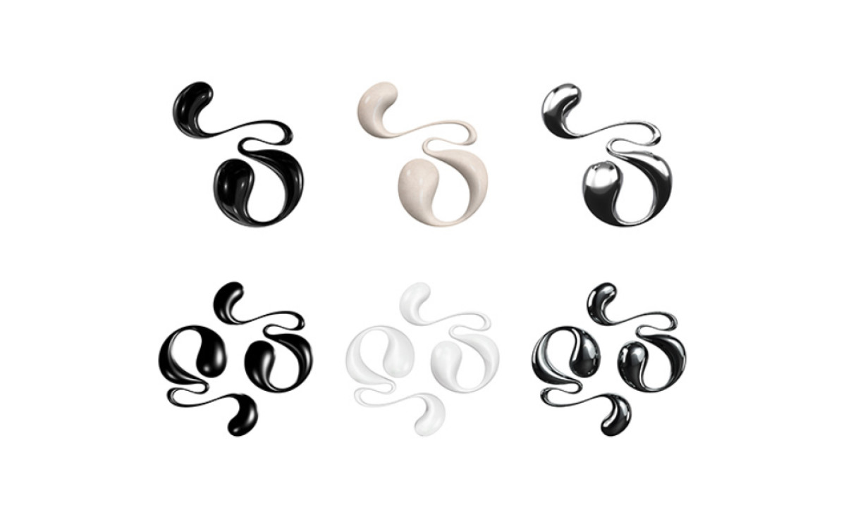
Zovska's design for the logo also incorporates a monochromatic color palette. A restrained palette such as this contributes to the brand's air of luxury. But what’s more interesting is its pearlescent and even transparent variants seen in some renderings. These cleverly allude to the reflective qualities of the mussel shells and oysters used in its products.
The nuances of Zovska Illustration's design — from the balanced contrast to the pearlescent color variations — reveal the depth of thought that goes into effective branding. This serves as a strong reminder that a well-designed logo can act as a powerful visual shorthand for what brand offers, as well as what it stands for.