Standout Features:
- Organic, multi-layered logomark with rich symbolism
- Earthy and aquatic color palette
- Approachable sans-serif wordmark
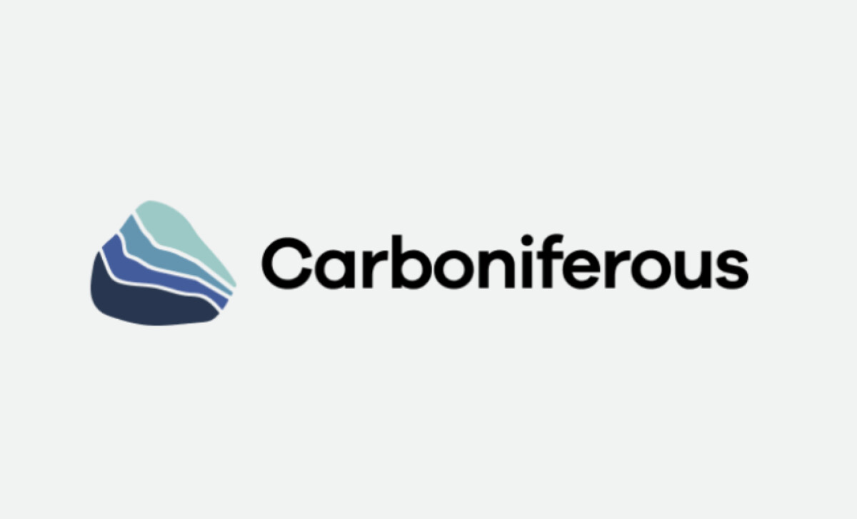
The logo for Carboniferous, a tech company focused on carbon sequestration by transporting agricultural waste to ocean basins, was designed by Almost Digital. The design eschews sterile scientific visuals for an organic, modern mark that builds confidence and conveys a positive vision.
An organic, multi-layered logomark — a pebble-like shape with four wavy internal layers — is the centerpiece. Its abstract, natural form is highly symbolic, suggesting anything from geological layers to oceanic processes. This helps make the company's mission feel like a natural solution rather than a harsh industrial intervention.
The color palette is calming and natural, with layers of muted seafoam green and a gradient of three blues. These colors are harmonious and chosen to suggest ecological balance. This visually positions Carboniferous as a guardian of the natural world, a vital message that helps allay concerns about environmental engineering.
The use of blue also strategically aligns the brand with established industry leaders, as reports show that almost 30% of the world's top 100 brands feature blue in their logos.
The wordmark uses a clean, modern sans-serif with subtly rounded characters and is rendered in dark charcoal grey. A sharper, more clinical typeface might have felt cold; instead, this font balances professionalism with a welcoming tone. It perfectly complements the organic logomark, creating a cohesive visual identity.
This logo illustrates that for companies in the environmental tech space, a powerful and positive visual shorthand is essential for building support. The Carboniferous logo offers a strong model for how to create a brand that feels both innovative and deeply connected to the natural world it aims to protect.