Standout Features:
- Geometric and minimalist typography
- The "Brain" in NetBrain
- Monochromatic color scheme
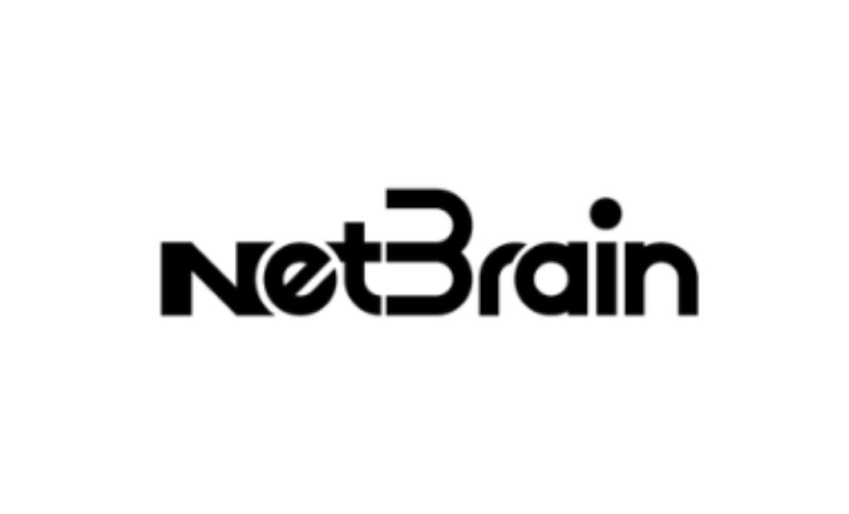
NetBrain, a pioneer since 2004, empowers organizations by simplifying complex network operations through its intuitive no-code AI automation platform. Its logo is a sleek, modern, and geometric design that embodies this mission.
The logo features geometric and minimalist typography, with "NetBrain" in a clean, custom typeface that has rounded corners and a balanced, compact structure. The sleek, tech-savvy feel aligns perfectly with NetBrain’s tech industry.
A particularly clever element is the way some letters in NetBrain are positioned. Specifically, the unique design of the letter "B" with its subtly broken vertical stem and the way the letter “E” in “net” is imposed upon the letters around it. It adds a unique touch that makes an otherwise simple type-forward logo into something memorable.
The design employs a monochromatic color scheme, primarily using black. This deliberate lack of multiple colors gives the logo a timeless quality, ensuring it remains versatile and recognizable across all formats. Black often conveys sophistication and authority, key attributes for a technology company trusted with intricate network operations.
This technology logo, with its custom typeface and unique letters, highlights the significant impact custom typography can have in creating a distinctive brand identity. This approach allows a logo to be truly ownable.