Most sports logos have a designer. The Chicago Bulls logo has two, maybe.
A founder asked for blood on the horns, a sketch came back, and sixty years later nobody can say with complete certainty who held the pen. What everyone agrees on is that the design hasn't changed since 1966, and nobody has found a good reason to touch it.
That's the thing about getting it right the first time: it makes the origin story almost beside the point.
Chicago Bulls Logo History
The Bulls were among the NBA's first expansion teams, founded in 1966 by Dick Klein, a former athlete turned entrepreneur who wanted an identity that felt like Chicago: tough, direct, and unpretentious. Illinois had a long history with the cattle and meatpacking industry. The 1966–67 season marked the NBA's first major expansion push, growing from nine to twelve teams as the league competed with the upstart American Basketball Association for players, markets, and audience.
For a new franchise entering a crowded sports city -Chicago already had the Bears, the Cubs, the White Sox, and the Blackhawks. Klein needed an identity that could establish itself immediately, without the benefit of history or a star player to carry it.
The bull wasn't a random choice. When other name options were floated, Klein's son reportedly said some of them sounded like "a lot of bull." The name stuck.
Once Klein had a name, he needed a logo. That's where the story gets complicated.
A Tale of Two Designers
Klein called in a favor from a fellow Little League coach, a commercial designer named Dean P. Wessel. As Wessel recalled in a 1993 Chicago Tribune interview:
"Dick looked it over and sent it back to me, saying, 'I want blood on the horns. Blood!' I, of course, obliged him."
Wessel never received royalties. The only credit he got was when he told people himself. His version of events is the most detailed on record, and he had a direct personal connection to Klein. Both Chicago sports historian Jack Silverstein and Peter T. Alter, chief historian at the Chicago History Museum, lean toward Wessel as the original designer.
But there's a second name. Ted Drake, a designer at Wilson Sporting Goods who also created Notre Dame's leprechaun, was credited with the Bulls logo by both the Associated Press and the Chicago Tribune when he died in 2000.
One Tribune article connected Drake to a logo for a Milwaukee team relocating to Chicago, which doesn't line up with the Bulls being an expansion team.
As Silverstein put it: "That doesn't add up."
Alter left the door open: "Sometimes conflicting stories actually may not be conflicting. Maybe Drake and Wessel somehow worked together."
The Bulls confirmed they still use the original 1966 logo but declined to say who made it. As Alter put it: "Things that are common often have mysterious origins."
A Design That Was Built to Last
The Chicago Bulls logo doesn't ease you in. The brow is heavy, the eyes are narrow, the nostrils are wide open. It's not rage exactly. It's focus. Most mascots in professional sports are designed to look angry and end up looking panicked instead. This one looks like it already knows what's about to happen.
The whole mark is built on a central axis. Flip the Chicago Bulls emblem left to right, and nothing changes. That symmetry is why it works on a hat brim as well as a stadium banner. The eye knows exactly where to land regardless of how small it gets.
Three colors. Red pulls your eye in, black holds it, white keeps the whole thing from collapsing into itself. Klein picked the combination before a designer touched it, and it didn't need revisiting.
The wordmark sits between the horns in a heavy serif, most likely derived from Stymie Black, though nobody has officially confirmed it. What matters is that it doesn't float above the illustration like an afterthought. It's built into the mark. The whole thing reads as one form, not a logo with a label attached.
Visual hierarchy does quiet work here too. Your eye enters at the horns, reads the wordmark, then drops into the face. The journey takes under a second and nothing interrupts it.
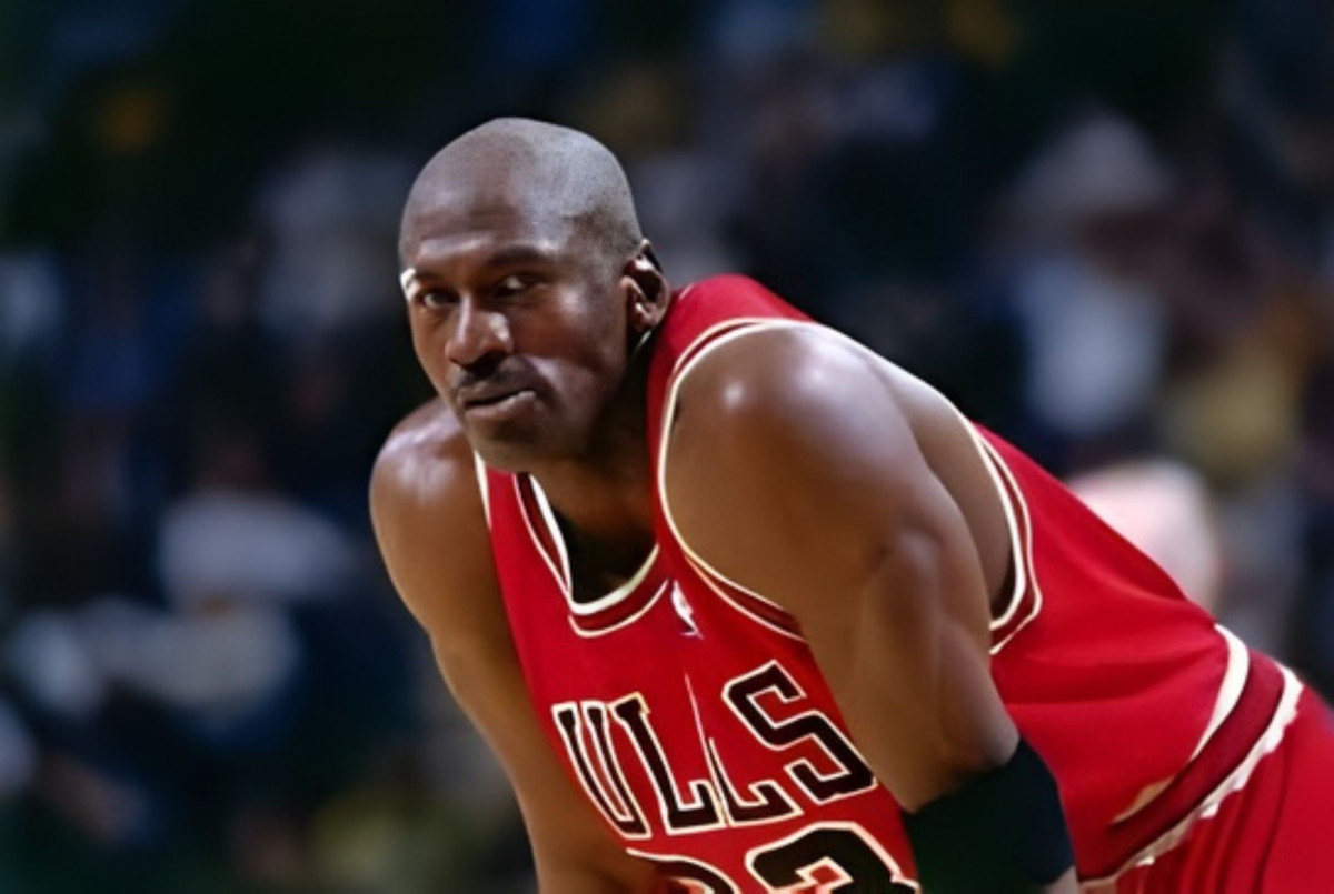
How Jordan Made It Global
[Source: NBA]
The Bulls were a decent team before Jordan. A good Chicago Bulls emblem, modest ambitions, nothing that was going to end up on bedroom walls in Tokyo. Then Jordan arrived in 1984 and the whole thing changed scale.
Six championships between 1991 and 1998, a 72-10 season widely considered the greatest single-year performance in NBA history, and the most commercially powerful athlete in American sports all wearing the same red and black.
The NBA used the Jordan-era Bulls as the engine of its international licensing expansion - by the mid-1990s, the league had established a presence in over 200 countries, with Chicago merchandise leading sales. During that run, the Bulls were the top-selling licensed merchandise team in the NBA, a distinction confirmed by the franchise's own front office at the time.
The Chicago Bulls logo travelled with all of it, turning up in the background of TV shows, in the homes of world leaders, on streets in cities with no prior relationship with basketball. The Space Jam film and The Last Dance documentary introduced the identity to new generations.
The Jordan era amplified the logo. The design earned it.
Chicago Bulls Logo Evolution: Why Nobody Changed It
Every other franchise has refreshed or rebranded. The old bulls logo from 1966 is still the one on the jersey today.
As NBA creative consultant Ced Funches put it: "The Bulls logo is synonymous with winning. And at the end of the day, that's really all that unites the fabric of sports. If you do anything to change or take away from that, you better have a really good reason."
No gradients, no lens flares, no swooshes borrowed from whatever was fashionable at the time. Flat drawings of angry bulls don't go out of style. The Bulls have also generated some of the most recognizable sports apparel in history, and nobody was going to disrupt that without a very good reason.
The Chicago Bulls Logo Upside Down
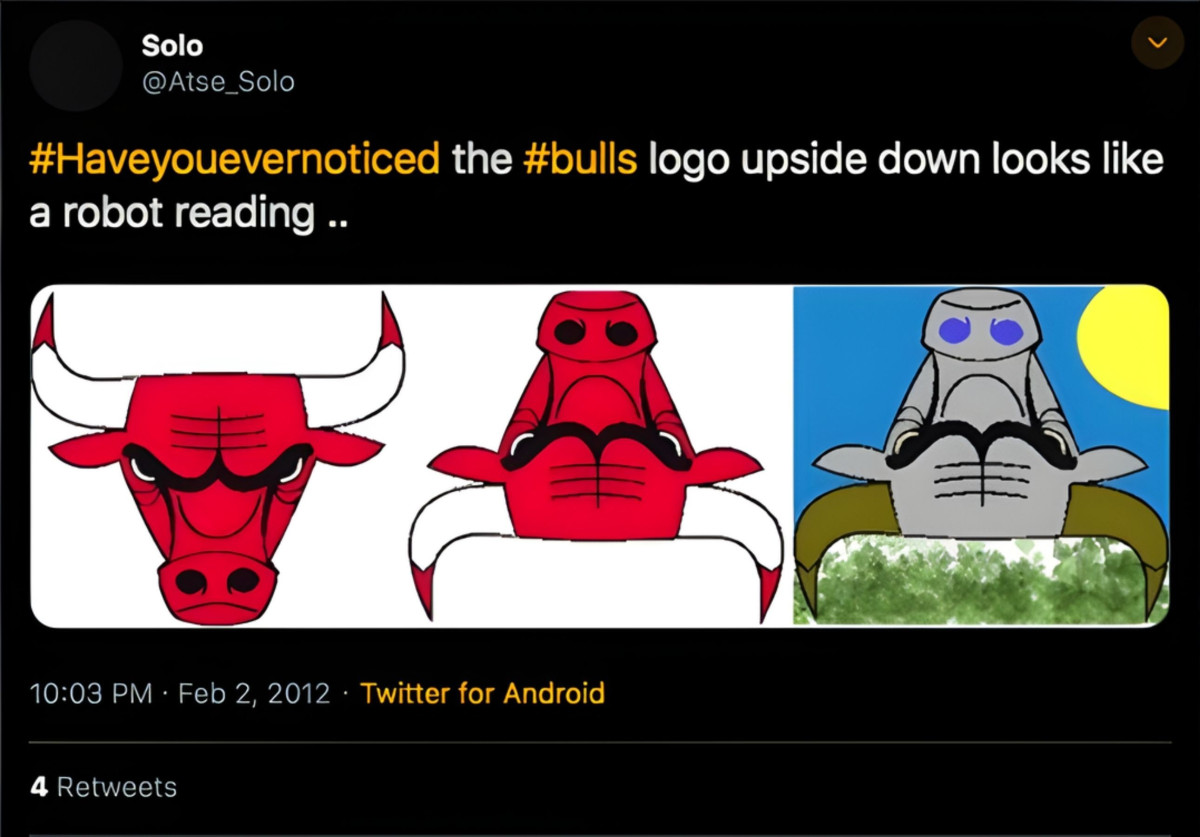
[Source: @bubbaprog on X]
Turn the Chicago Bulls Emblem upside down and you'll find either a robot reading a book or a robot doing something that would get it banned from most social platforms, depending on your imagination. The observation had been floating around online for years before writer Deniz Camp posted a side-by-side on Twitter in 2022 and it went everywhere.
Nobody hid anything in there. The logo is from 1966. That wasn't a thing yet. Symmetrical illustrations just do this when you flip them. While the Chicago Bulls logo upside down is funny. It isn't a design scandal.
What Other Brands Can Take From It
The Bulls logo holds up as a design lesson for one reason: it was never trying to be clever. A mascot built around one clear quality doesn't need updating because it was never chasing a moment to begin with.
The bull communicates focus, aggression, and readiness without ambiguity. Three colors applied consistently across fifty-plus years of merchandise and broadcast create an identity that's almost impossible to confuse with anything else. Emotional expression isn't decorative here, it's structural. Remove it from this Chicago Bulls emblem and you have clip art. Keep it and you have a character.
Silhouette legibility is what lets a logo function at 12 pixels and 12 feet. The Bulls mark works at both.
Chicago Bulls Logo: Key Takeaways
Logos usually get changed for one of three reasons: new leadership wants to make its mark, the original design was never quite right, or enough time passes that it starts looking dated. None of those conditions have been applied here.
Compared to the broader NBA logo landscape, where teams have rebranded repeatedly to chase relevance, the Bulls have simply never needed to. The authorship question may never get a clean answer. Wessel's story is the most detailed on record; Drake's name keeps showing up, and the Bulls aren't talking.
But the logo doesn't need a confirmed origin story to keep working. It just needs to keep doing the same job it's been doing since 1966.
That's usually how it goes with the good ones.