Buffalo Bills Logo Evolution:Key Points
- Simplicity Scales: The 1974 “charging buffalo” logo has remained untouched for 50 years, proving that a bold, minimal silhouette offers lasting brand equity and cross-platform versatility.
- Design That Moves: The red motion stripe isn’t just decoration, it signals speed and intent, turning a static image into a symbol of momentum that resonates with fans and drives merchandise appeal.
- Fans as Brand Guardians: The rejection of a proposed 2002 redesign shows how deeply fans identify with the logo, reinforcing the power of audience-led branding in legacy sports franchises.
The Modern Buffalo Bills Logo: Motion, Minimalism, and Memorability
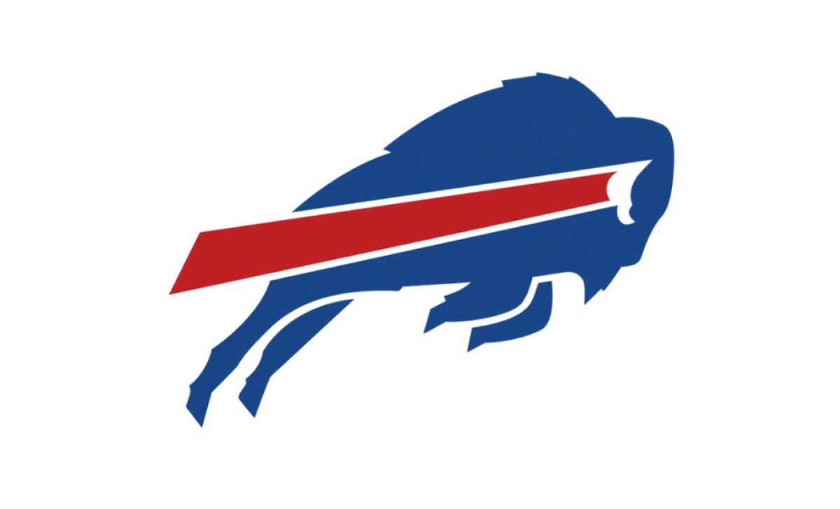
Modernized in 1974, the current Buffalo Bills logo exemplifies design longevity, an increasingly rare feat in pro sports, where over 60% of NFL teams have altered their primary logos since 2000 alone. The enduring appeal of the Bills' “charging buffalo” lies in its simplicity and symbolic clarity.
This logo features a streamlined royal blue bison in mid-charge, punctuated by a vivid red streak projecting from its horn, conveying momentum, aggression, and athletic intensity.
Royal blue, red, and white palette mirrors the team’s uniform colors, reinforcing brand unity across merchandise, broadcast, and stadium design.
Notably, the sharp horn/eye detailing and minimalist structure exemplify modern best practices in logo design: bold shapes, reduced clutter, and high contrast for maximum legibility and emotional impact.
This approach mirrors strategies seen in the evolution of logos like the Nike Swoosh and Chicago Bulls, where visual economy drives timeless relevance across generations.
Reader Reward: Build for scale and emotional recall. Logos that prioritize bold forms, high contrast, and symbolic resonance are more likely to survive platform shifts, merchandise demands, and generational turnover.
Buffalo Bills Logo Design Evolution
1960 – 1961: Inaugural Football Emblem
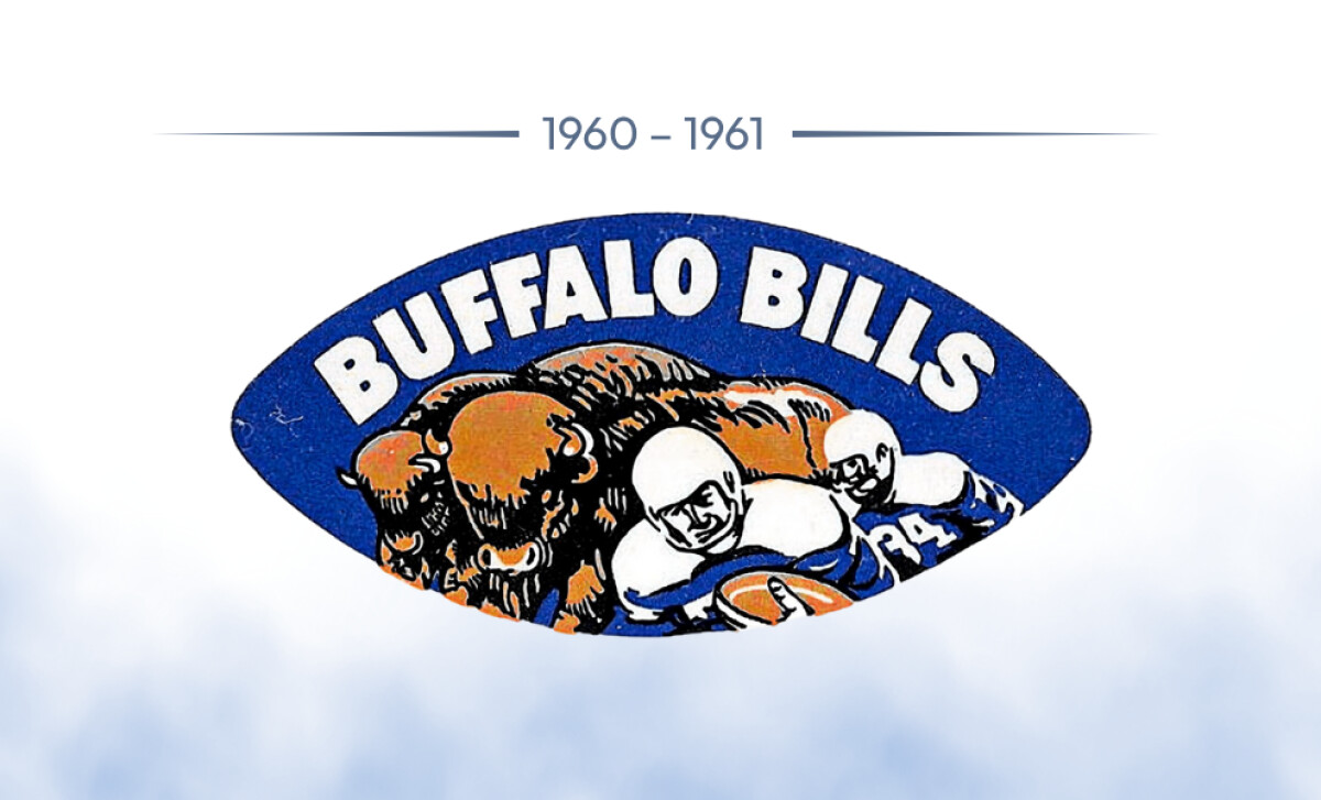
The first logo, launched in 1960, featured a dark-blue football motif containing a scene of buffalo herds and two players, topped by a sans-serif “BUFFALO BILLS” wordmark.
This cluttered composition reflected the AFL era’s emphasis on literal storytelling and established the team’s connection to football and frontier imagery.
Reader Reward: This complexity mirrors an early branding trend where logos served as narrative tools, less about visual identity, more about immediate recognition among local fans.
1962–1969: Streamlining the Story
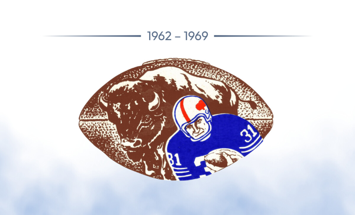
Redesigned in 1962, the logo retained the football background but reduced visual clutter by depicting a single buffalo in grainy sepia and one player in blue and white gear. The wordmark was dropped in favor of clarity.
The visual clean-up aligned with 1960s modernist trends and improved legibility across media.
Reader Reward: A subtler palette and fewer elements laid the groundwork for brand recognition, a strategy notable in successful logo redesigns like the Chicago Blackhawks removing text to amplify symbol identity.
1970–1973: Toward an Icon
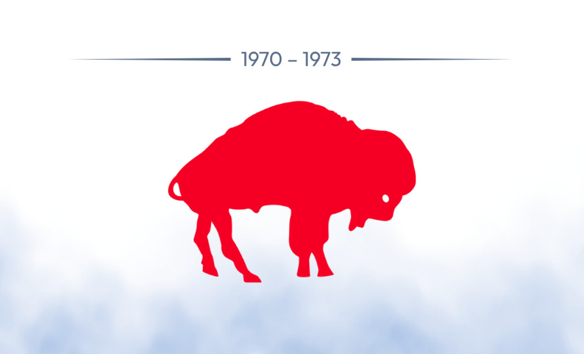
The football and players were removed entirely in 1970, leaving a bold red silhouette of a bison. This design decision marked a strategic pivot, setting constraints that made the logo easier to reproduce on merchandise, signage, and uniforms.
Insight: In a $170B global licensed sports merchandise market, logos that scale across touchpoints are more profitable. This can help position team brands for commercial viability beyond broadcast.
1974–Present: The Charging Buffalo
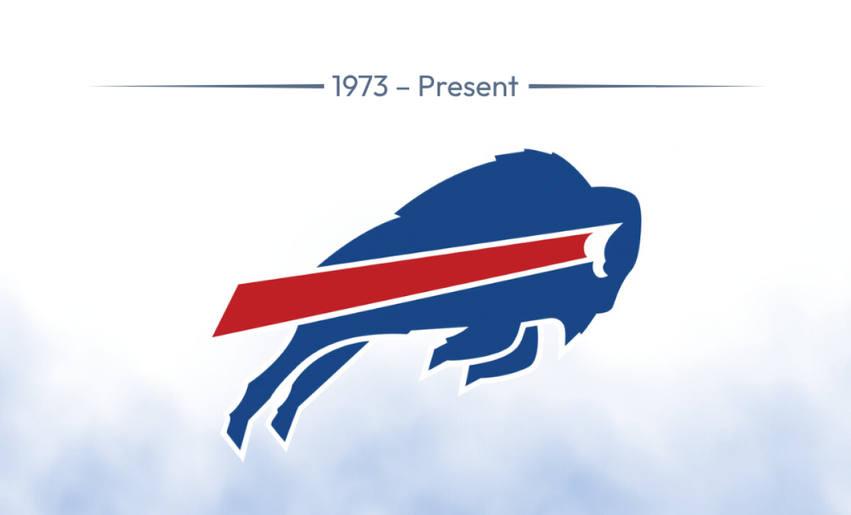
In 1974, aerospace illustrator Stevens Wright introduced the now-iconic blue buffalo in motion, accented by a red velocity stripe. The logo launched on helmets, instantly signaling dynamism and aggression.
In Yahoo Sports’ 2024 NFL logo ranking, the Bills placed 3rd overall, behind only the Cowboys and Raiders. Fan rejection of a proposed 2002 “B” logo further cemented the design’s legacy.
Strategic Cue: Legacy logos that earn national ranking can be marketing assets in themselves, driving licensing, PR, and community identity. For Buffalo, the logo is more than a visual, it’s brand capital.
Check out our curated lineup of legacy logo redesigns that still deliver decades later.
The Wrap-Up: Build Velocity Into Your Visuals
The Bills’ “charging buffalo” logo moved the brand forward without changing course.
While many NFL teams chase novelty, Buffalo has stayed true to a high-impact identity that captures momentum, grit, and local pride in one clean silhouette.
Final Notes:
- Design for Recognition, Not Reinvention: Logos grounded in motion and symbolism, like the Bills’, age well across decades and digital shifts. A clutter-free mark with purpose-built geometry still outperforms complex redesigns, especially in crowded visual ecosystems.
- Symbolism Accelerates Brand Equity: The red motion streak does more than decoration, it’s also narrative shorthand for energy and speed. Strategic iconography like this boosts emotional recall, on and off the field.
- Fans Value Continuity: When the Bills floated a logo change in the early 2000s, fan backlash shut it down. Lesson? Don’t disrupt what works, especially when your audience has already claimed it as their own.
Great logos don’t just reflect performance, they become part of it. For brands seeking lasting relevance, the Bills offer a blueprint: move forward, but don’t let go of what’s already running strong.