Standout Features:
- Abstracted chicken form with personality
- Fork-as-wing visual pun
- Line-based icon with high reproducibility
Coals' design for Chick 'n Dip is a brand emblem that captures the restaurant's essence. Its unique visual identity cleverly connects the product (chicken) with the eating experience, creating an instantly recognizable symbol for this fast-casual eatery found in Leuven and Mechelen.
At the heart of the restaurant logo is a clever visual pun: a fork integrated into a chicken's form. The utensil's handle creates the chicken’s wing, while its tines mimic feathers. This seamless morphing, achieved with simple, bold strokes, ties the brand’s product to the act of eating.
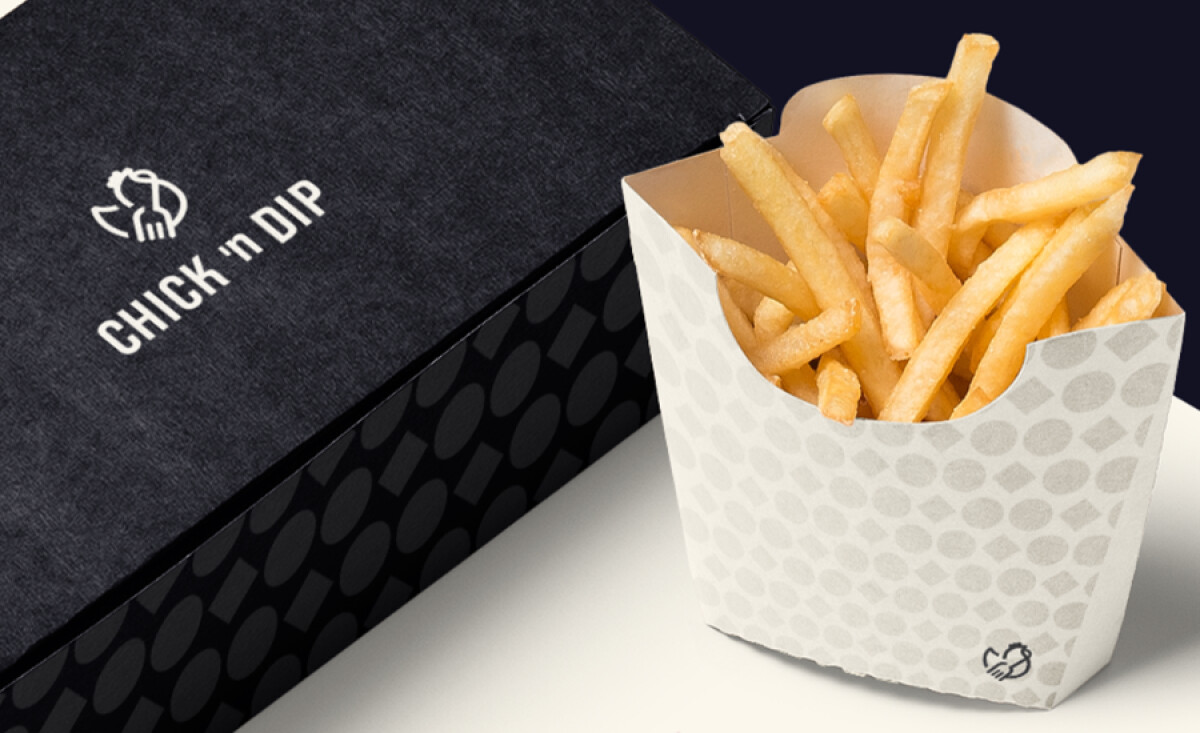
The mark's design uses bold, flowing lines of a consistent weight. It avoids shading, instead using strong contrast between the white icon and a dark background. This makes the logo extremely versatile, easily scalable for diverse applications like menus, packaging, or online profiles.
Despite its minimalism, the logo artfully captures a chicken's silhouette through abstraction. It shows a rounded head with and comb, a tucked wing (that’s also a fork), and a stance that appears proud yet endearingly quirky. This infuses the simple form with a distinct and friendly personality, effectively speaking to the 42% of individuals who believe a logo itself reveals the essence of a brand's character.
A key takeaway from the Chick 'n Dip logo is the value of high reproducibility and adaptability in a modern food brand’s visual identity. The clean, line-based design ensures consistent application across all touchpoints, from physical stores to digital platforms, which is crucial for building recognition in a fast-paced market.