- Agency: FocoTik
- Client: Claren
- Category: Logo Design — Technology
- Project Brief: Create a logo that communicates Claren’s commitment to clear, practical AI solutions through a confident and enduring visual identity.
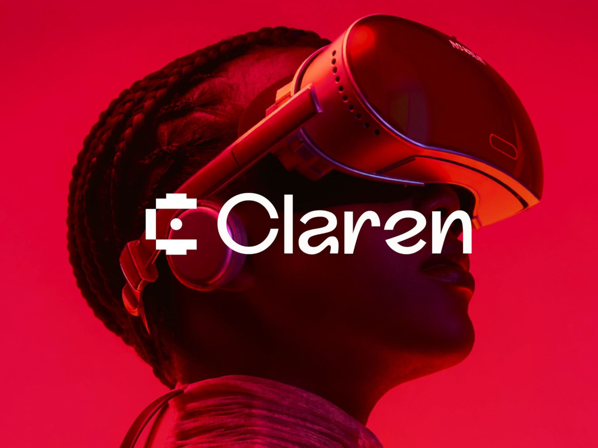
A technology logo has to feel like the product itself — clear and capable, not buried under buzzwords. Claren's mark pulls that off with a blocky, bracketed C that reads like a clean little machine, simple in the hand and powerful in action just like the brief asked.
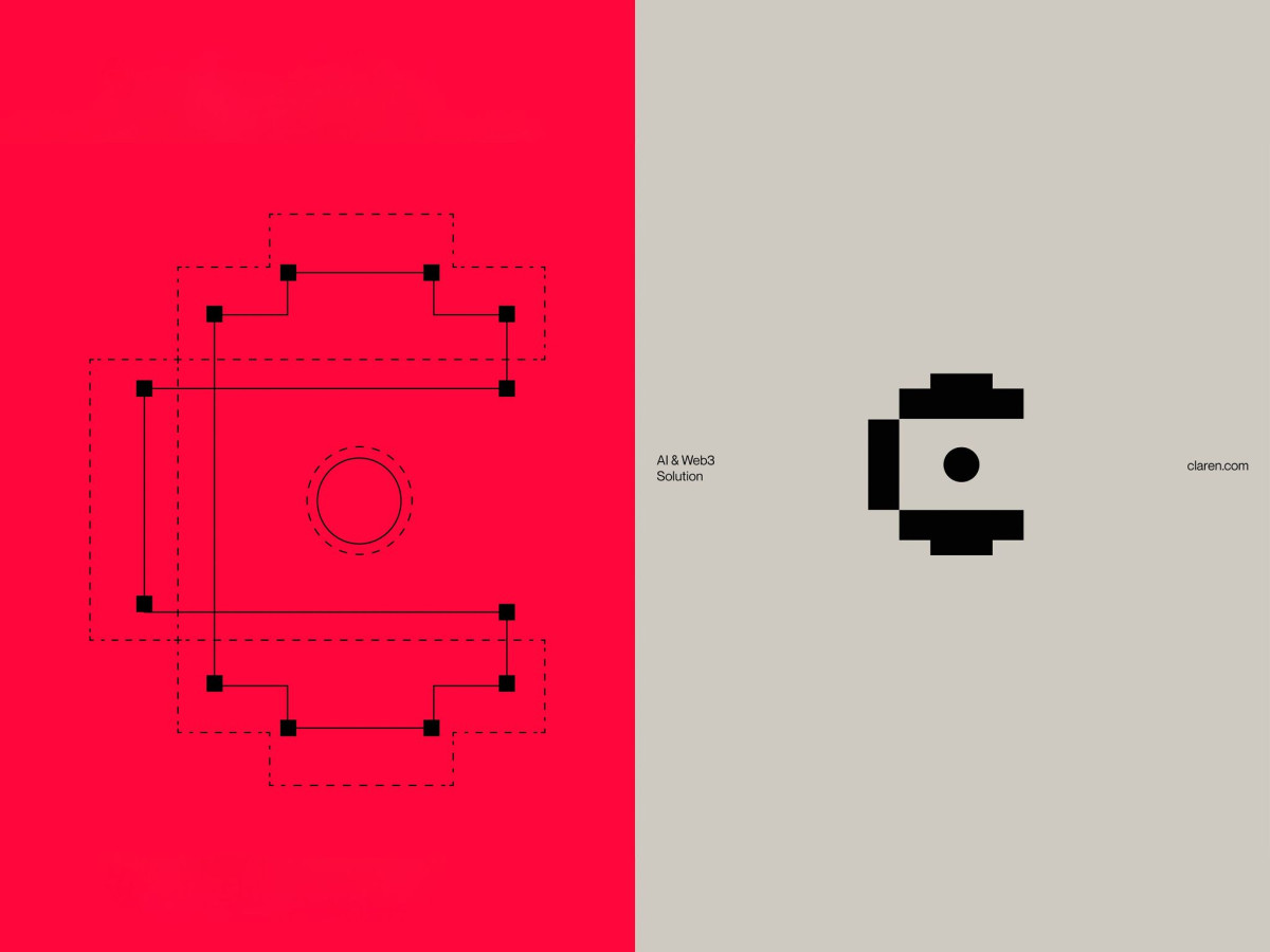
The glyph does a lot with a little. Built from chunky pixel-style blocks around a single dot, it nods to AI and Web3 without going full sci-fi, so it feels honest and engineered rather than decorative.
Color is where it gets brave. The team skipped the usual tech blue and purple for a neon red that glows from the inside, paired with dark and light tones so it stays alive on any background instead of feeling cold.
Diatype keeps the whole thing grounded. The grotesque wordmark is minimal but has real character, so the brand looks refined without sliding into another faceless techno project. For a startup that builds instead of just talking, a logo this direct is the right call.