-account-photo_listing.jpg)
-account-photo_listing.jpg)


Our Jury has worked with Prada, Nike, Chanel, Google, and Apple.
Best Lettermark Logo Designs of 2026
View the Top Lettermark Logo Designs Below
Best Lettermark Logo Designs of 2026
4,200+ Submitted Designs
- Advertising
- Agriculture
- AI
- Airline
- Alcohol
- App Company Logo
- Architecture
- Arts & Recreation
- Automotive
- Banking & Finance
- Beer
- Church
- Clothing Brand
- Coffee
- Content & News
- Distribution
- E-Commerce & Retail
- Education
- Engineering
- Entertainment
- eSports
- Farm
- Fashion & Beauty
- Food & Beverage
- Government
- Health & Wellness
- Hospitality
- Legal & Insurance
- Luxury
- Manufacturing
- Non-Profit
- Photography
- Professional Services
- Real Estate
- Restaurant
- Restuarants
- SEO Agencies
- Shoe Brand
- Small Business
- Software
- Sports & Leisure
- Startup
- Technology
- Travel
- Video Companies
- Weed/Cannabis
- Abstract
- Animated
- Artistic
- Bakery
- Black
- Black & Yellow
- Blue
- Bold Logo
- Brand
- British
- Business
- Circle
- Creative Name
- Dental Office
- Done by Freelancers
- Emblem
- Floral
- Geometric
- Glow
- Gradient
- Gym
- Icon
- Illustration
- Lettermark
- Logo symbols
- Makeup Brand
- Marathon
- Minimal
- Modern
- Monogram
- Multicolored
- Nature
- Negative Space
- Rebranding
- Red
- Redesign
- Simple
- Starting With the Letter S
- Successful
- Sunshine
- Trendy
- TV Channel
- Typography
- Unisex Salon
- Vintage
- Water
- Watercolor
- Wordmark
★8/10
 AO 9.00
 BS 5.00
 KS 7.50
 KT 9.50
 LB 9.00
View Design
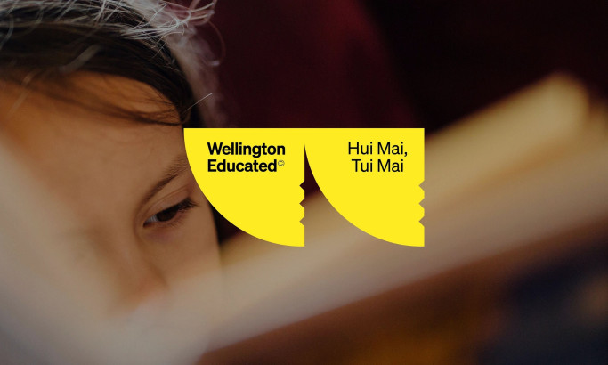
Wellington Educated
View Design
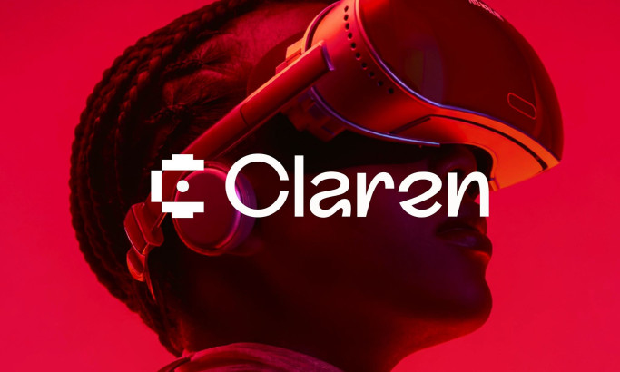
Claren Logo Design
byFocoTik
View Design
Ford Motor Company Logo
View Design
The GTA 6 Logo Design Analysis
View Design
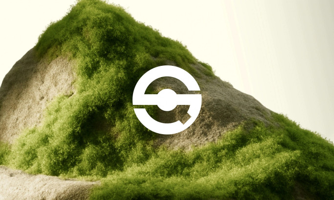
Q-Selection Logo Design
byVisinex
View Design
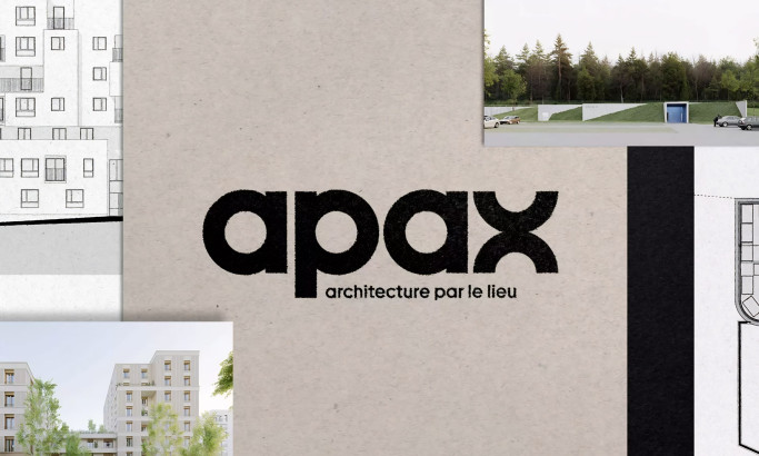
Apax Architecture Logo Design
View Design
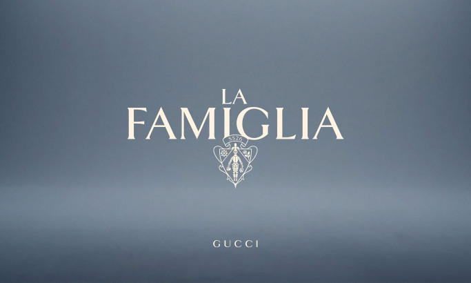
La Famiglia - Gucci
byAFFAIRE
★8.8/10
- AO 10.00
- BS 9.50
- KS 6.00
- KT 10.00
- LB 8.50
View Design
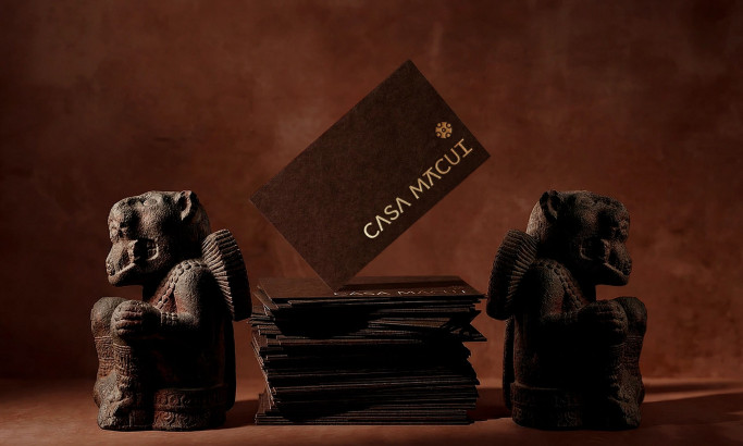
Casa Macui
byFugitiva
View Design
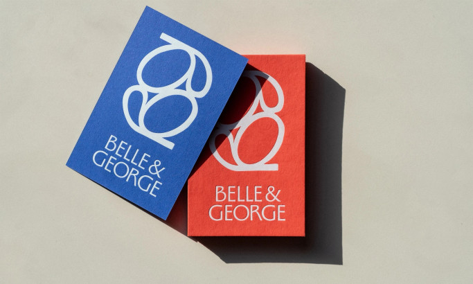
Belle&George
byAbmo
Get Connected
With The Right Agency Partner
& Receive Proposals For FREE
View Design
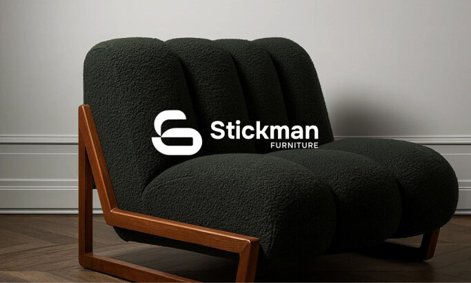
Stickman Furniture
-preview.jpg)
View Design
McDonald's
View Design
Sparkle Clean
byCayweb

View Design
Zaad Farms

View Design
Trifecta

View Design
Toblerone
View Design
Star Wars
View Design
Shakesphere

View Design
Plant Potion
Ready to elevate your designs?