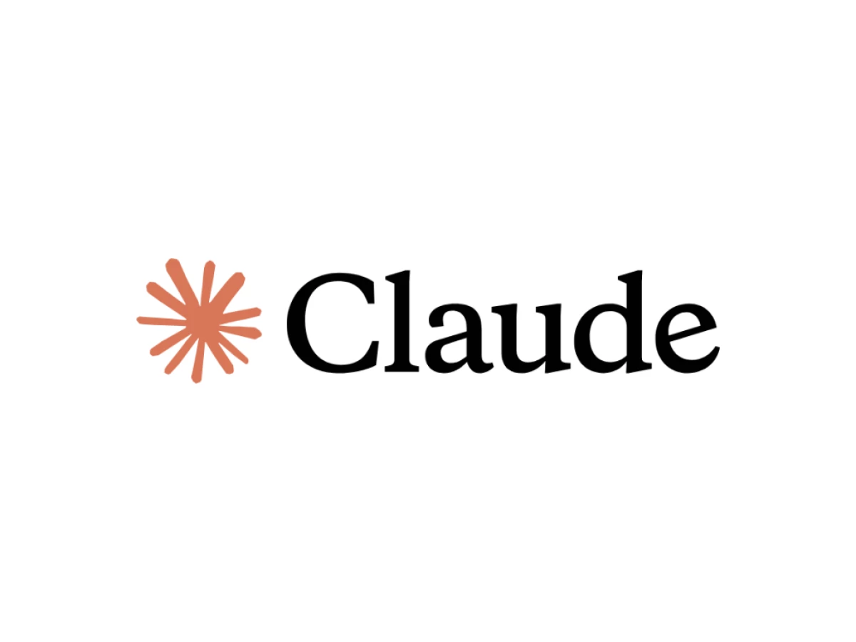

Pull up the logo design for every major AI brand and you could almost swap them out for each other. Same clean geometry, same trust-me palette, same shape built to look smart in a pitch deck. Then there is Claude: a lopsided, hand-drawn smudge of orange that people online still can't agree is an asterisk, a pinwheel, or an amoeba. That is not Anthropic missing the brief. That is Anthropic reading the brief and tossing it. Here is what the decision actually does, and why any brand stuck in a lookalike category should pay attention.
Everybody Else Is Drawing The Same Logo
Line up the competition and a pattern shows up fast.
ChatGPT wears six interlocking loops in a muted sage green, a tidy symmetrical knot meant to read as cycles of exchange. It has not changed since OpenAI shipped it in November 2022, and plenty of people still see a vortex or a woven wreath wrapped around a hexagon of empty space.
Grok picked a different color and the same discipline. Jon Vio's current mark is a monochrome ring built on the idea of a black hole, the settled version after an earlier design got yanked when a lot of people saw a broken cross in it. Different drama, same instinct: sharp, high-contrast geometry in black and white.
Gemini chose the gradient lane. Google's assistant now runs a four-point sparkle in the company's own red, yellow, green, and blue, swapped in over the old purple-blue to pull the product deeper into the Google family. The redesign is widely read as the moment Gemini's icon stopped standing out from the rest of Google's apps. The whole job of that mark is to blend in with Search, Chrome, and Workspace.
Three companies, three palettes, one playbook: clean geometry, careful symmetry, a shape engineered to survive from favicon to keynote slide. Claude walked away from all of it.
A Mark You Can't Quite Name
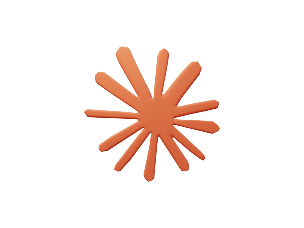
The Claude icon is a radiating, off-kilter starburst made of strokes that look drawn by hand instead of plotted on a grid. On the interface it breathes, pulsing outward like something alive rather than rendered. First correction for anyone about to design around it: that is not a stylized letter C. It is an abstract mark, called a starburst or a pinwheel depending on who you ask, and the slightly uneven linework is the point, not a mistake.
Proof of that is in how much argument it starts. One writer burned a whole blog post trying to figure out what the thing even is, before settling on an amoeba: shapeless, still forming, impossible to file under one label. That is not a weakness. In a field where nobody can agree on what AI actually is, a logo that dodges a clean read does more honest work than any crisp geometric badge.
The Color With No Blue In It
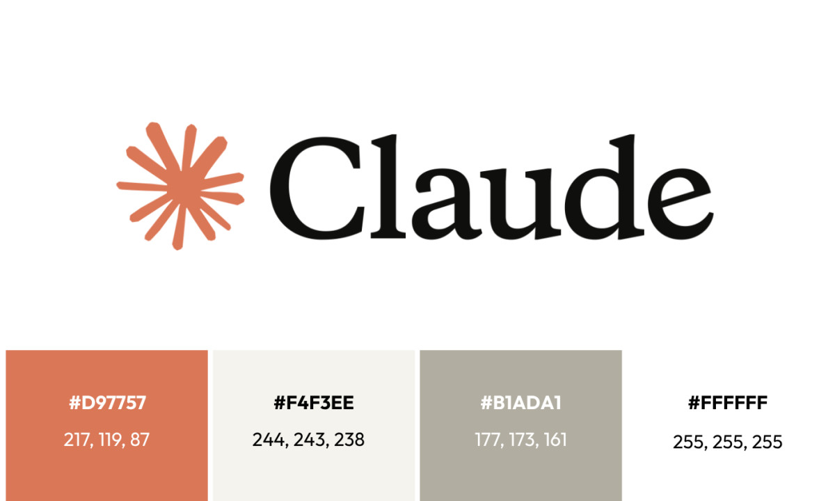
The primary brand color is Crail orange, hex #d97757, a warm rust tone that sits closer to terracotta than to any standard tech accent. It is paired with near-black (#141413) and an off-white (#faf9f5), with mid-gray (#b0aea5) as a secondary element. Look again and the palette carries no deep blue at all, which is easy to miss until someone says it out loud.
That gap is the whole move. Blue is the default trust color in tech, worn by IBM, Meta, LinkedIn, Samsung, and Dell, and copied by most AI products before they drifted toward gradients. Leading with a terracotta orange is a flat refusal to speak that shared language. It reads as warmth before authority. Put plainly, Claude is not trying to look like enterprise software. It is trying to look like something you would want to talk to.
Two Typefaces That Shouldn't Work Together
Headings run Poppins, a geometric sans-serif with clean, circular letterforms. Body runs Lora, a humanist serif with visible bracketed serifs and a gentle swing between thick and thin strokes. Most tech brands stay in one lane, either an all-sans system or a serif kept around for heritage. Claude pairs the two, and the result comes off precise and warm at once, with neither side smothering the other. Same argument as everything else in the identity: capable and approachable, no trade-off.
What Claude Logo Design Teaches Everyone Else
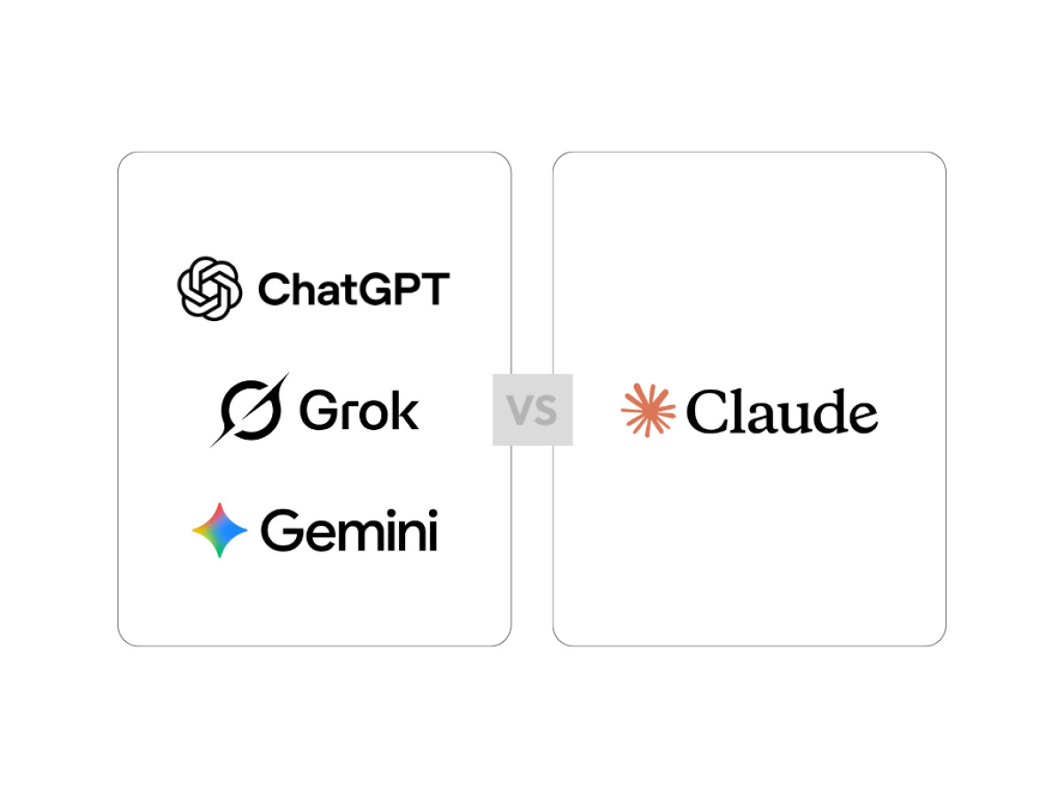
Here is the takeaway worth stealing. Anthropic bet against the room. While every rival converged on the same signals of intelligence and scale, from Gemini's four-color unity play to Grok's black-and-white minimalism, Claude took the one open position left: look like none of them. The icon refuses a single reading, the primary color skips blue entirely, and the type pairing breaks a rule most brand systems obey. Nothing about it screams "AI company," and that is deliberate.
For any brand in a crowded field, and not only in AI, the lesson transfers cleanly. Match the category and you buy instant credibility with people who already know the category. Break it and you signal something riskier and far stickier: that you don't need the category's permission to be recognized. Claude is a working case study in that second bet, with one honest caveat. A logo can only cash the check the product writes. The mark buys attention. Everything after that is up to what the thing actually does.
For more on how AI brands are handling identity under pressure, see this look at Nvidia's logo, built for gaming and now wrapped around the whole AI economy, and this report on OpenAI's 2025 rebrand, which ran the opposite play from Claude by pulling ChatGPT's mark and typeface closer to standard tech cues.
Our team ranks agencies worldwide to help you find a qualified partner. Visit our Agency Directory for the Top Logo Design Companies as well as:

_272aed2c5969-preview.jpg)