Nvidia is worth more than $5.7 trillion. It is the most valuable company on the planet, larger than the GDP of Germany. The logo on its data center chips is the same green eye that shipped on a GeForce box in 2006.
Nobody has changed it. That is either remarkable discipline or a slow-burning brand problem, depending on who you ask.
The Nvidia logo was designed for a graphics card company. It now sits on hardware that runs OpenAI, Anthropic, every hyperscaler in the world, and most of the AI tools people now use without thinking.
The question worth asking is not whether the logo looks good. It does. The question is whether a visual identity built for one audience can keep doing the work for a company that has become something else entirely.
Where the Nvidia logo came from
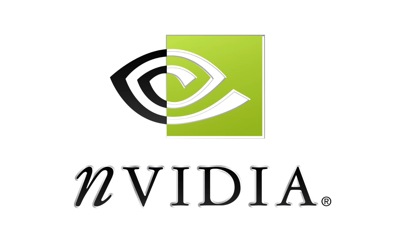
The Nvidia logo history is short by Fortune 500 standards. Two designs. One in 1993, when Jensen Huang, Chris Malachowsky, and Curtis Priem started the company with $40,000 and a thesis about graphics-based computing. A second in 2006, when the company cleaned things up and locked in what is essentially the current mark.
The name itself came from the Latin "invidia," meaning envy. The founders had been saving every project file with the prefix NV, short for "next version," and needed a real name when it came time to incorporate.
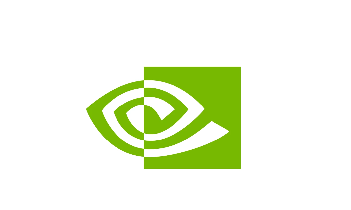
The eye symbol that became the visual anchor was a play on the envy idea. An eye that watches, that wants what others have, that is always looking for the next thing.
That was the founding story of Nvidia brand identity. A gaming hardware company whose name meant envy, whose mark was an eye, and whose color was a green so loud you could spot a GeForce box from across a Best Buy.
The eye motif: design intent or marketing fan fiction
There is a small industry of blog posts that read deep symbolism into the Nvidia eye. The all-seeing eye of the divine. A nod to the Egyptian god Horus. Masonic imagery. Most of this is reverse-engineered.
What the eye actually does, as a piece of design, is more mundane and more interesting.
It signals vision in the literal sense, which made obvious sense for a company that drew pixels for a living.
It is asymmetric enough to look like motion rather than a static badge. And it is abstract enough that it never had to mean any one thing. That ambiguity is the reason the Nvidia logo meaning still works in 2026.
An eye built to sell graphics cards reads, today, as a perfectly fine symbol for AI systems that see, perceive, classify, and predict. The mark did not get smarter. It just got luckier.
That is not nothing. Most logos break when the company changes. Nvidia's did not break because it was abstract to begin with.
The lesson, if there is one, is that specificity is a liability when you do not yet know what your company will become.
See our roundup of the best brand logos for more examples of marks that survived a category jump.
Why green, and why it matters now
Tech brands are mostly blue. Meta, LinkedIn, Intel, IBM, HP, Dell, Samsung. Blue says trust, calm, competence, enterprise. It is the safe color choice, which is part of why nobody remembers any of those logos individually.
Nvidia went green. Specifically Pantone 376C, a yellow-leaning, high-saturation green that looks like a highlighter.
In 1993 this was a gaming choice. Green pops on a black motherboard. Green looks like neon, like arcades, like the inside of a PC case lit up at 2 a.m. It was a color picked for an audience that wanted their hardware to look fast.
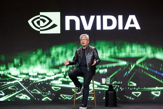
Nvidia CEO Jensen Huang in his leather jacket | Source: DIGITIMES ASIA
In 2026, the same green is doing different work. On a data center rack, NVIDIA green is the color of compute supply. On an AI conference stage behind Jensen Huang in his leather jacket, it is the color of the company everyone else is paying.
The color did not change. The associations did. That is the part brand strategists tend to miss when they argue about whether a tech company should be blue or black. Color meaning is downstream of who is wearing it.
Does the Nvidia logo still fit who Nvidia is? 
This is the real question. And it is not the slam-dunk yes that fan blogs suggest.
The case for yes is straightforward. The mark is abstract. The color is owned. The wordmark is custom, in a modified Handel Gothic, with the kind of weight and angle that reads as engineering rather than software.
Three decades in, the Nvidia logo is one of maybe twenty tech marks that people can draw from memory. Touching it would be expensive in a way that is hard to recover from.
The case for no is more interesting.
The current mark was finalized in 2006, when Nvidia was a $10 billion company selling GPUs to gamers and a small professional graphics market.
The product was a card you plugged into a tower. The audience was hobbyists and creative professionals.
Everything about the logo, the loud green, the chunky industrial type, the gaming-adjacent symbol, was tuned for that audience.
The Nvidia of 2026 sells to sovereign governments, hyperscale cloud providers, AI labs, defense contractors, and pharmaceutical companies.
The customer is no longer in their garage. The customer is a procurement officer at a national lab, or a CFO signing a multi-billion-dollar GPU contract. Those buyers do not need the logo to look like a gaming brand. They might prefer it not to.
You can see the tension in how Nvidia presents itself in different contexts.
The consumer GeForce side leans into the green and the gamer energy.
The data center and enterprise side, visible across their technology web properties, is noticeably quieter, more black-heavy, more restrained.
The brand is being asked to do two jobs, and the logo is doing only one of them comfortably.
Why Nvidia has not rebranded
Two reasons, one obvious and one less so.
The obvious one is that there is no commercial reason to. Nvidia is not trying to win new customers it cannot already reach. Every AI company on earth already knows who Nvidia is.

A rebrand would create months of internal noise and external commentary for zero revenue lift. From a CFO's perspective, the smartest brand spending Nvidia could do right now is no brand spending at all.
The less obvious reason is that the logo's gaming heritage is actually load-bearing. It signals that Nvidia is a hardware company, not a software company, and not a consultancy.
In a market where every AI startup is making vaguely similar promises with vaguely similar wordmarks in vaguely similar shades of off-white, the green eye is a useful reminder that one of these companies actually makes the metal.
The logo's slight aesthetic mismatch with the trillion-dollar AI conversation is, weirdly, doing brand work.
It keeps Nvidia categorized as the supplier rather than the application. That category is, financially, an extremely good place to be.
Whether that holds for the next decade is a separate question. If Nvidia keeps moving up the stack into software, services, and full systems, the gaming-era visual language will start to feel like a costume the company has grown out of.
At that point a rebrand becomes a real conversation.
For now, restraint is paying. The Nvidia logo is not perfect for what Nvidia has become. It is good enough, recognizable enough, and owned enough that changing it would be a worse decision than keeping it.
That is the most a thirty-year-old logo can really ask of a company. Most do not get even that.


