Standout Features:
- Geometric hexagonal 'O'
- Clean and modern typography
- Strong geometric structure and balance
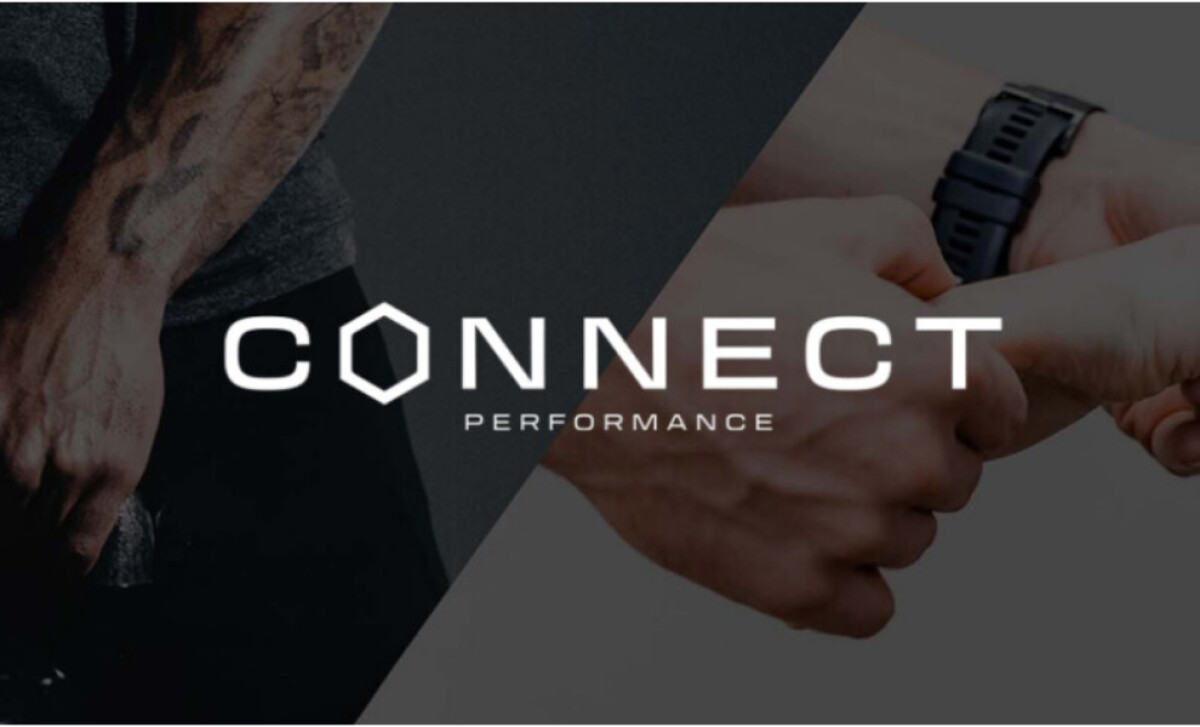
As a full-service fitness and therapy centre offering chiro, physio, and training, Connect Performance needed a logo to represent its integrated services. Explora Creative developed a design that does just that.
The logo features a geometric hexagonal 'O.' This core element visually represents interconnectedness, structure, and multifaceted support — key to the brand's collaborative approach. The hexagon, a shape found in nature and construction, also implies strength and efficiency.
Then there's the clean and modern typography, with a sleek, readable sans-serif chosen for the logotype. The word "Performance" is placed neatly below "Connect" in a slightly smaller size, creating a clear hierarchy. This contemporary font choice reflects Connect Performance's cutting-edge, client-centered focus.
The design relies on a strong geometric structure and balance, with the hexagonal "O" serving as a central anchor within the logotype. This careful alignment and use of well-proportioned letterforms give the logo a sturdy, well-constructed feel. It reflects the company’s core values of stability and methodical, evidence-based care.
The Connect Performance logo achieves a strong sense of balance and adaptability through its well-proportioned typography and central geometric element. The lesson for any professional service or health and wellness identity is that a visually balanced and structurally sound logotype will have greater versatility and enduring appeal.