-desktop.jpg)
Standout features:
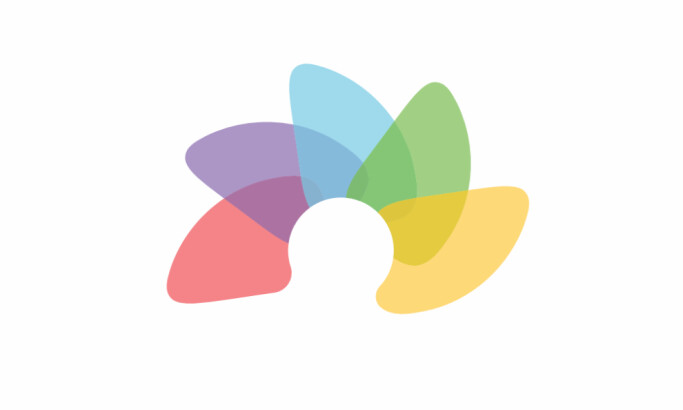
- Similar yet iconic design
- Use of rainbow colors
- Readable font style
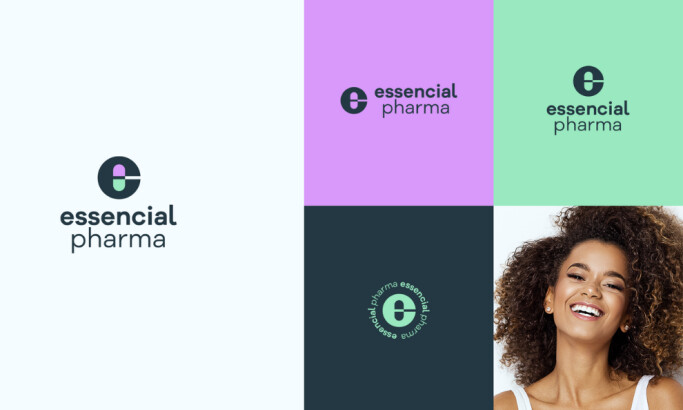
Medical and health companies need a logo that says they can be trusted by people in matters of life and health, so a reliable logo design is in order.
With that in mind, Web Design Phoenix created an attractive logo design that is unique and does not stray far from the field.
Their logo design looks similar to the related companies in the field, which should not be a minus point. Even though you want to stand out, you still want to ensure that you are not a sore thumb.
A design that shares a few similarities with others in the industry is okay. It helps people identify your niche correctly and more easily.
One notable feature of this design is the use of rainbows. This quickly signifies that healthcare is for everyone, which is what they want to convey.
Lastly, the serif font styles are typical for medical and health companies, which means they blend in so effortlessly. Still, they managed to keep their character and values intact.