Logo Designed by
Bortoletto Studio Bortoletto Studio

Coral Marketing

Coral Marketing Logo Design by Bortoletto Studio
Bortoletto Studio developed a new identity for Coral Marketing, a Mexican company specializing in promotional marketing and point-of-sale execution. Built around the idea of operations as a connected system, the project positions Coral as a trusted partner that brings structure, consistency, and control to complex networks of people, processes, and brands.
Drafting lines highlight a branching coral letter r.
Geometric typography implies precise and structured brand branching
Hand places brochure beside a framed promotional poster.
Brand mockups imply consistent point-of-sale marketing execution
This website uses a colour palette of 4 colours
  • #FF6A56
  • #F7F5ED
  • #FFFFFF
  • #000000
Technologies & Tools
Description
Team Behind the Design
  • Agency: Bortoletto Studio
  • Client: Coral Marketing
  • Category: Logo Design — Professional Services
  • Location: São Paulo, Brazil
  • Project Brief: Create a logo identity that reflects Coral Marketing’s role in connecting brands, field teams, and point-of-sale operations.

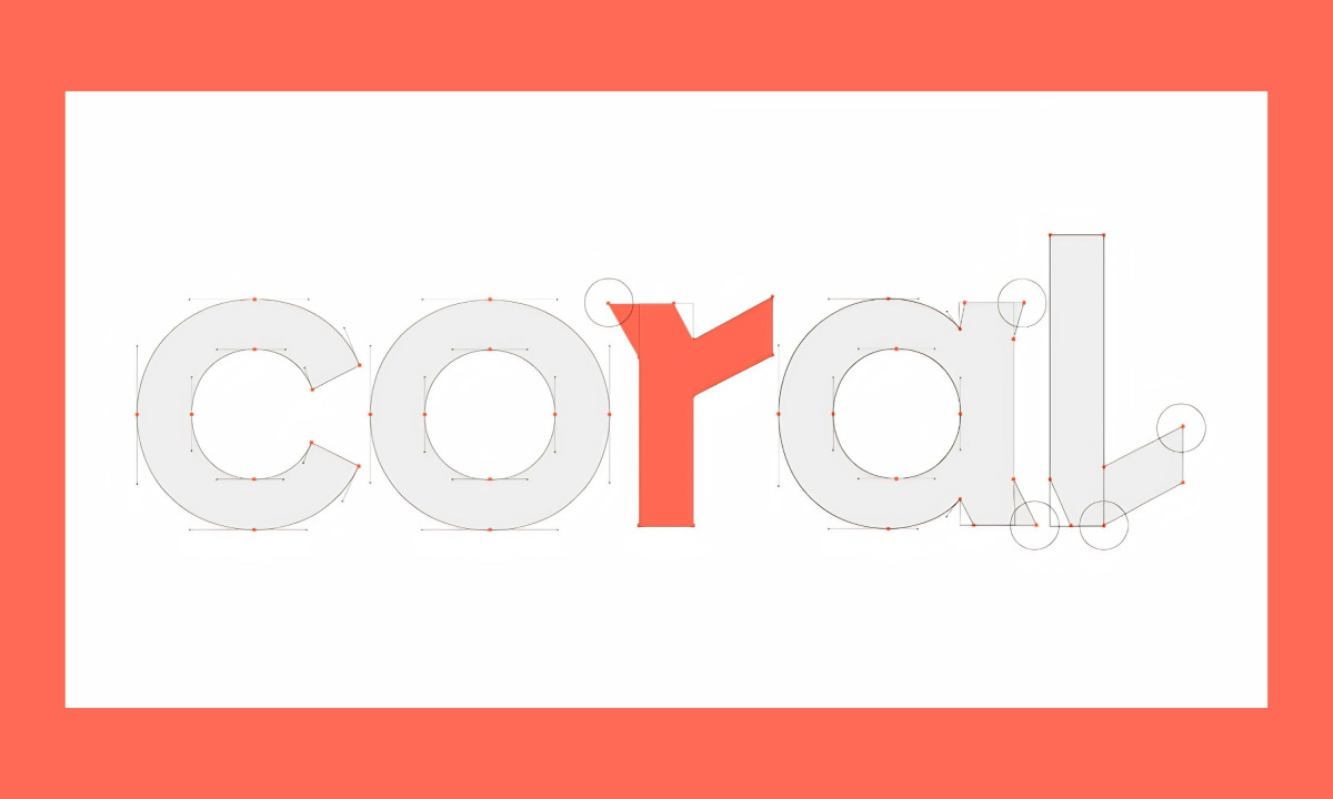
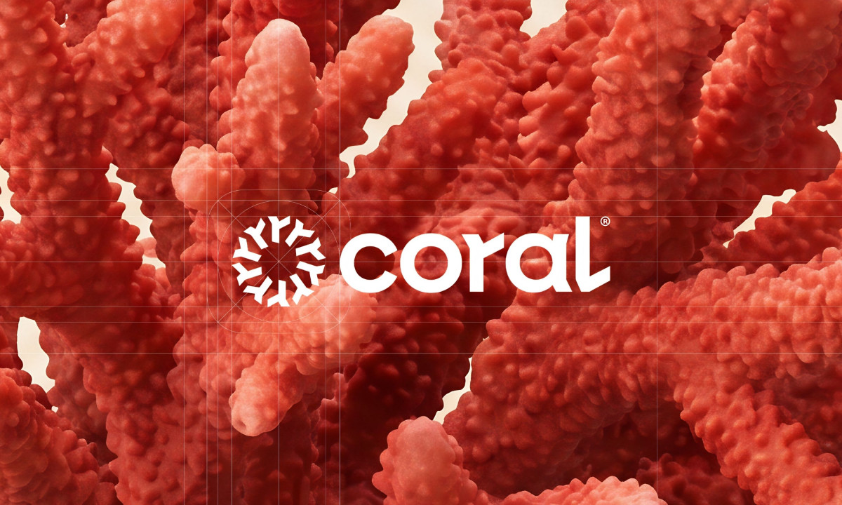
A professional services logo for a marketing operations firm usually leans on rigid corporate marks. Bortoletto Studio's identity for Coral takes the brand's name literally, building the symbol from radiating coral branches arranged into a perfect circle.

The icon reads as both a sea coral and a network diagram. Each arm extends from the center at equal intervals, signaling the firm's role as a connector between brands, field teams and points of sale.

The lowercase "coral" wordmark carries the second tell. A small flag breaks the top of the "r," echoing the icon's radial geometry and giving the type a custom detail that anchors the system at small scale.

Coral red drives the entire identity, paired with cream and a soft blue accent on poster applications. Bortoletto kept the palette narrow and the geometry strict, which is what lets a promotional marketing brand read as a system rather than a sales pitch.

Discover more from Bortoletto Studio

A F*king Good Coffee™ packaging design by Bortoletto Studio

A F*king Good Coffee™

Explore this year's Design Awards finalists and see the projects selected for top recognition. These entries are now in the finalist stage, moving forward for jury evaluation across categories like web, branding, product, and digital design.
Casa Macui Logo Design by Fugitiva
Casa Macui
Designed byFugitiva
Balance Logo Design by Studio AIO
Balance
Designed byStudio AIO
Wellington Educated Logo Design by Stanley Street
Wellington Educated
Designed byStanley Street
Aperture Capital Logo Design by Numinous
Aperture Capital
Designed byNuminous
AXIA Energia Logo Design by Tátil Design
AXIA Energia
Designed byTátil Design
Russells Logo Design by Yago Ferreira
Russells
Designed byYago Ferreira
View All BestLogo Designs

Ready to elevate your designs?