Standout Features:
- Modern shield symbol
- Fresh green color palette
- Flexible typographic system
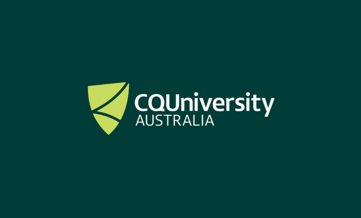
Educational brands, like any other, must evolve visually to accurately reflect their contemporary aspirations. CQ University Australia recognized this crucial need, initiating a comprehensive brand refresh thoughtfully led by Brother & Co. The primary objective was to craft a flexible, forward-looking logo suitable for such a dynamic university as theirs.
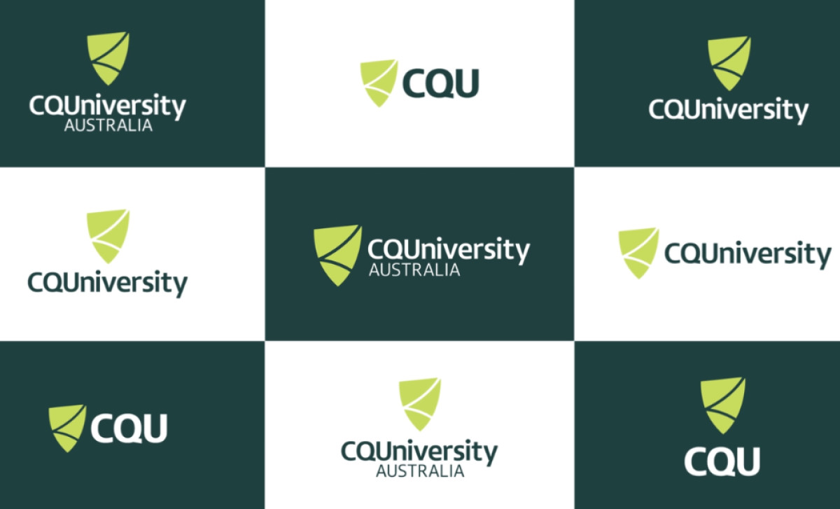
A key element is the modernized shield symbol. While retaining a traditional academic silhouette, its internal structure features a dynamic lime green shape divided by lines of negative space. This modernization results in a less literal, more adaptable icon, functioning successfully as recognizable shorthand for the university.

The refresh introduces a vibrant color palette pairing a sophisticated deep green with an energetic lime green. This specific color combination feels both innovative and striking, while still being appropriately grounded. It’s perfect for a brand refresh of such a prestigious, well-known institution.
Supporting the visuals is a clear and flexible sans-serif font. The identity offers multiple lockups — including the full name, "CQUniversity," and a concise "CQU" acronym version for tighter spaces. Having these options guarantees suitability and legibility for various contexts.
A well-executed brand update offers significant internal benefits too: a renewed sense of institutional pride. When a logo reflects an organization's energy and values, it can help galvanize staff and current students alike, making this one of the best education logo designs to date.

-preview.jpg)
