
Standout Features:
- Geometric and minimalist approach
- Clever use of symbolism with letters and shapes
- Strong contrast with modern color palette
Cryptoflation’s logo, designed by Hamad Alammash, needed to encapsulate the essence of the brand — cutting-edge, efficient, and forward-thinking. Through a mix of minimalist elements and bold symbolism, the logo manages to convey these attributes while maintaining a sleek, professional aesthetic.
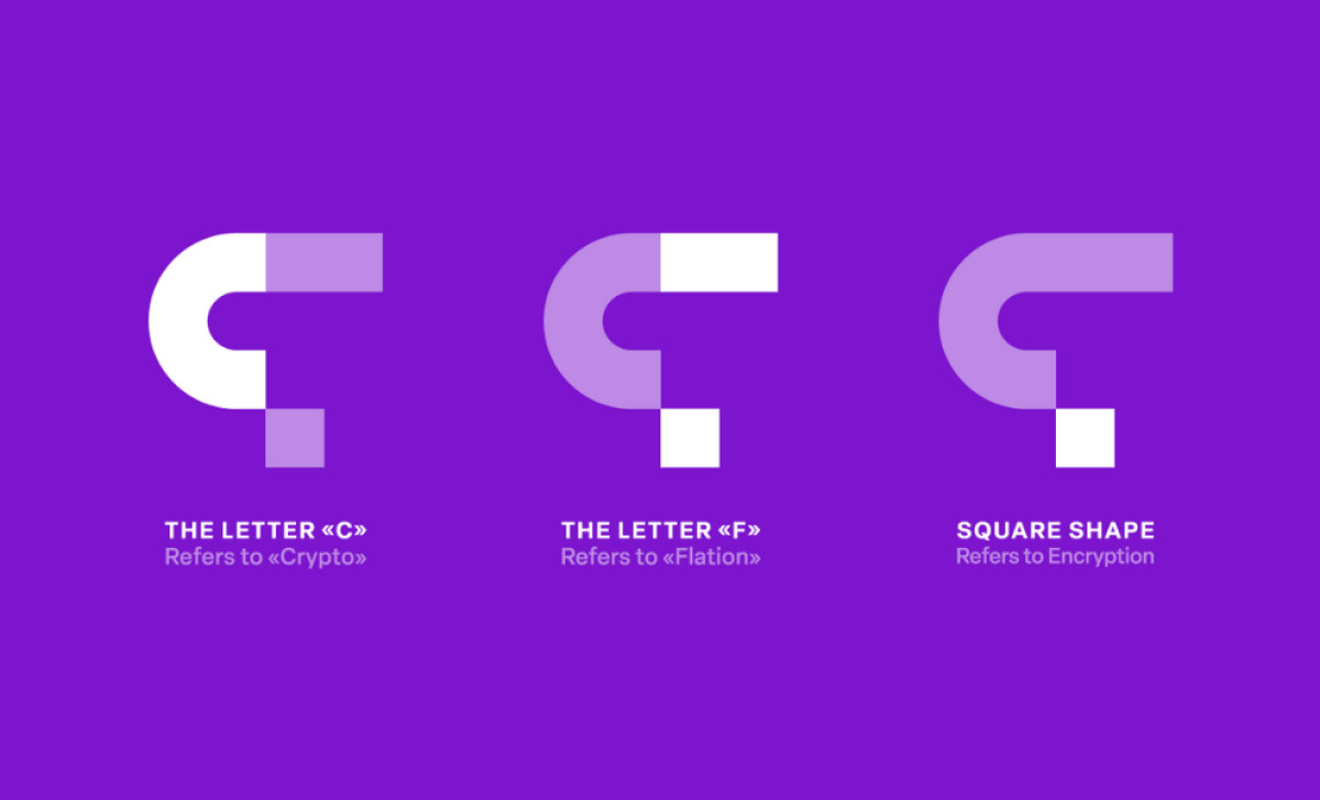
The use of letter "C" for crypto and "F" for flation is visually linked through a clever design, creating a distinct and memorable mark. The separation between the two letters, connected by an additional square shape, plays with the idea of digital blocks and encryption, which ties into the brand’s focus on crypto technology.
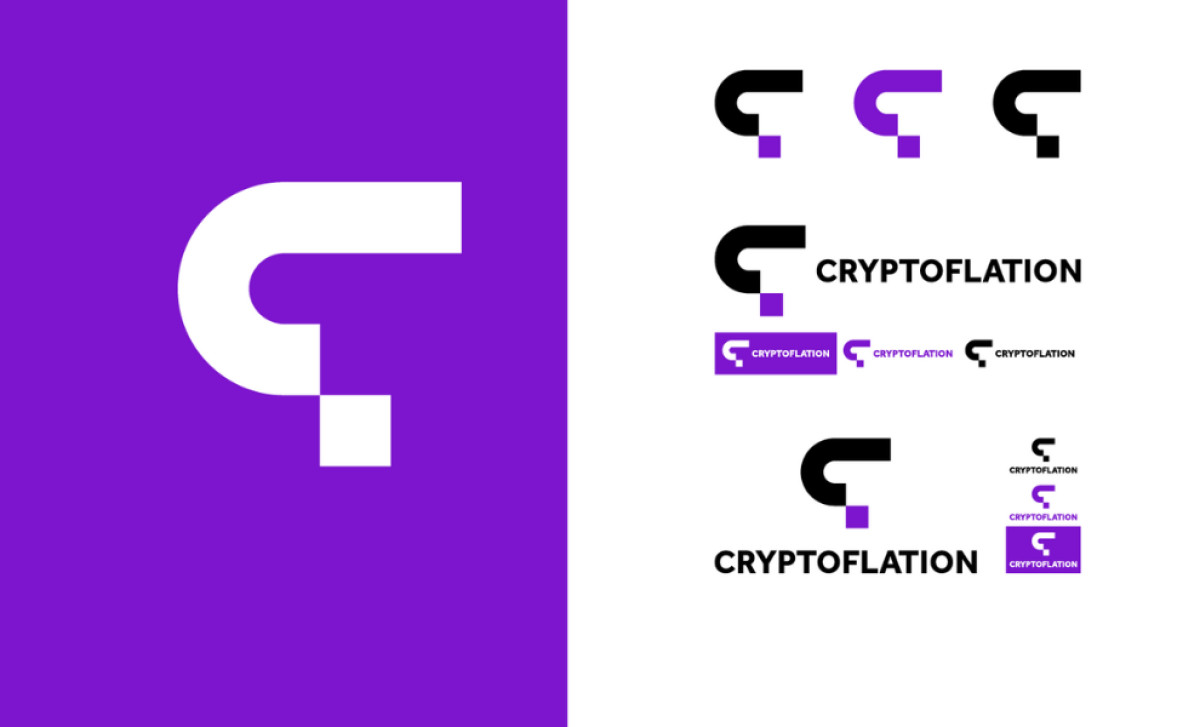
Purple, often associated with innovation and creativity, adds a layer of uniqueness to the design. This bold color choice makes the logo not only eye-catching but also memorable, reinforcing the brand’s cutting-edge identity. The clean, minimalist style ensures that the logo remains flexible and adaptable.
Additionally, the various logo iterations shown, including full versions and monochrome options, demonstrate the logo’s versatility across different contexts. This adaptability is important for a brand like Cryptoflation, which needs to maintain a cohesive identity across a range of platforms, from websites to promotional materials.
In summary, the clever use of geometric shapes and modern color schemes allows the professional services logo to capture the essence of the brand — technology, finance, and innovation. This design is a strong example of a top logo design, perfectly suited for a company at the forefront of the cryptocurrency and fintech industries.