Standout features:
- Simple design approach
- Bold typography
- Warm color story
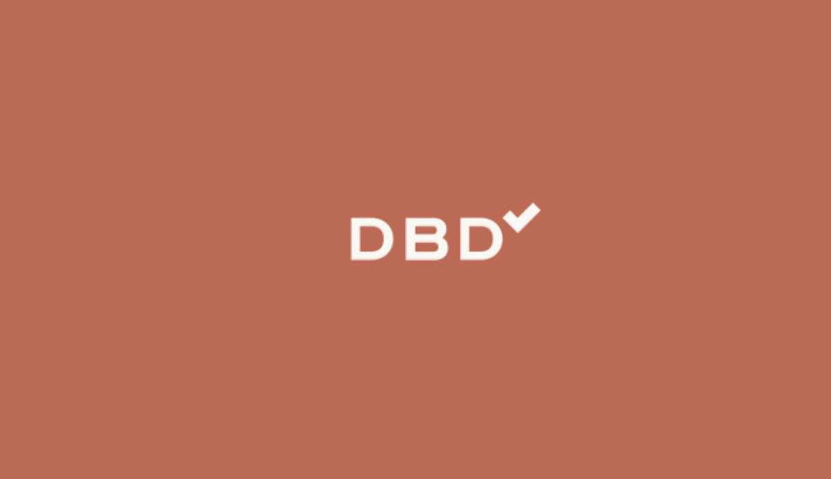
Day by day is an app that helps people organize by providing them services such as calendar scheduling, to-do lists and so much more. In this fast-paced world, apps like these are a lifesaver to many professionals and students.
Since they live by their aims of organization and relevance, they want a concise logo that is not too plain, and eme.studio has done a great job capturing that essence for the brand.
You can only see four elements in the logo design: the letters DBD and a checkmark, all in bold font styles. Typically, designers use boldface styles in fonts to give the impression of security and reliability.
Using this particular font style has managed to send that message across effortlessly.
The colors they also used are friendly to the eyes, which is great because they are all after the efficiency and efficacy of the app, so using such warm colors is helpful to their purpose.