Standout Features:
- Character symbol and portal
- Bold and modern typography
- Dynamic color usage and animation
A logo that pulsates with the energy of a live electronic music set — that's the effect Josh Muscat has achieved for DFT Music. It goes beyond a static image, incorporating dynamic animation and vibrant neon colors that truly come to life, making the logo a perfect representation of the Australian duo's electrifying sound.
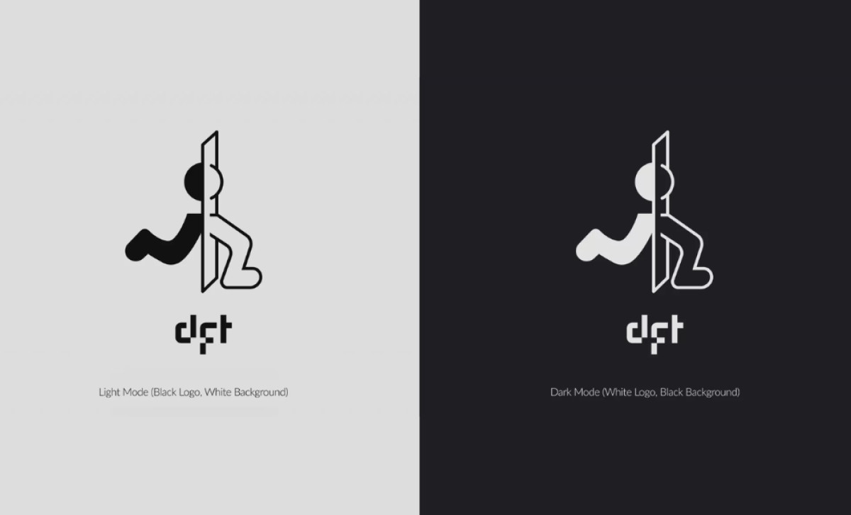
The main visual is a stylized, stick-figure-like character coming partially out of a vertical rectangle, giving you this "portal" or "threshold" kind of effect. It's a unique and intriguing metaphor that fits really well with electronic music's dynamic nature, with its sudden changes in tempo, mood, and intensity.
The DFT Music logo also uses bold, modern typography. The brand name "dft" is presented in a custom, geometric, almost pixel font with sharp-edged angles and a bit of a distorted feel. This font choice feels modern, edgy, and fits the contemporary aesthetic of electronic music.
In its static form, the logo is black and white, but when animated, it uses vibrant neon color gradients that shift and breathe. Neon is often linked to nightlife and the electronic music scene. Pair this with the character’s walking animation, it gives the logo even more energy, making it pretty engaging, particularly during live shows.
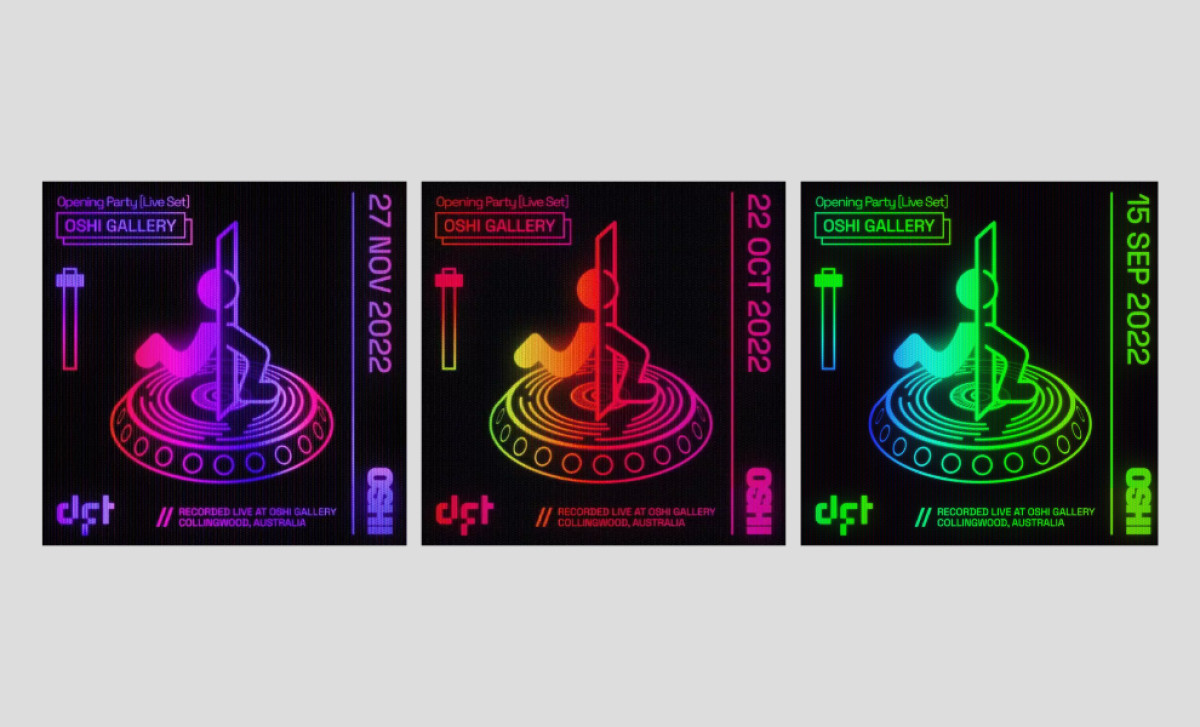
Josh Muscat's entertainment logo design for DFT Music transcends the typical limitations of a static logo. From its futuristic typography to the shifting neon hues, the logo creates a multi-sensory experience that gives viewers a glimpse of what DFT Music can bring to a party.